Keep the information plain
The expressive headline sits beside straightforward product facts. A customer should be able to find the format and color without decoding the joke.
Original brand concept / Fashion / Beauty / Fragrance
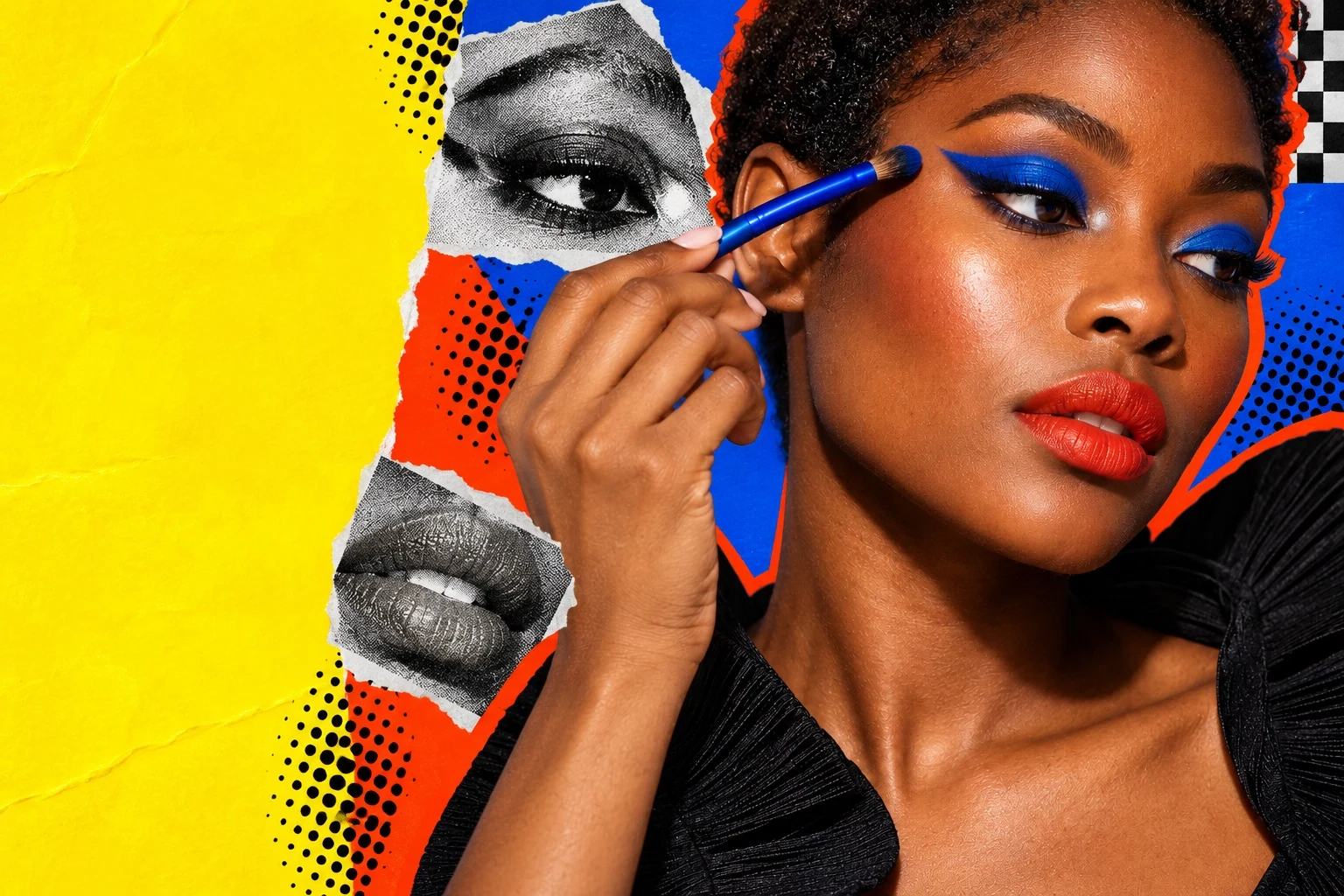
OH FCK carries a blunt voice across clothing and beauty. I developed the product direction and identity, then used close crops and strong color in the proposed shop and campaign.
THE STARTING POINT
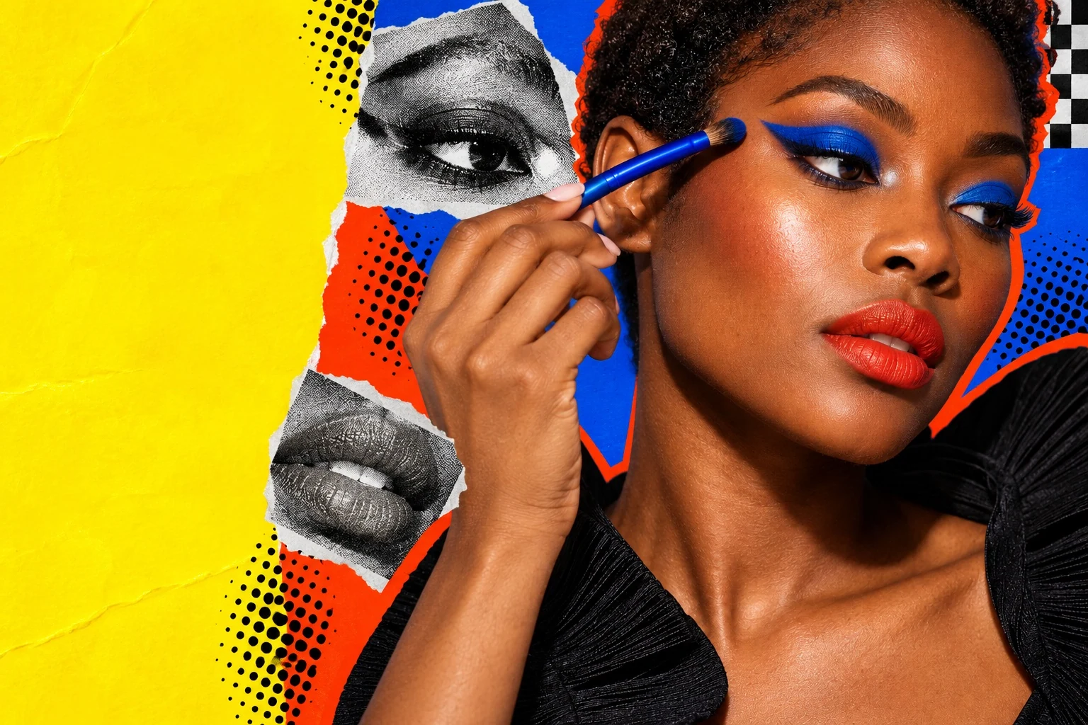
OH FCK starts with a familiar reaction to something good. I wanted the products to keep that energy once the name had done its job. Strong color and close crops gave the campaign a direct way to hold attention.
The information still needs room. I kept the product naming clear and used compressed type where it could carry the attitude without taking over every line. The study brings that balance into the proposed collection and store.
THE IDENTITY
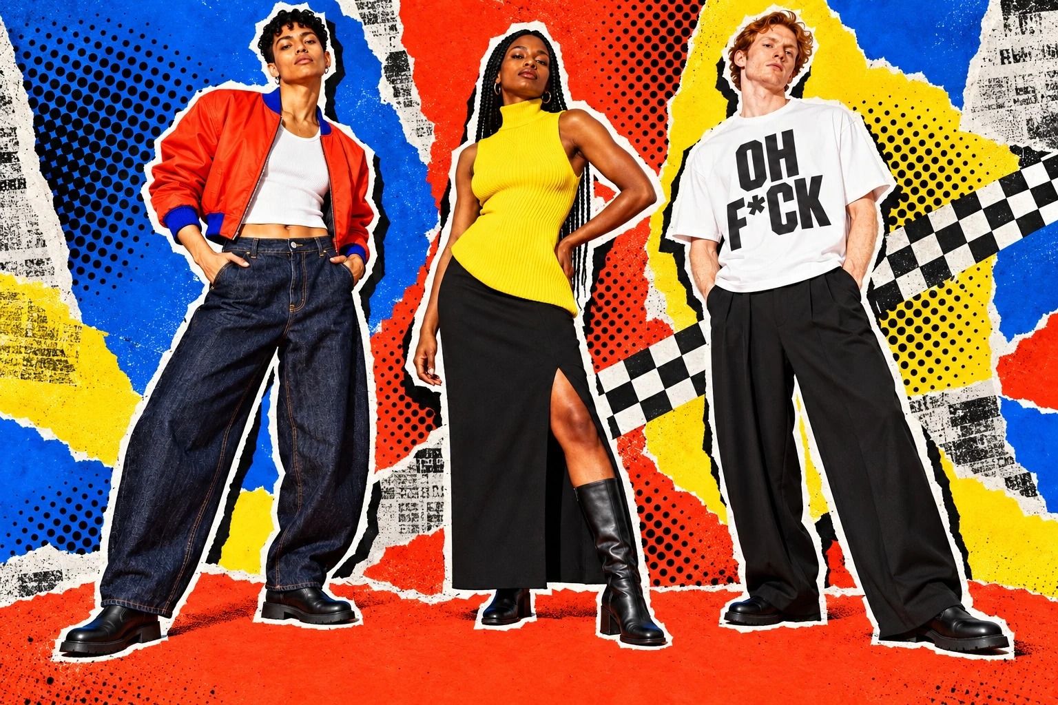
The asterisk stays in place across the identity. Compressed letterforms make a strong block, with orange-red and cobalt carrying most of the visual weight. Checkerboards and Ben-Day dots supply a second graphic layer.
Headlines are blunt and oversized. Product names and practical details use a calmer hierarchy. The voice swears at delight, never at the customer.
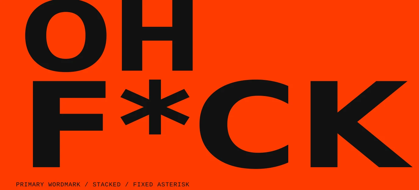
#FF3C00#003BCD#FFDA00#111111#FFFFFFPRODUCT & COLLECTION DESIGN
I developed a clothing capsule alongside makeup and fragrance directions. Choose a category, then explore the pieces within it.
Eight proposed pieces built around a strong silhouette and usable details.
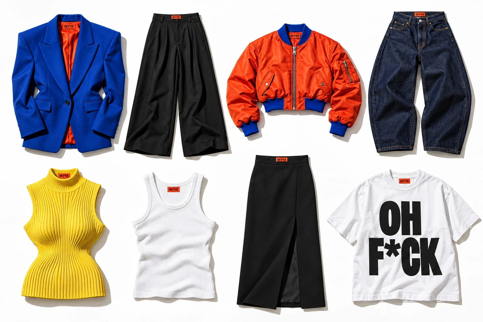
A wool-blend blazer with broad shoulders and a shaped waist. Deep pockets make the statement practical. Proposed in cobalt and orange-red.
Fashion direction
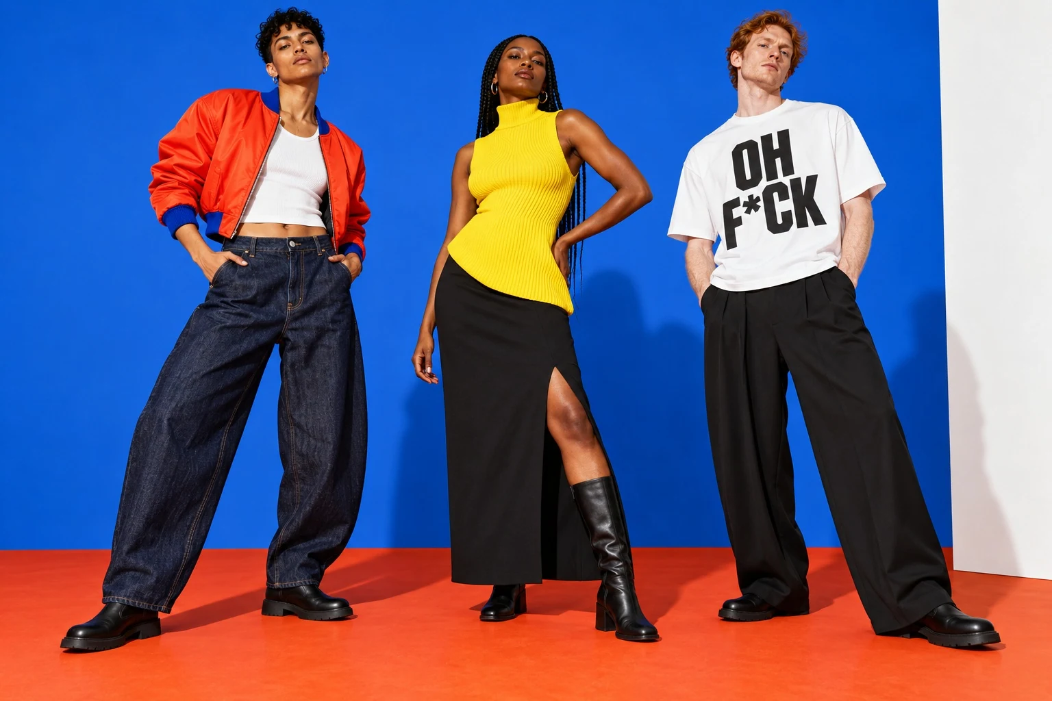
The clothing campaign gives the silhouette the first word. Close crops and strong poses show how the pieces hold their shape, with the brand colors working across garments and backgrounds.
Beauty direction
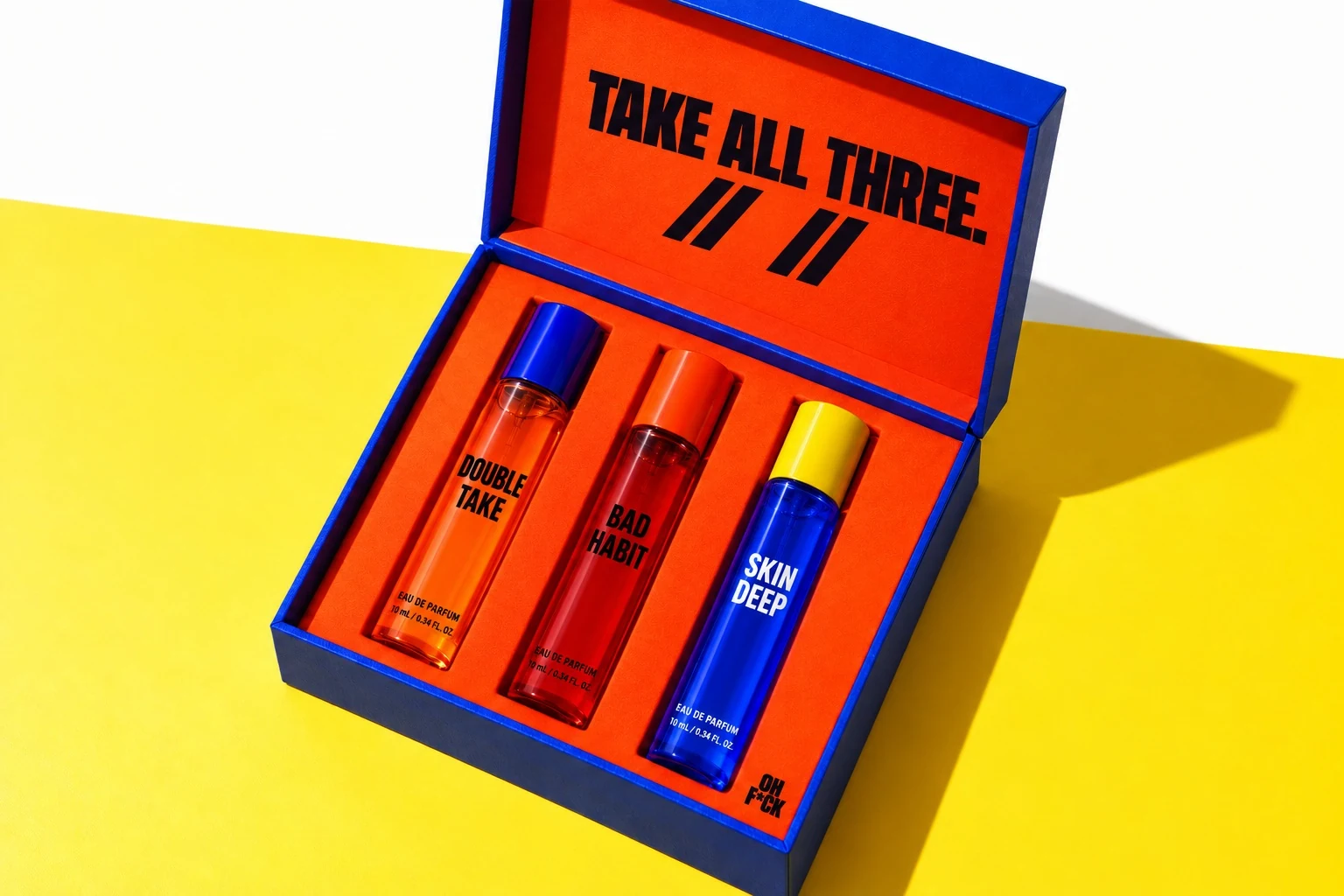
Makeup gets closer. The editorial direction brings the color onto the face, while product images keep the formats easy to compare. Packaging carries the same asterisk and strong blocks of type.
Campaign
The copy changes with the product. “Nice fucking cut.” belongs to tailoring. “Smell like trouble.” gives Bad Habit its own line. Short, deadpan statements leave the visual work enough space.
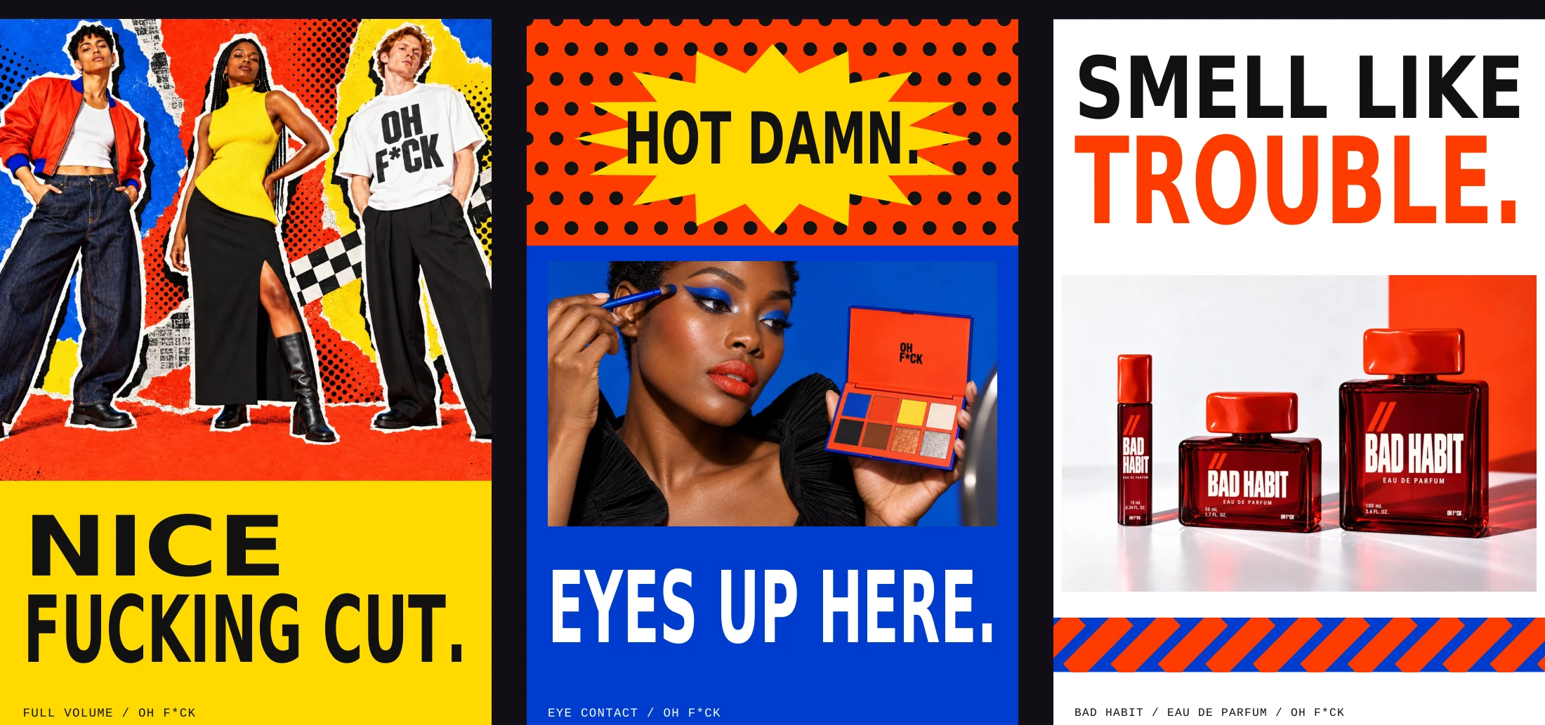
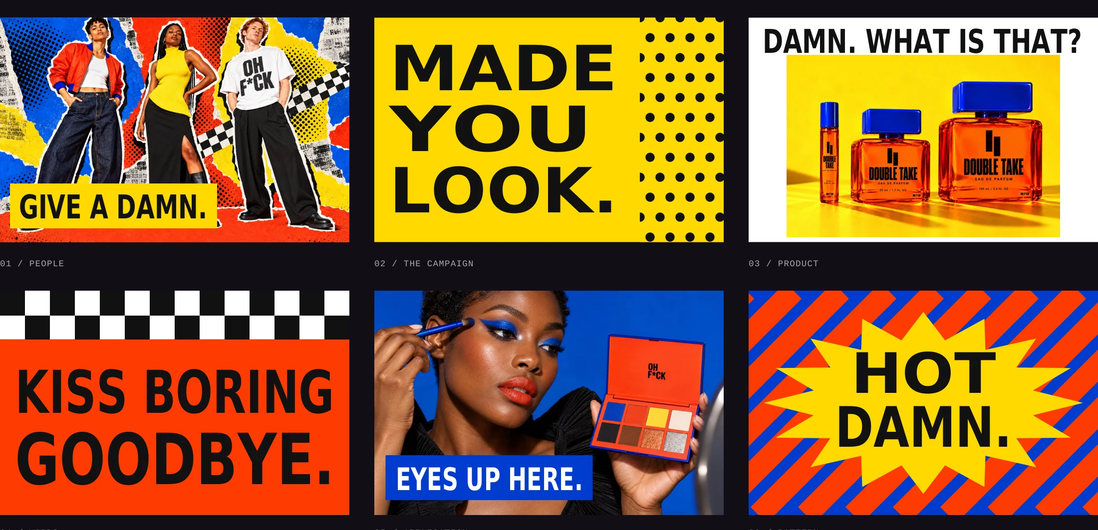
The expressive headline sits beside straightforward product facts. A customer should be able to find the format and color without decoding the joke.
A hard crop can carry the attitude. The copy does not need to repeat the brand name on every application.
Retail
A cobalt facade and large orange sign introduce the proposed store. Inside, a fitting wall gives clothing its space, with a color counter and a separate fragrance table for discovery.
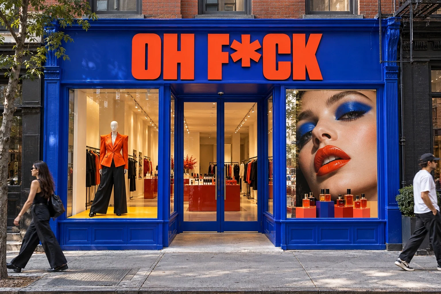
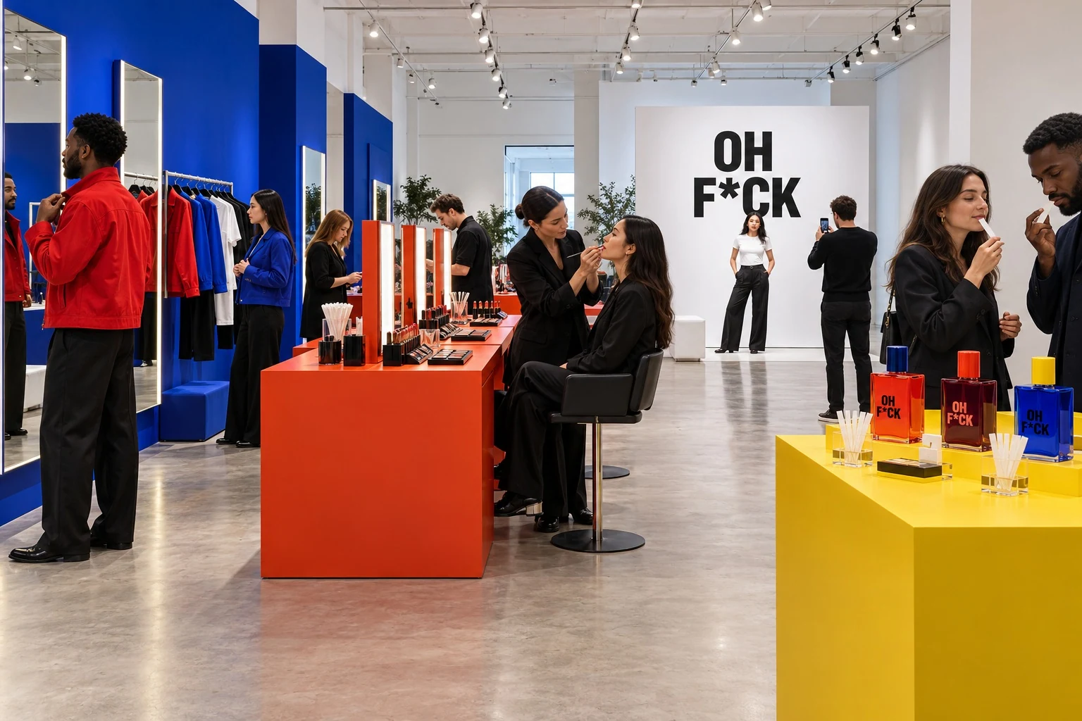
The visit starts with the clothing silhouette and a chance to try it on.
The makeup counter brings the campaign palette into a personal choice.
Individual blotters introduce the three briefs, with time to compare.
An optional portrait closes the visit. Guests choose whether to participate or share it.
THE WORK, TOGETHER
Independent brand concept by Priscilla Rios. Product designs, scent directions and experiences are proposals. Scent notes are creative briefs for perfumer development.