INTEGRAL

THE STATE OF
BEING WHOLE.
I was the sole designer behind Integral’s rebrand. I built the identity, then carried it into the company’s everyday work.
Explore the story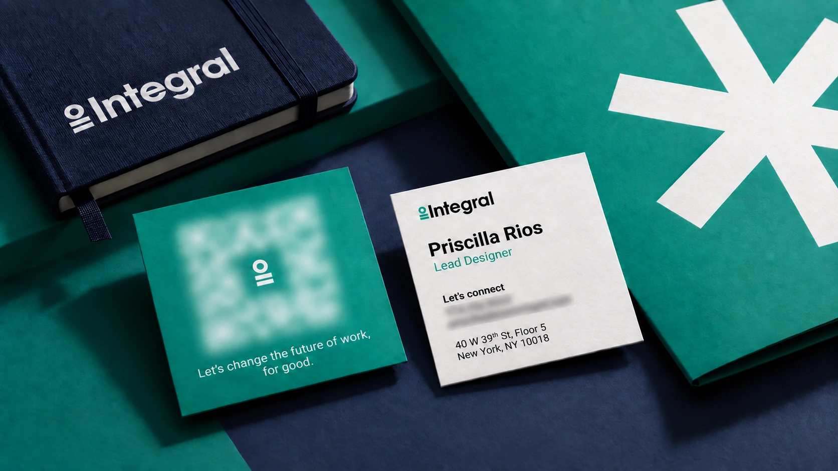
THE STARTING POINT
A BUSINESS
BUILT AROUND
PEOPLE.
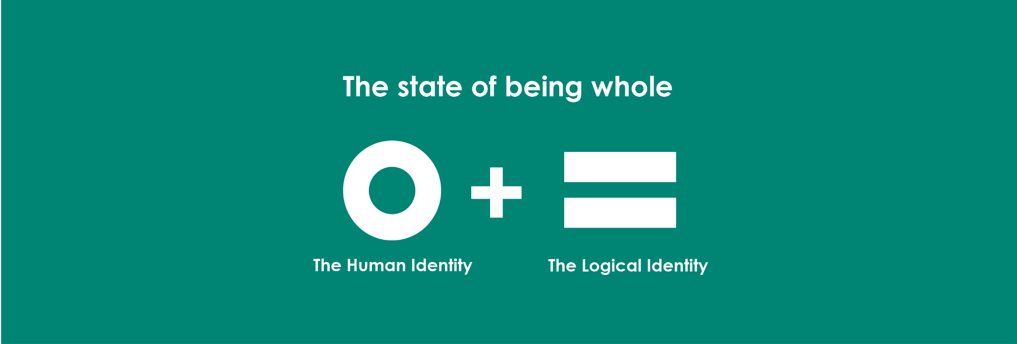
The rebrand started with a definition. Integral means whole.
Integral Communications Group shortened its name to Integral in 2020. I was the sole designer on the rebrand.
The hard part was giving humanity and integrity a shared visual language. Integral’s work draws on strategy and data. I wanted the mathematics of that thinking to come through without making the identity feel dry.
I also needed room for variation. Too much change would make the brand hard to recognize. I kept the circle and equals sign together as the main mark, with the asterisks carrying the variation.

HUMANITYConnection.
A place in the whole.
INTEGRITYFairness.
A shared standard.
A simple idea
with somewhere to go.
The circle expresses human connection. The equal sign brings a mathematical reference to fairness and truth. The original rationale makes that relationship explicit.
THE VISUAL LANGUAGE
NO TWO
ALIKE.
People arrive with different experiences. Integral’s work changes with them.
The asterisk gives that variation a place in the identity. Its shape can change while the main logo remains consistent. Some versions feel precise. Others feel loose and spontaneous.
 Hex bloom01 / 12









 Hex bloom01 / 12
A fixed identity.
An open vocabulary.
Choose a mark to see the range built into the system.
MAKING CONTACT
THE BRAND
ENTERS THE
CONVERSATION.
The identity has to hold up in someone’s hand.
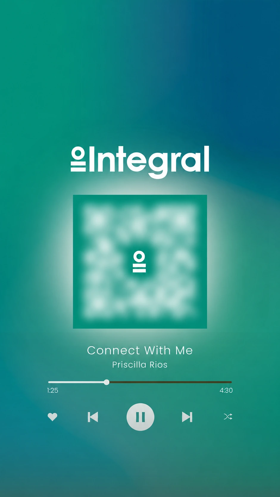
My square business card gives the QR code a full side, with the Integral symbol at its center. The reverse keeps the contact information direct. A digital card carries the same idea onto a phone screen.
EXTENDING THE IDENTITY
GIVE THE IDEA
MORE SPACE.
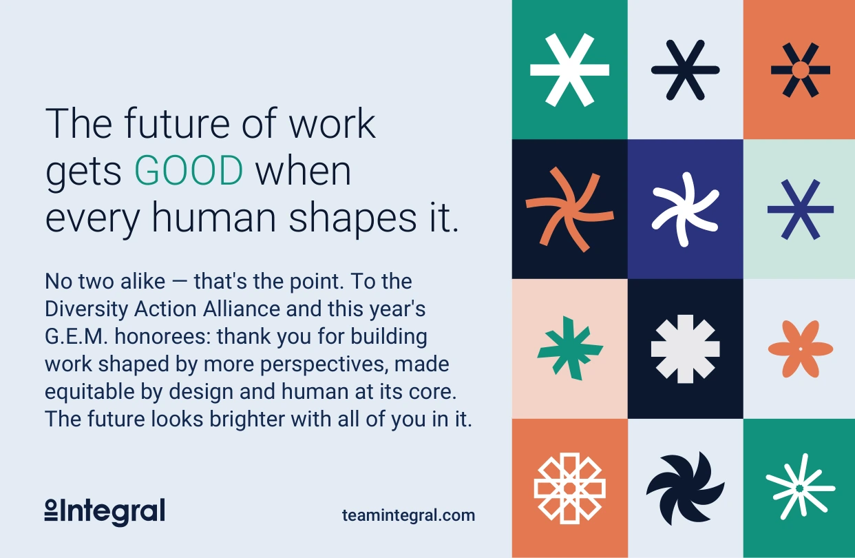
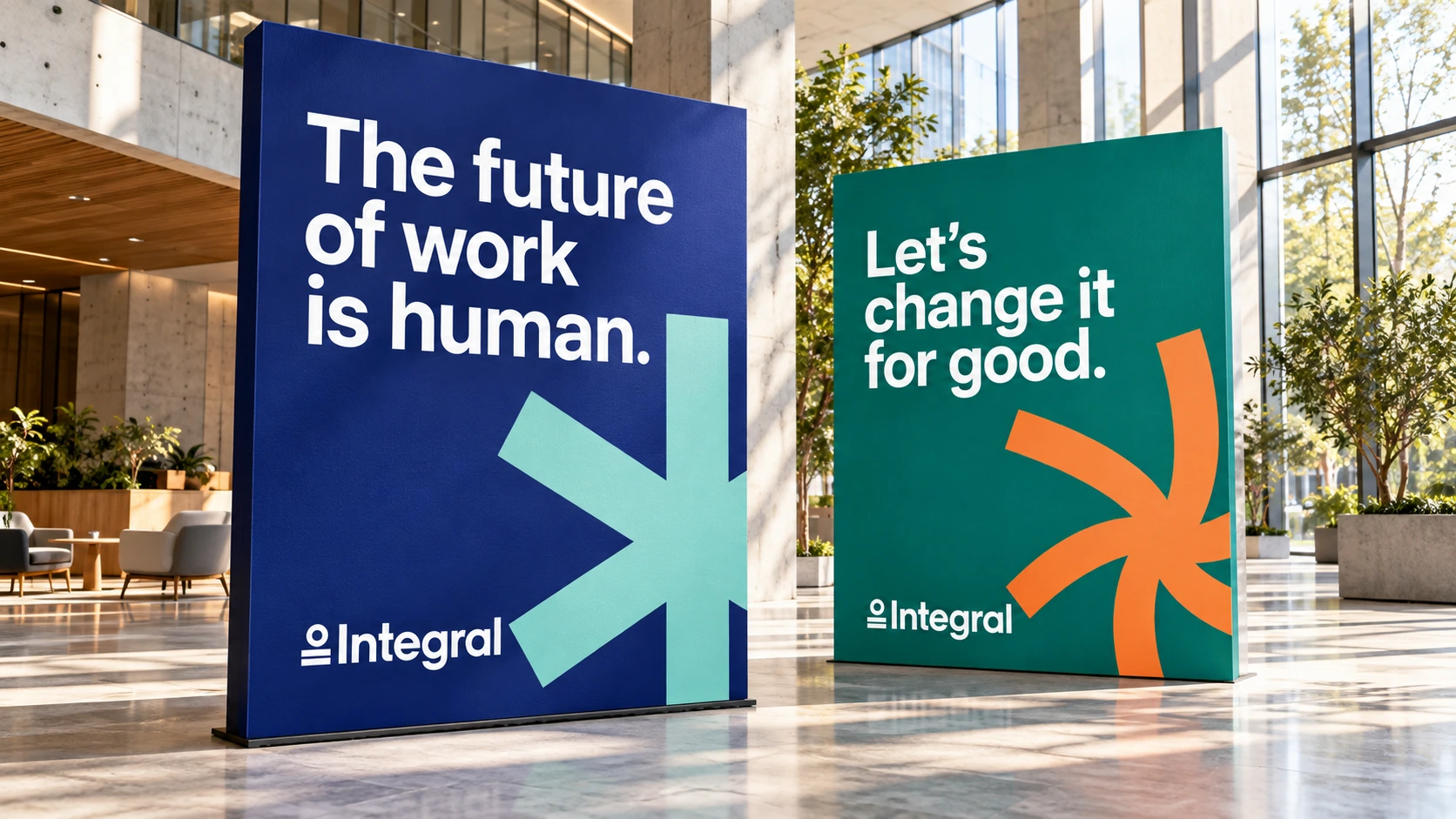
These two ads are campaign concepts made for the portfolio.
They draw on Integral’s own voice: a better start to the working week, and the belief that a better employee experience helps people do their best work. The asterisk puts a person at the center of that idea.
THE WORKING SYSTEM
BUILT TO
BE USED.
A visual identity needs rules people can work with.
I brought the system into a shared set of brand guidelines. Teal and blue anchor the palette, with secondary colors for specific moments. Roboto gives the typography range without asking the team to manage multiple typefaces.
People.
At work.
PROGRAM EXPRESSION / CAMP INTEGRAL
SAME BELIEF.
LOOSER LINES.
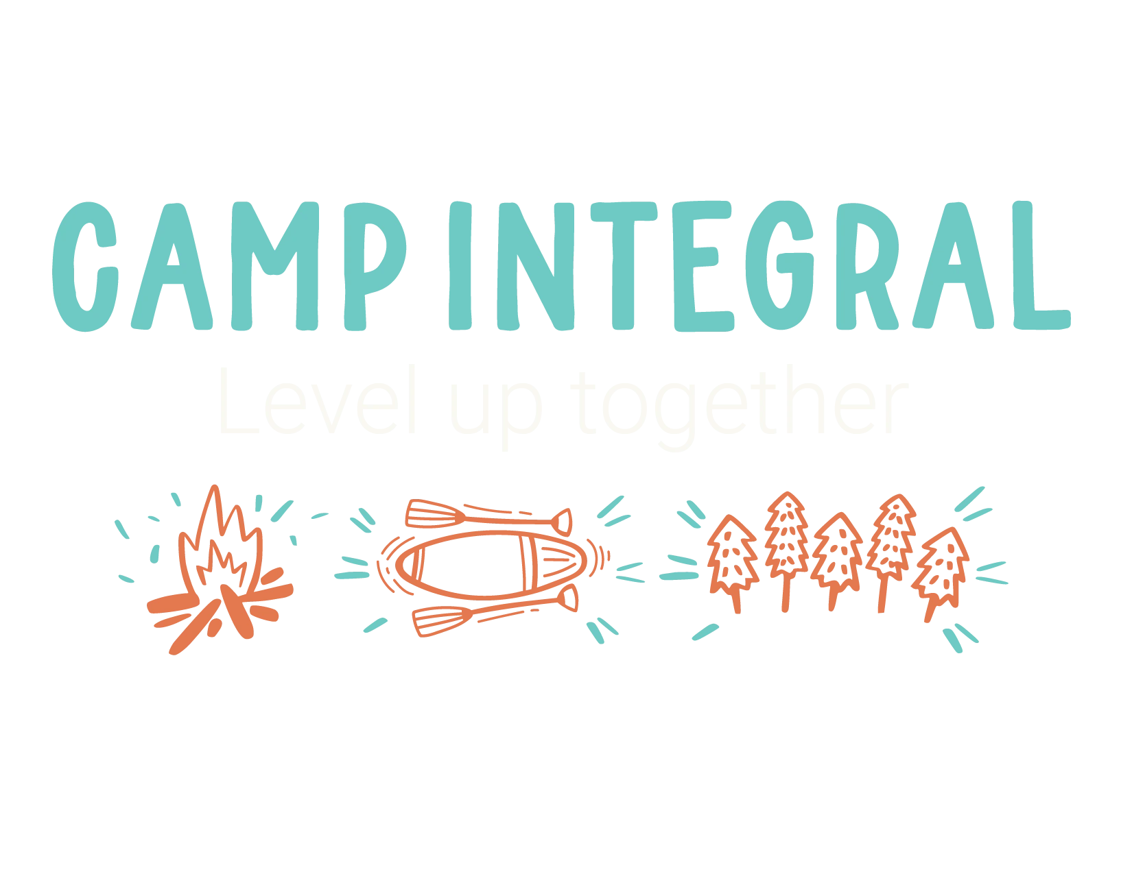
Camp Integral takes the brand into shared learning.
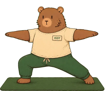
The Camp Integral drawings leave room for a hand-drawn line. Iggy returns as a recurring character, and the individual illustrations fit together in a larger pattern.
 MEET IGGY



Something to wear.
Something to keep.
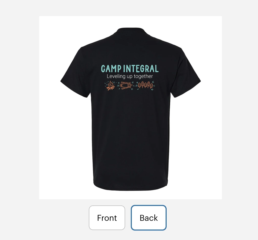
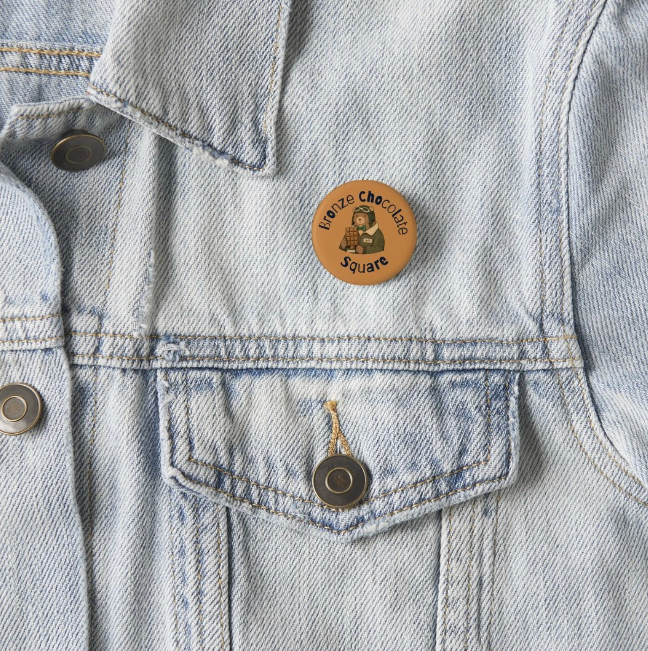
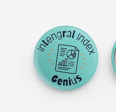
I carried the camp identity onto apparel and activity badges. The shirt keeps the Integral mark small on the front and gives the camp artwork room on the back. The badges turn individual activities into little keepsakes.
PROGRAM EXPRESSION / THE INTEGRAL INDEX
THE SYSTEM
HAS RANGE.
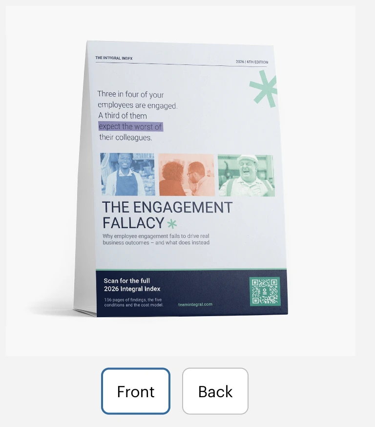
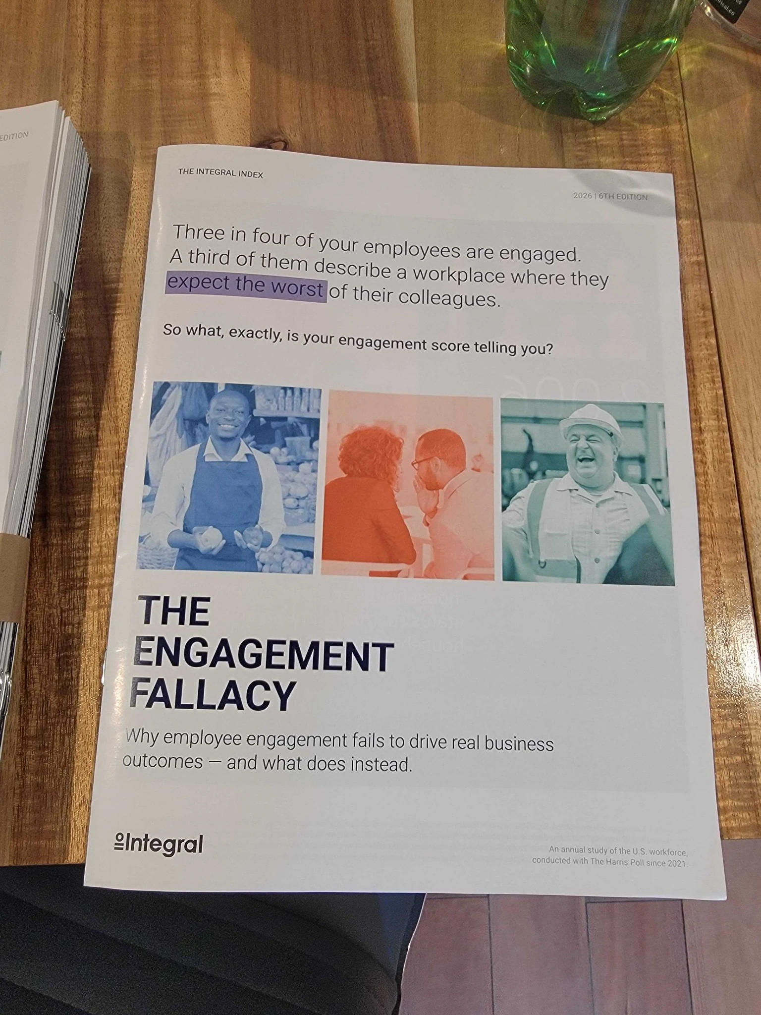
The Index uses the same type foundation for a different reading task. Color-coded chapters help readers place the findings, with green identifying the report.
View the Index case study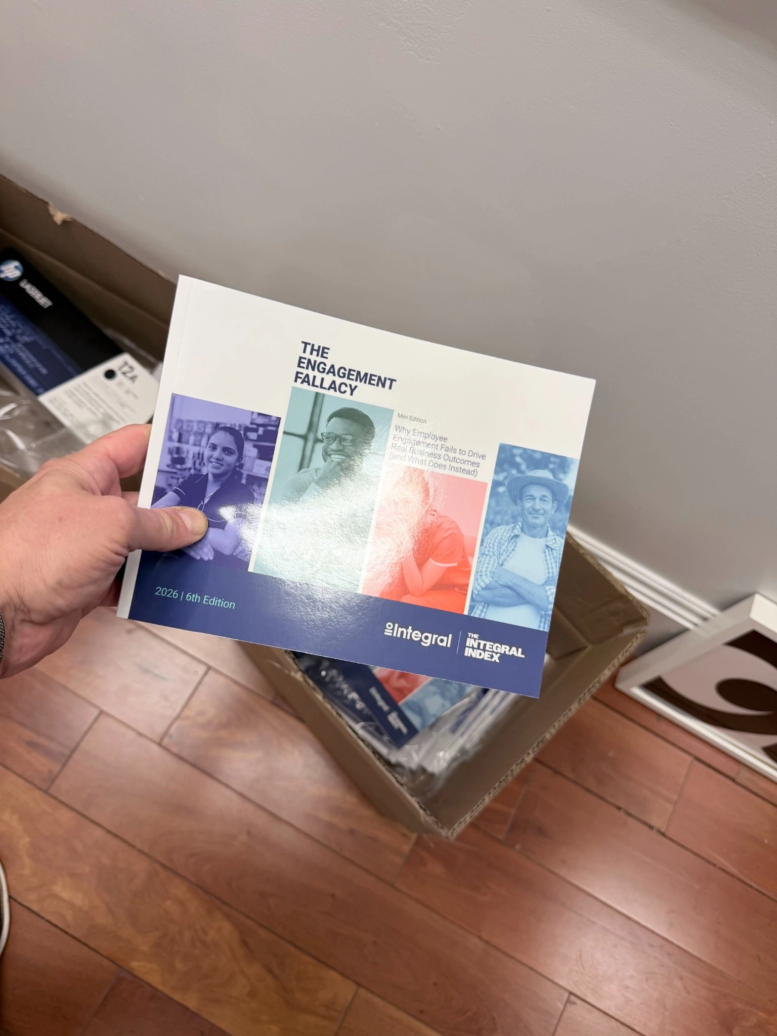
THE RESULT
ONE IDEA.
A BRAND PEOPLE
CAN BUILD ON.
I designed the rebrand and built the guidelines myself. That same responsibility carried through to the work for Camp Integral and the Integral Index.
The circle and equals sign give the brand a fixed point. Camp Integral can loosen the drawing style, while the Index can organize dense research. Both still belong to the same company. I carried that relationship through the guidelines and the applications shown here.
PRISCILLA RIOS / SOLE DESIGNER