
CLIENT WORK / INTEGRAL / 2026
// DARK MATTER GRID / CASE STUDY P12
THEENGAGEMENTFALLACY
A 172-page workforce study about what people do at work and why they stay, including the patterns organizations miss.
READ THE STORY ↓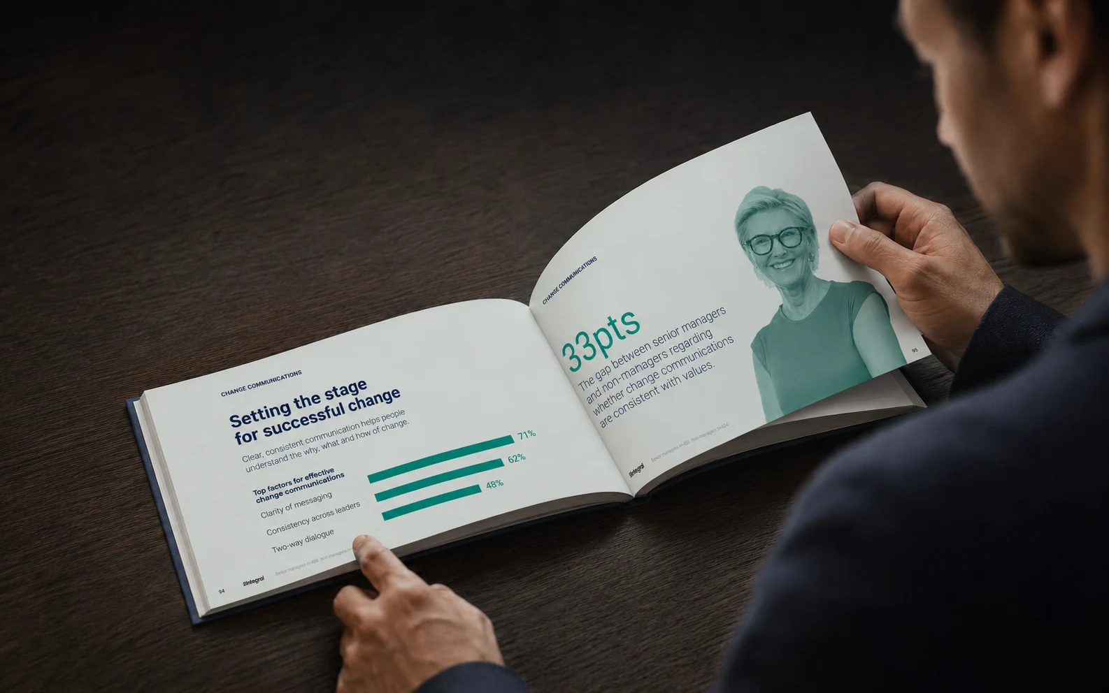 9 × 7 IN / HORIZONTAL EDITION
THE OPENING QUESTIONTHE REPORT BEGINS WITH A CONTRADICTION
WHAT IF THE
WAY WE MEASURE
ENGAGEMENT
IS THE PROBLEM?
The sixth Integral Index brought together a lot of connected findings. My job was to help a reader follow the argument across 172 pages without losing the detail. The design had to give important numbers room and keep the quieter explanations readable.
I used large findings as turning points, then slowed the pace for the explanation that followed. That balance mattered. If every spread shouted, the reader would lose the thread.
BEING PRESENT
IS NOT THE SAME
AS BEING ENGAGED.
THE VISUAL SYSTEM MAKES THE DIFFERENCE IMPOSSIBLE TO MISS.
NARRATIVE ARCHITECTUREBUILD THE RESEARCH LIKE A FOUR-ACT STORY
172PAGES
ONE REPORT.
FOUR TURNS.
I grouped the report around four turns in the argument. Each gives the reader a reason to keep going and a way to place the next finding.
01 / THE ASSUMPTION
ENGAGEMENT LOOKS LIKE ONE NUMBER.
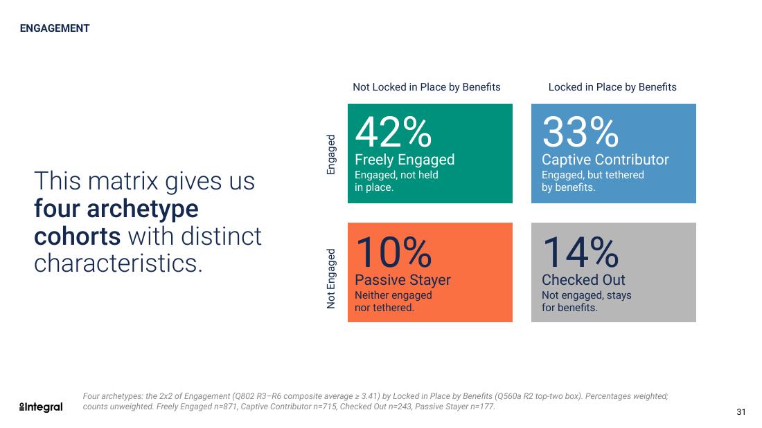
The research told a more complicated story. People could be committed, skeptical, stuck, or actively disengaged. A single score could not explain why.
THE READER ENTERS THROUGH SIX FINDINGS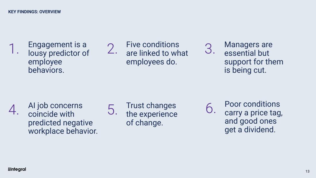
EDITORIAL SYSTEMRHYTHM KEEPS 172 PAGES MOVING
ARGUMENT.
EVIDENCE.
BREATH.
A dense analysis page needs somewhere to end. Section openers and portraits give the reader a pause, then the next chart can establish a new finding.
- 01LEAD WITH THE POINT
Each section leads with its finding. The supporting research follows.
- 02MAKE RELATIONSHIPS VISIBLE
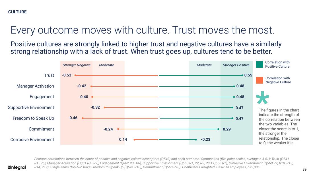
Scale and overlap establish the relationship. Color makes it readable.
- 03KEEP PEOPLE IN FRAME
Portraits bring people back into view between the research pages.
FIGURE 07 / CULTUREONE RELATIONSHIP, SHOWN CLEARLY
DATA AS DRAMALET THE RIGHT NUMBER COMMAND THE FRAME
A single contrast leads the page before the explanation arrives.
The space between the two groups makes the gap visible.
The closing argument connects workplace experience to action.
SELECTED SPREADSTHE REPORT CHANGES FORM WITHOUT LOSING ITS VOICE
OUTCOMETHE REPORT
THE REPORT
DIRECTS
ATTENTION.
The report uses changes in pace to help readers stay with the research. A large number can establish the point, then a quieter page gives it context. The evidence stays intact. My contribution is the structure and design that help someone read it.
Art direction and information design help readers understand the patterns they recognize, then decide how to act.