BREED ARCHITECTURE
Colt, Pacer, Mustang, Scout, Bronco, and Stallion turn a product catalog into a memorable taxonomy.
BRAND / PRODUCT / MOBILITY
WHERE I STARTED
I used mechanical breeds to give the EQUUS models distinct personalities. The challenge was keeping that idea useful when someone compares vehicles. Each model needed its own intended behavior within a recognizable family. Materials and silhouette carry those differences through the brand presentation.
“Classify bicycles as kinetic breeds, each shaped by an instinct and the terrain its rider chooses.”
WORKING THROUGH IT
Colt, Pacer, Mustang, Scout, Bronco, and Stallion turn a product catalog into a memorable taxonomy.
Restrained editorial design frames animal references and raw materials, with physical tension in the images.
Rain and friction weather the copper and brass over time. Ownership leaves a visible record.
Each breed appears first through posture and presence. Range and speed follow, with the hardware explained afterward.
THE IDENTITY
The breed names distinguish the models. A restrained master mark keeps them part of the same vehicle family.
Silent. Swift. Entirely yours.
THE VISUAL LANGUAGE
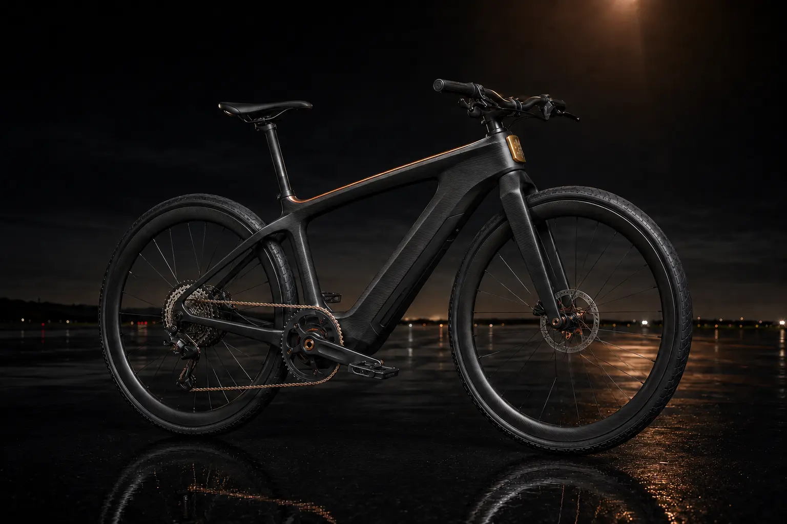
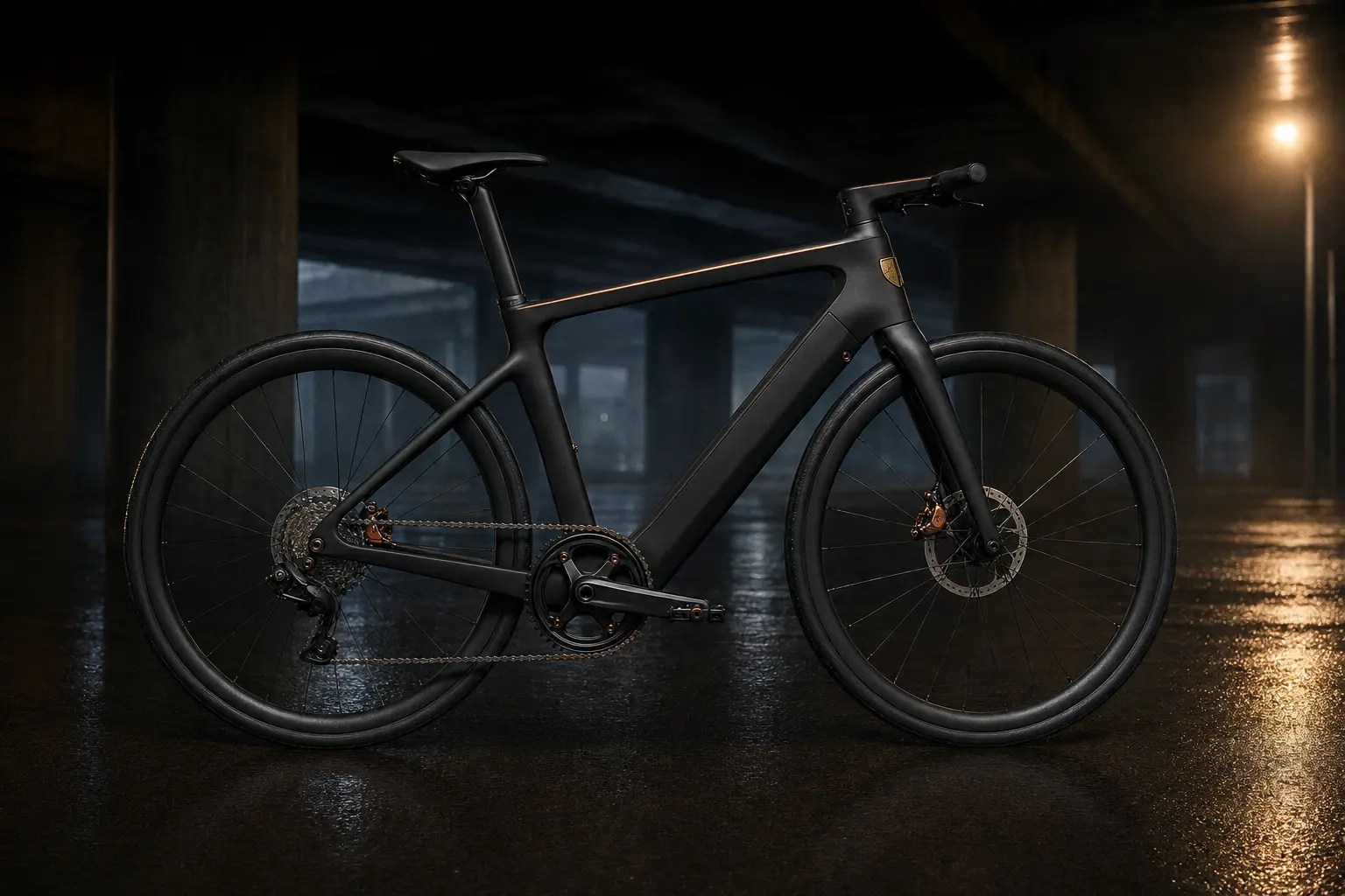
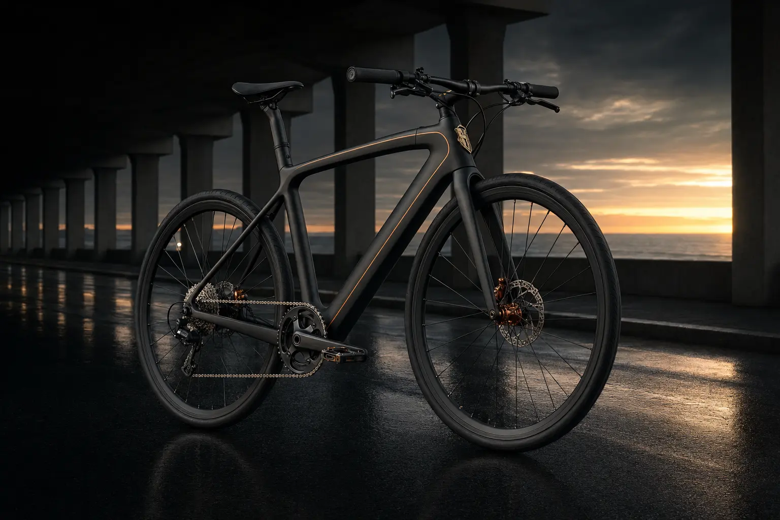
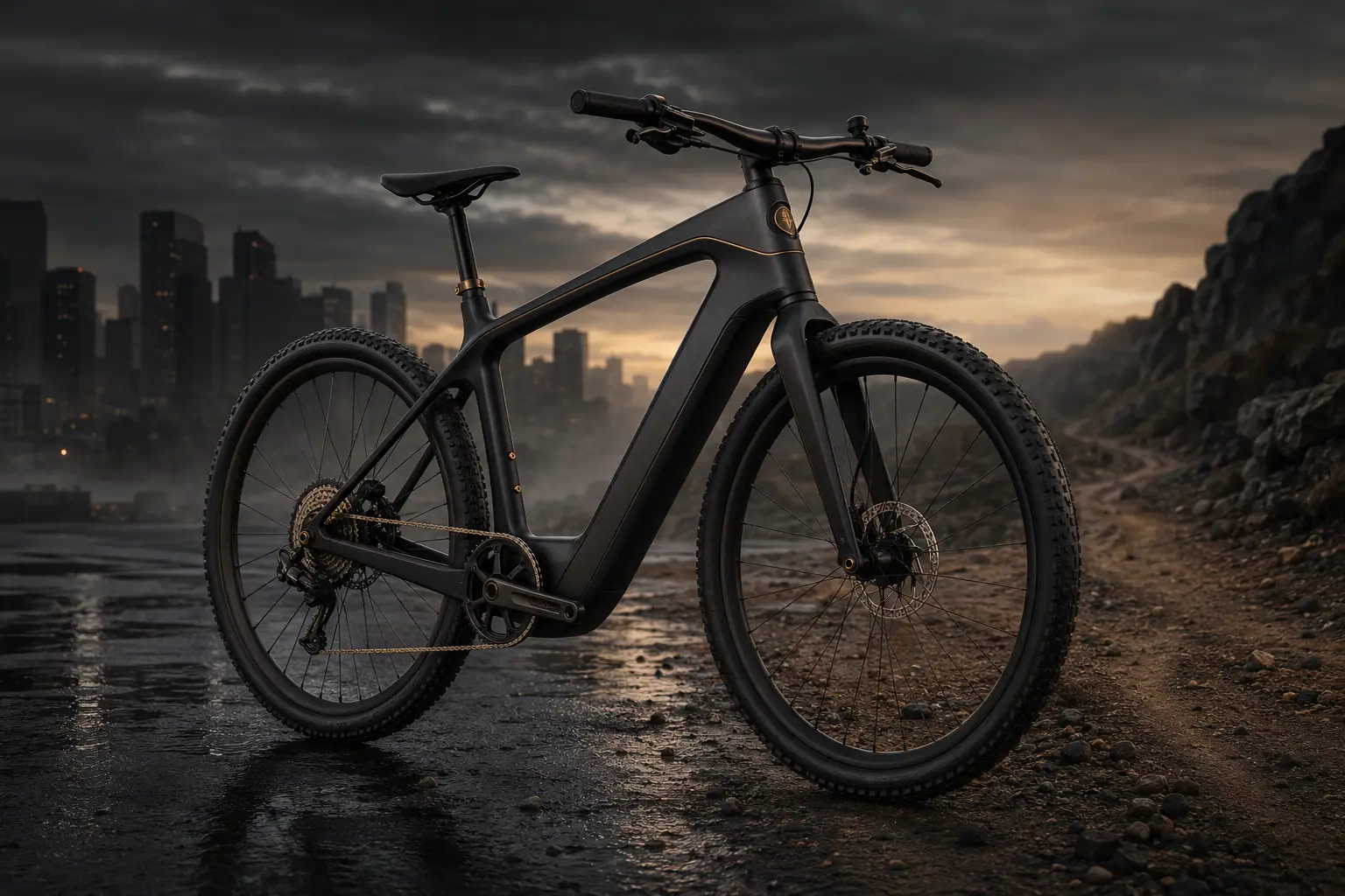
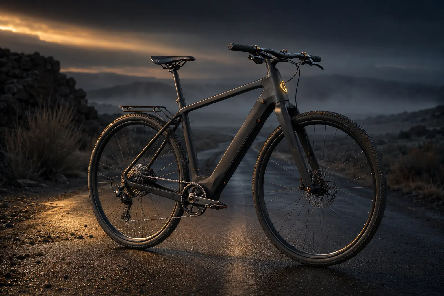
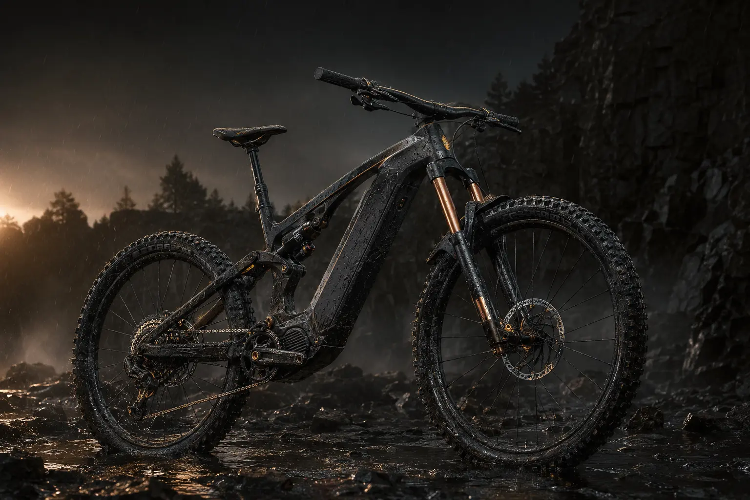
Portraits give each vehicle a distinct presence. Matte carbon connects the family, while stance and terrain show its purpose. Metallic accents identify the breed.
APPLICATION
The product portraits use the same framing so you can compare the models. Each breed keeps its own silhouette and intended behavior within that shared format.
EXPERIENCE
The website introduces each model’s intended use, then its materials and specifications. Motion suggests acceleration. The patina section shows how copper and brass would change with wear.
Instinct and use organize the lineup.
Show the copper and brass after use. Their patina would make ownership visible over time.
The manifesto explains why the models use animal names. It needs to stay close to how each vehicle is meant to move.
WHERE THE CONCEPT STANDS
The concept gives six electric vehicles a shared identity with distinct model names and visual cues. The site makes those differences visible. The vehicle designs and performance directions remain speculative product work.
VIEW THE PROJECT ↗