ONE SIGN, ONE SIGNAL
One oversized zodiac glyph leads each bottle, making the collection easy to recognize and choose from.
BRAND IDENTITY / PACKAGING / CAMPAIGN / RETAIL
THE STRATEGIC HOOK
The zodiac gave the collection an immediate structure. Each sign could have a distinct expression, but I did not want twelve unrelated labels. I kept the bottle information restrained and used the glyphs to carry the differences. The shared mark holds the family together.
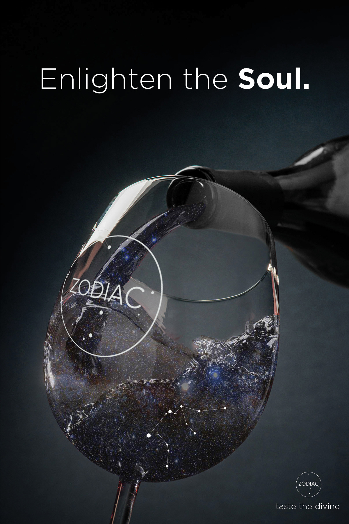
“Match the mystery of the night sky with the personal ritual of choosing a wine.”
WORKING THROUGH IT
One oversized zodiac glyph leads each bottle, making the collection easy to recognize and choose from.
Moon-white type sits on matte black glass, with fine constellation details connecting all twelve bottles.
The signs give each bottle an emotional point of entry without fragmenting the master brand.
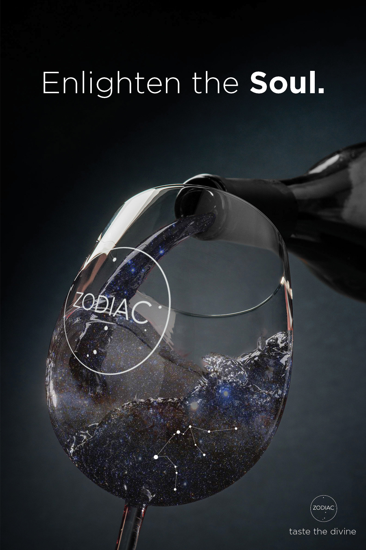
Orbital lines frame celestial photography. Restrained light carries the packaging idea into campaigns, retail, events, and merchandise.
PROPOSED FIRST EDITION
The twelve-sign collection has a full visual identity. I would introduce a small selection at an existing wine bar before building the constellation cellar. The glyph can start a conversation while the label still tells you what is in the bottle.
The full twelve-bottle designs and constellation cellar stay in the case. The larger setting is a later hospitality direction. A first tasting establishes how the identity helps people choose.
THE IDENTITY
A circular mark holds the name inside a small night sky. On the bottle, one large sign glyph leads. Product information stays small but readable beneath it.

Taste the divine.
THE VISUAL LANGUAGE
The identity moves between two scales: a spare circular master mark and a bold sign-led bottle architecture. Constellation imagery adds atmosphere without competing with the clarity of the packaging.
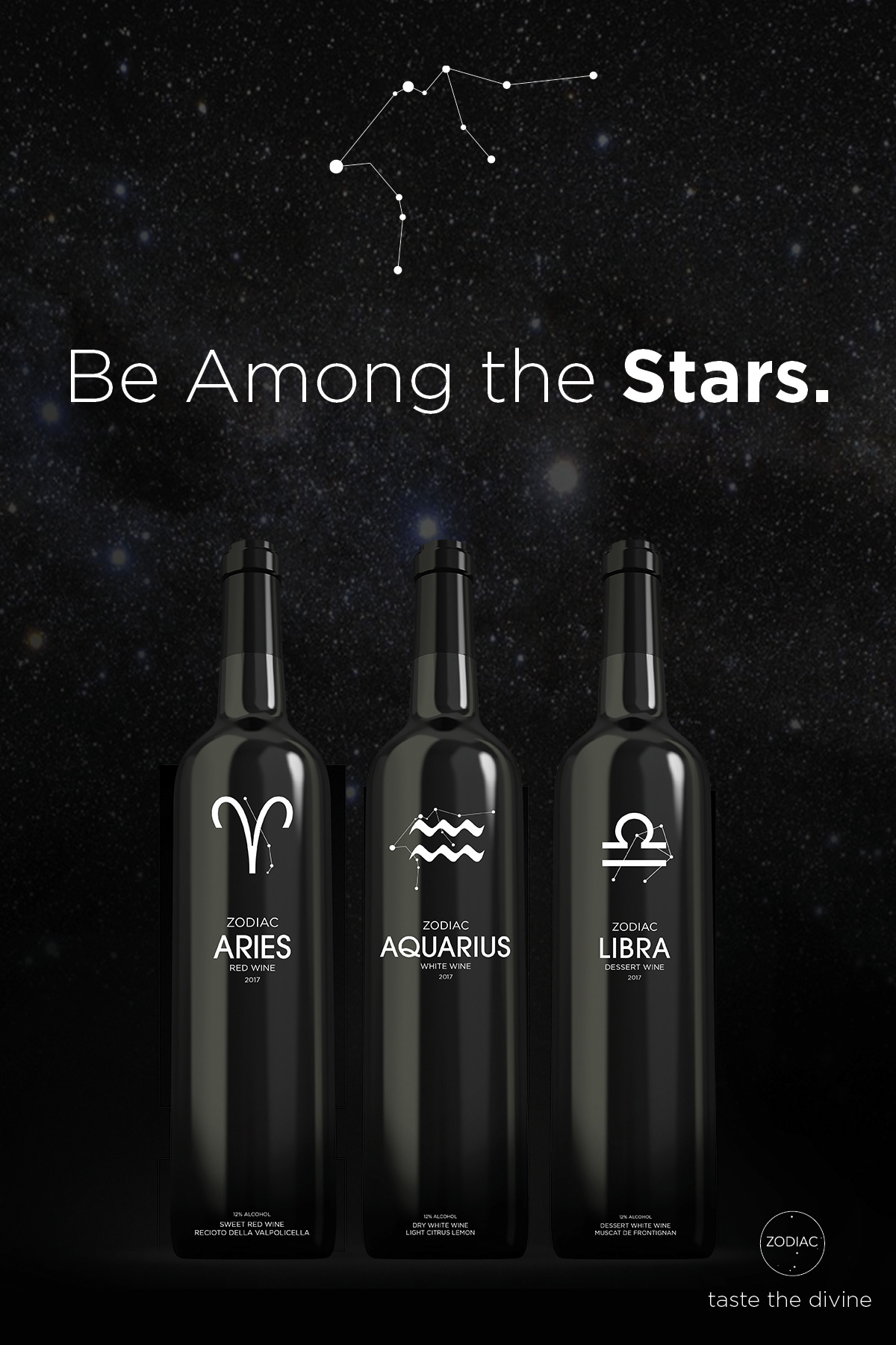

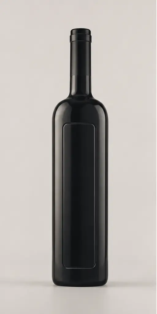
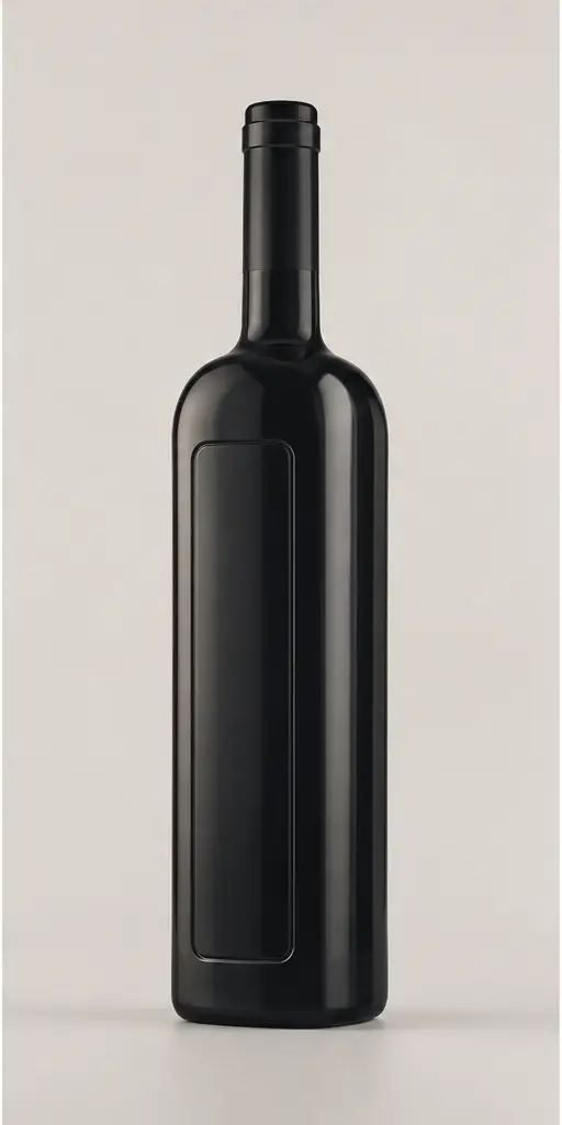
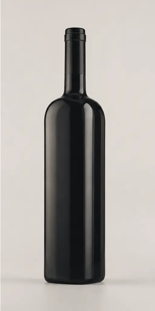
Keep the bottle shape constant and change the glyph for each sign. The family reads together on a shelf. Closer up, the label tells you which edition you have.
APPLICATION
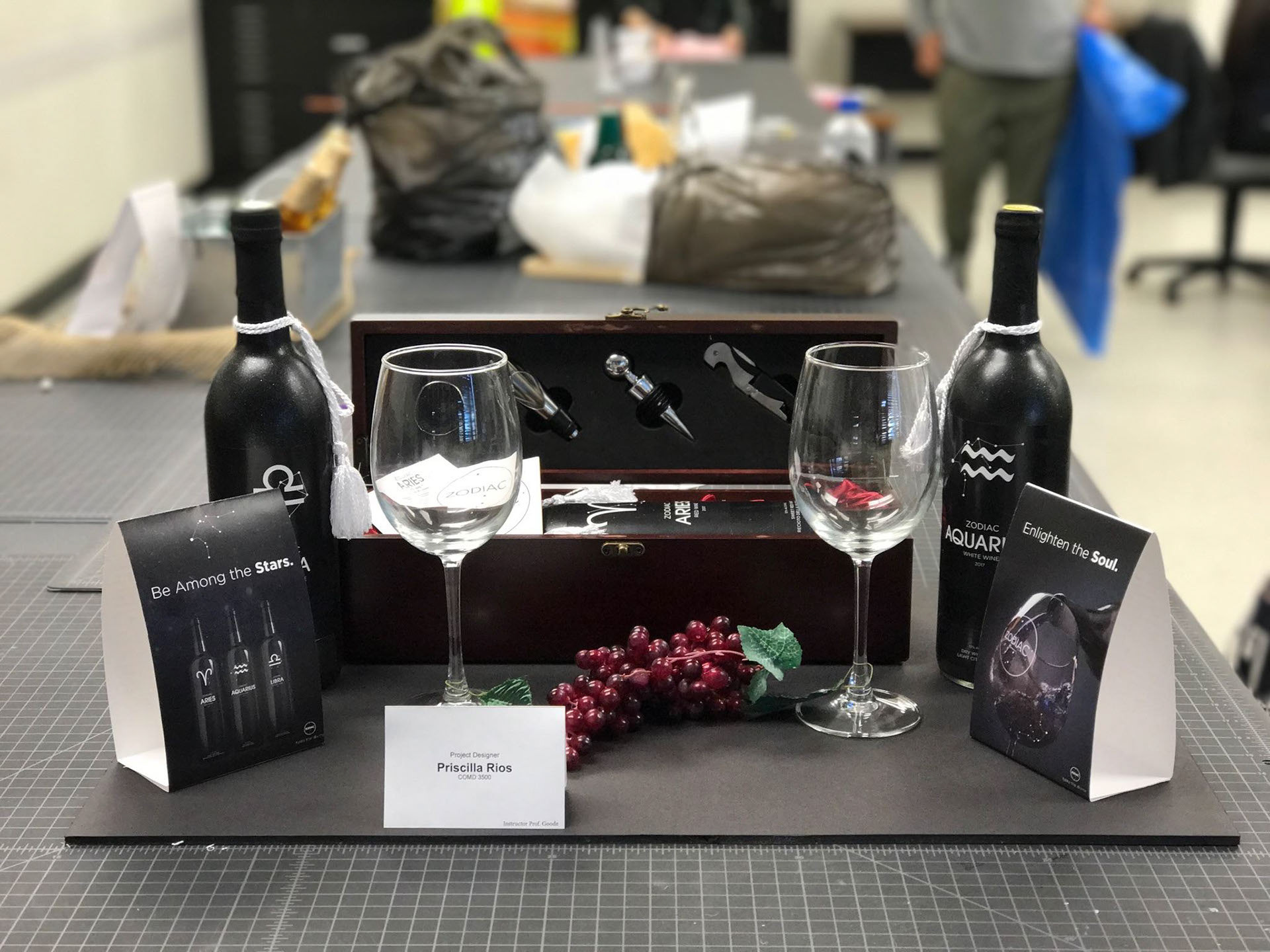
The original display and advertising studies establish how the collection looks on a shelf or at a tasting. Campaign images carry the same atmosphere.
EXPERIENCE
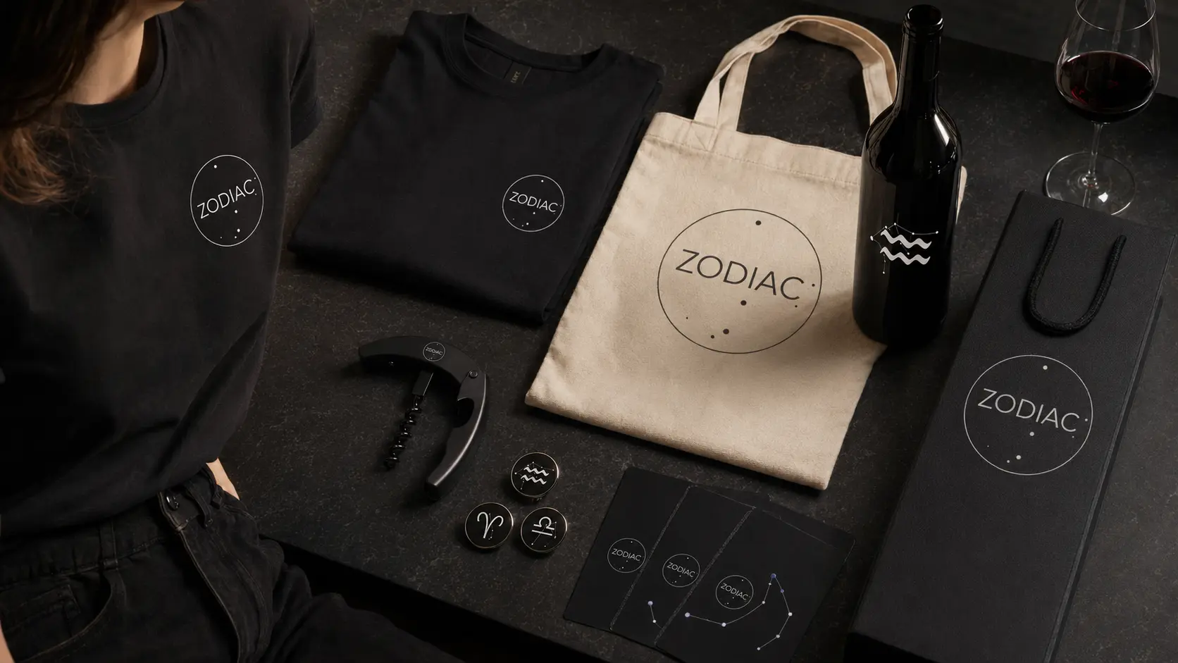
The extensions show a full retail display and an intimate tasting event, with a focused merchandise family. Each uses the original identity.
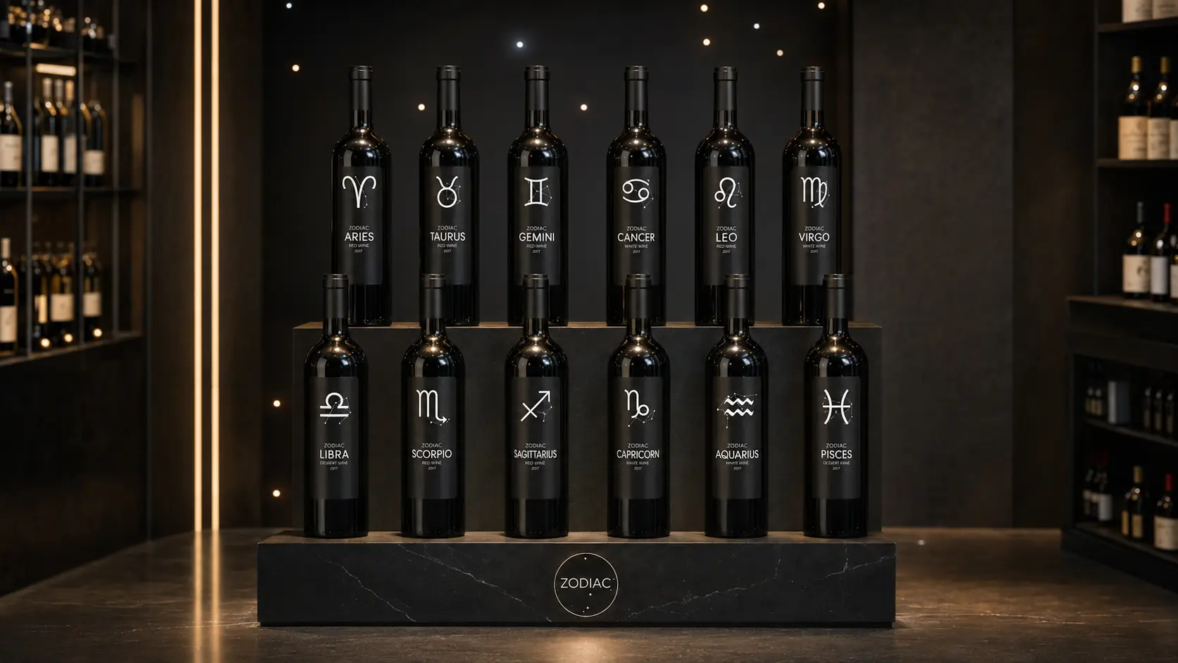

The twelve-bottle presentation makes each sign easy to find and gives the collection a distinct shelf silhouette.
Constellation light and restrained branded touchpoints make the product story spatial and social.
The circular mark identifies shared merchandise. Individual sign glyphs distinguish the tasting cards and bottle editions.
THE WIDER DESIGN STUDY
The following designs explore later editions. Their rollout depends on the first encounter working and each partner agreeing its part.
A sign can prompt the first bottle choice. The cellar proposal gives members time to compare the wine itself, with tasting notes and seasonal pairings. Repeat visits would depend on that experience.
Members receive the bottle for their sign and access to a contrasting seasonal pairing chosen for its flavor.
Each bottle opens tasting notes, provenance, serving rituals, and a growing map of the twelve-sign collection.
Restaurant partners host guided dinners that use the signs as a social invitation, then let the wine lead the actual pairing.
Magnums, stemware, cellar tags, and annual artist editions create a disciplined collector layer around the core bottle family.

Twelve tasting rooms form one orbital route. Guests start with their sign and try an unexpected pairing, then choose a personal three-bottle constellation to take home.
A sign gives someone an easy first choice. The proposed cellar program would need wine quality and provenance to bring them back, with food pairings and annual releases adding reasons to revisit.
WHERE THE CONCEPT STANDS
The twelve-bottle identity stays consistent across the labels and campaign. The cellar and tasting program are proposed extensions. They give the collection a setting, while the sign remains the simplest way to find an individual edition.