CONCRETE VS. GROWTH
Rigid city structure is interrupted by green life pushing through it.
BRAND / ART DIRECTION / ECOMMERCE
THE STRATEGIC HOOK
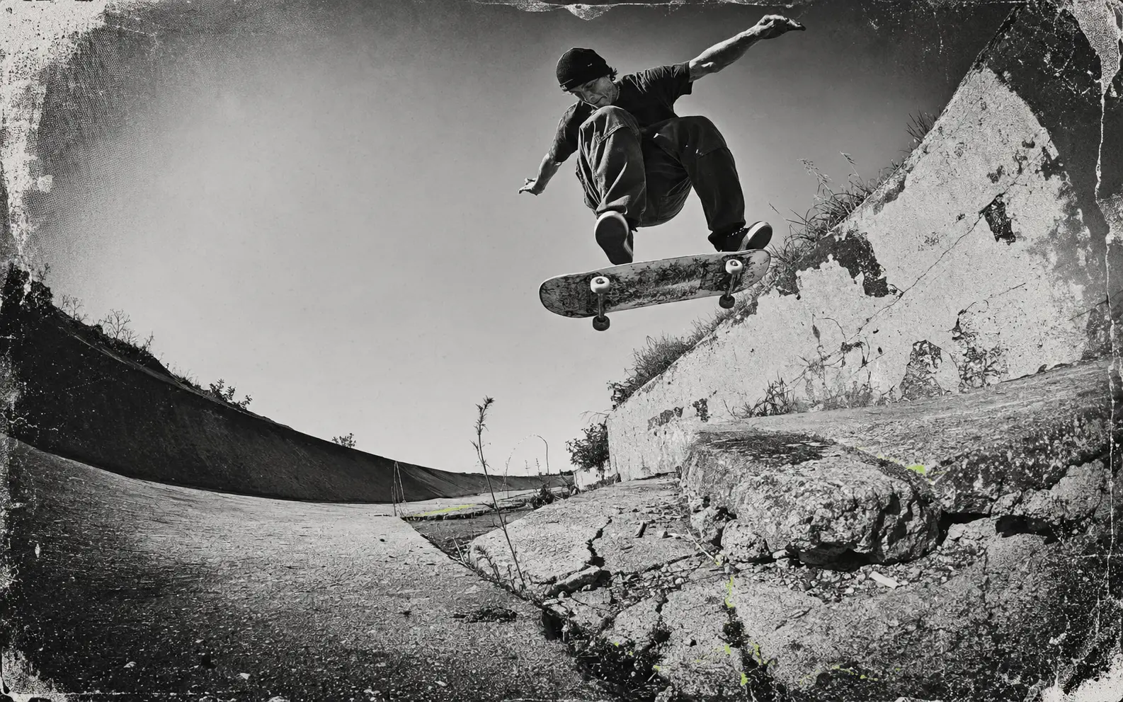
Skaters make use of places a city overlooks. I built Verdant around those worn surfaces and the life that collects there. The identity needed enough structure to work on a product page while leaving room for the cat and rougher marks. The proposed community work had to connect back to actual places.
“Treat every crack in the city as proof of life, and every scrape on the product as evidence that it belongs there.”
WORKING THROUGH IT
Rigid city structure is interrupted by green life pushing through it.
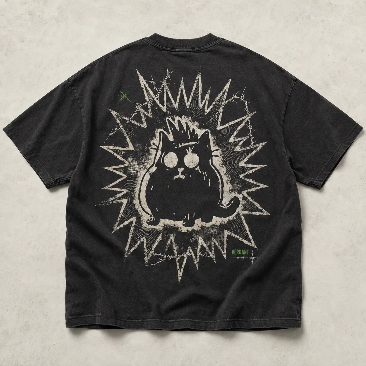
The cat turns up across the work as an alley observer. It can interrupt a serious product image without becoming a polished mascot.
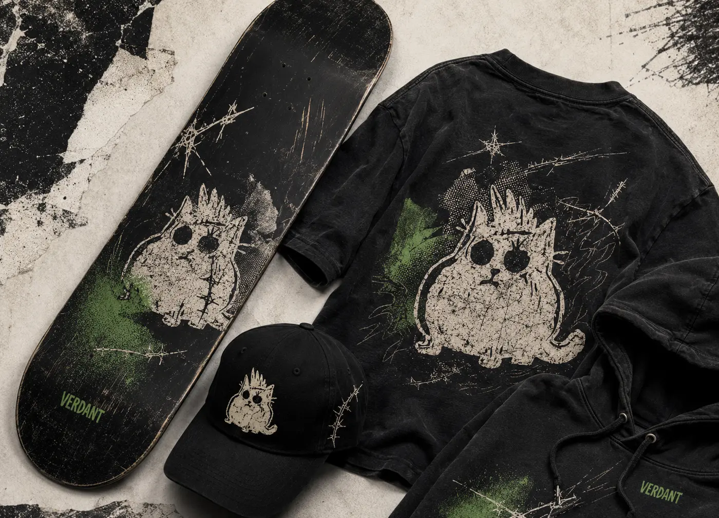
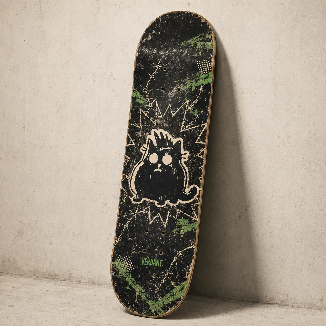
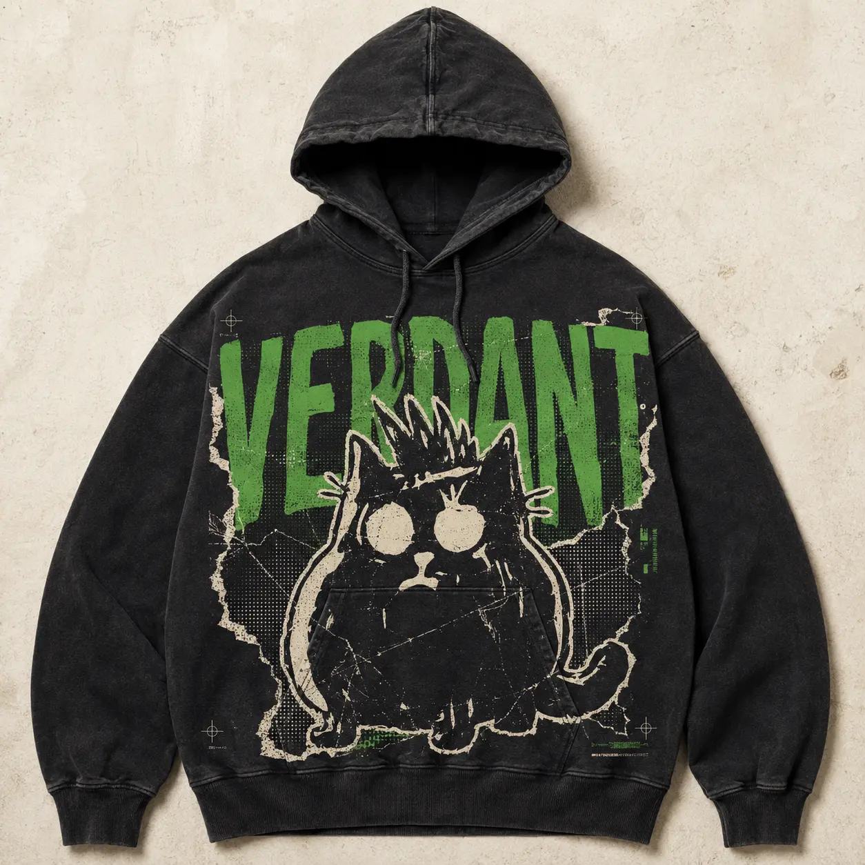
Distressed type, torn edges, scuffs, and imperfect crops make use and abrasion visible.
Keep the shop and the street photographs close. Someone should be able to read a field story and still find the deck in it.
PROPOSED FIRST EDITION
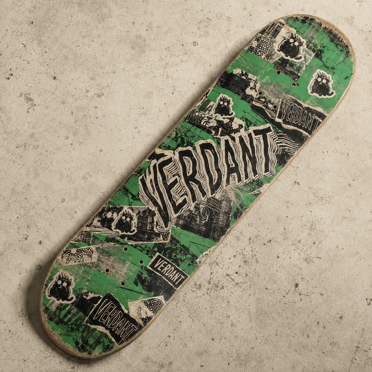
The street-store concept would begin through one independent skate shop. One deck graphic and a short local film give Verdant a first offer. The worn-surface idea has to hold up on the board itself.
The garment capsules and temporary spaces remain design directions. They follow demand for the first deck. Community-funded work needs a named recipient and its own public record.
THE IDENTITY
Asphalt black and invasive green frame distressed type. The mark looks stamped and dragged across the surfaces skaters use.
Growth through the cracks.
THE VISUAL LANGUAGE
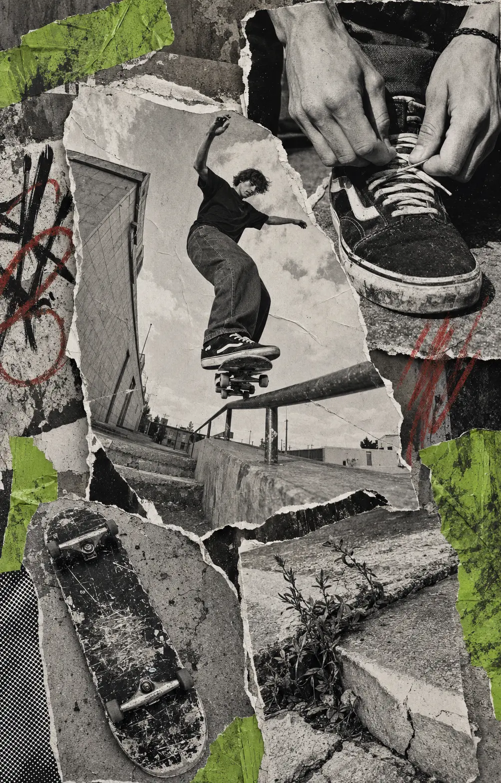
Hard flash catches scraped surfaces and ripped paper against concrete. An illustrated cat acts as both witness and provocateur. The images feel collected from the street.


APPLICATION
Deck graphics share the identity with apparel and utility goods. Each useful, collectible object is meant to show its age in public.
EXPERIENCE
The shop moves at the pace of a zine. Layered stickers and rough image crops give it character, with quick-add buttons kept close to the products. The collage should leave the buying path readable.
The manifesto leads into product and then community, keeping one story across the site.
Quick-add buttons and short product pages help someone buy during a limited drop.
Animated stickers sit over rough crops and layered surfaces, giving the interface an assembled feel.
THE WIDER DESIGN STUDY
The following designs explore later editions. Their rollout depends on the first encounter working and each partner agreeing its part.
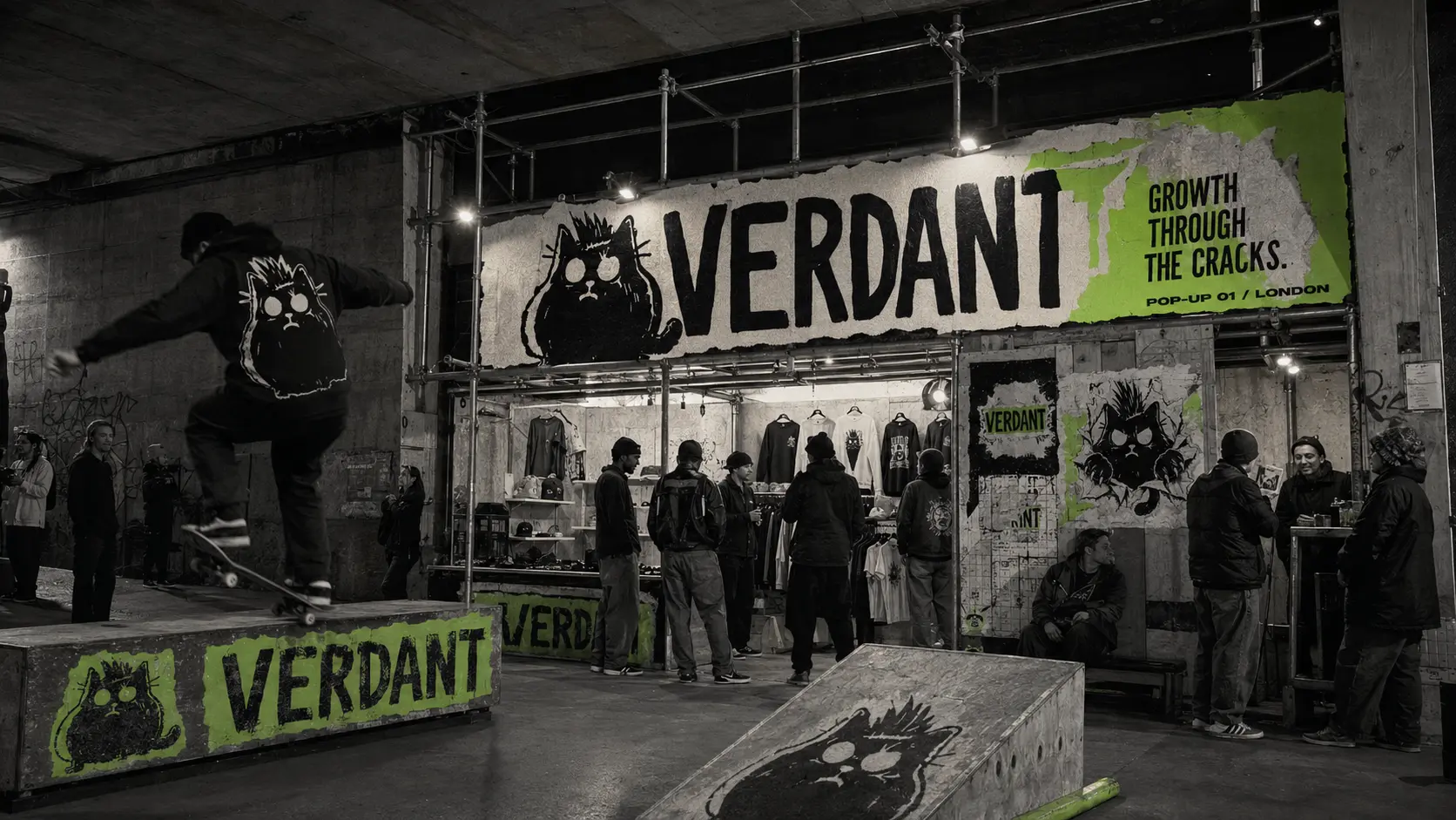
I kept the cat and torn edges in the later campaign ideas. Creator films show the riding and failed attempts. Temporary spaces give people somewhere to meet, with collectible print and speculative capsules available alongside the drop.
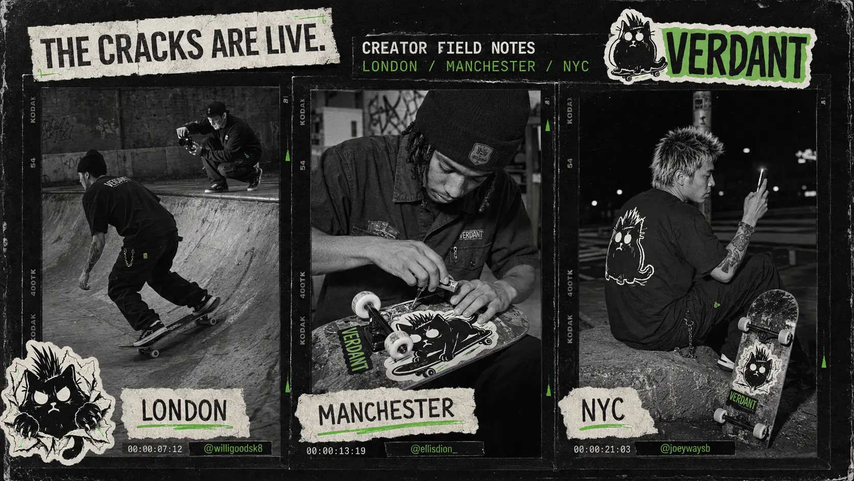
Three cities. Local voices. Process over polish.
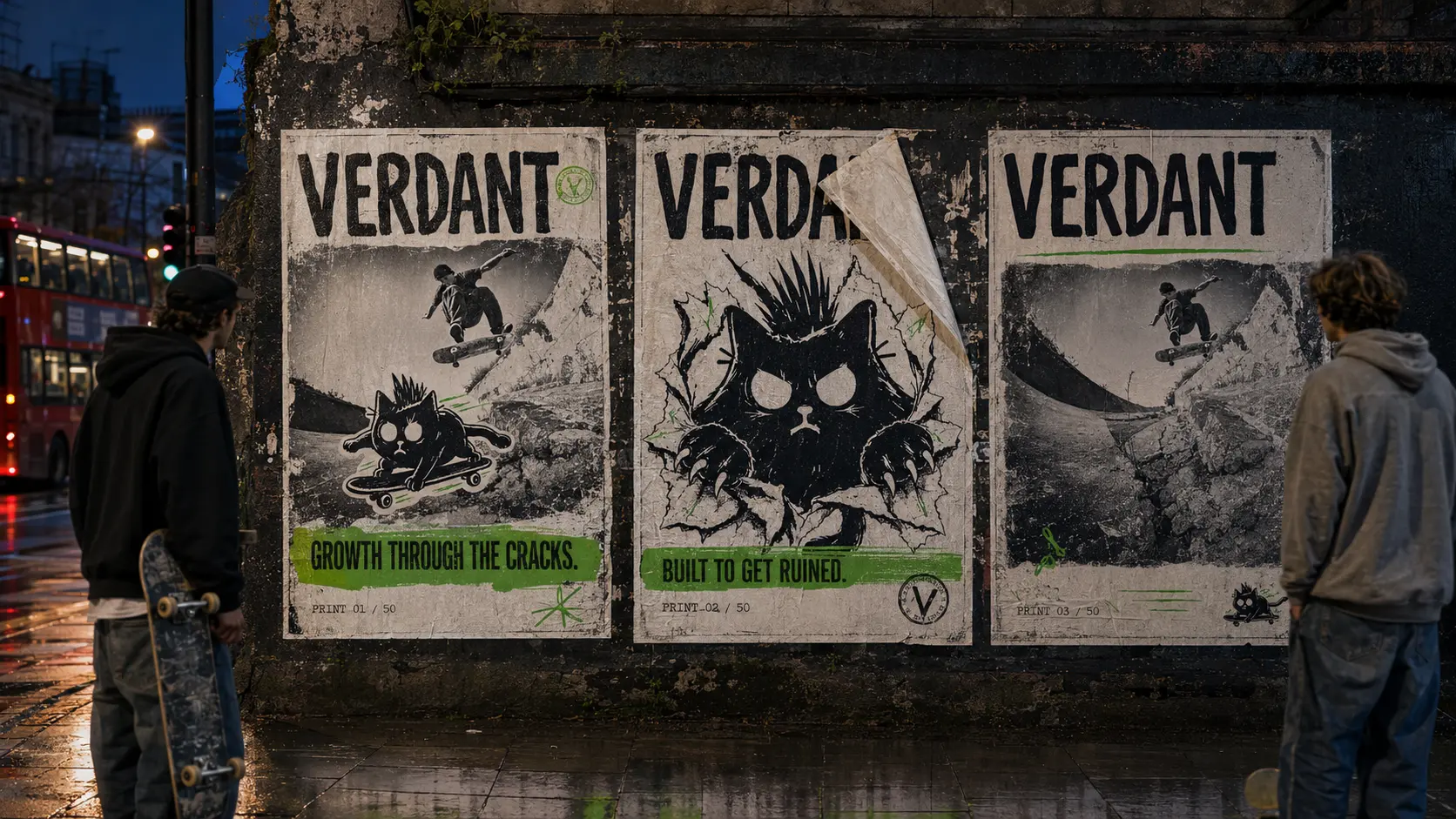
Pasted in public, then signed and numbered after the run.
Borrow a partner’s material or color where it suits the object. The cat and cracks still need to be recognizable.
Someone might find Verdant through a creator film or a pasted poster. The next step could be a session at the temporary space. The funding proposal needs to show which local spot benefits from the drop.
Seed product with skate photographers, filmers, builders, and riders. Publish the process and failed attempts, including the spots they find.
↗Temporary pop-ups turn overlooked underpasses and empty shopfronts into a deck wall, repair bench, print room, night session, and drop point.
↗Three screen-printed poster editions are wheat-pasted in public and sold as signed, numbered artifacts after the campaign run.
↗Let repairs and abrasion remain visible on the limited pieces. Edition marks identify the release, while wear changes the individual object.
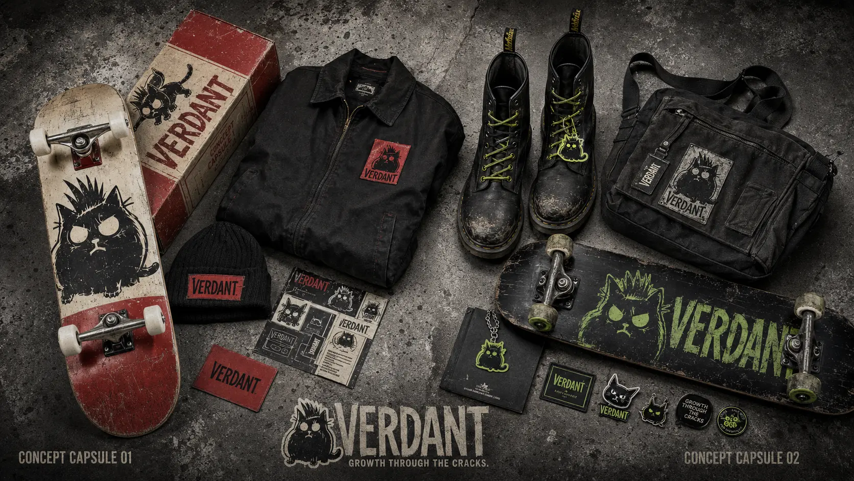
↗A speculative red-signal capsule carries the cat and damaged type across a deck, work jacket, beanie, and stickers. Cracks connect the graphics.
↗A speculative UK punk capsule moves the system into worn leather, acid-green laces, stitched patches, utility bags, and skate-ready field gear.
↗Responsive banners split open on hover. Creator edits appear beside drop coordinates, with a live countdown beneath the concrete surface.
↗The proposed drop contribution pays for a named skate-spot repair. Show what changed at the spot and how much the work cost.
↗Limited drops could contribute to repairs at local skate spots. The proposed campaign would show the work and name where the money went. Publish that record alongside the drop.
WHERE THE CONCEPT STANDS
The concept carries one graphic language through product and film, with temporary spaces extending the campaign. The proposed funding model returns part of that activity to local skate spots. Those improvements are an ambition of the concept, not a reported outcome.