CONNECTION IN MOTION
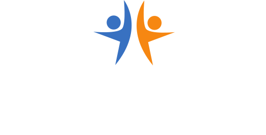
Two abstract figures meet at the center. The gesture can read as a high-five or embrace, with the energy of siblings running toward each other.
PRO BONO NONPROFIT / BRAND IDENTITY / COMMUNICATION DESIGN
WHERE I STARTED
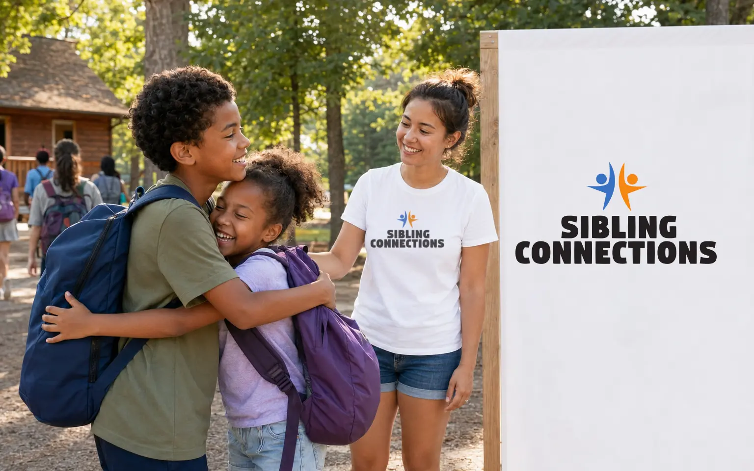
Sibling Connections brings together siblings separated by foster care. For this pro bono identity, I wanted to show the energy of seeing each other again. The mark had to carry that feeling and still reproduce clearly on the everyday materials a nonprofit needs. I kept the gesture simple: two people meeting at a shared center.
“The instant connection becomes the mark.”
WORKING THROUGH IT
Two abstract figures meet at the center. The gesture can read as a high-five or embrace, with the energy of siblings running toward each other.
The two figures remain distinct inside a shared silhouette. Their meeting point makes the connection visible.
Orange brings energy to the reunion gesture. Blue gives the everyday communications a steadier base.
Program names can sit beneath the main lockup. A standalone symbol and knockout version cover smaller or darker surfaces.
THE IDENTITY
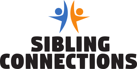
Two figures lean toward a shared center above a bold, compact wordmark. Their gesture shows reunion. Blue and orange can trade roles without losing recognition.
Connection is the reason.
THE VISUAL LANGUAGE
The approved mark shows two people meeting at the center. Orange and blue can reverse roles, while the stacked name keeps the organization readable.
APPLICATION
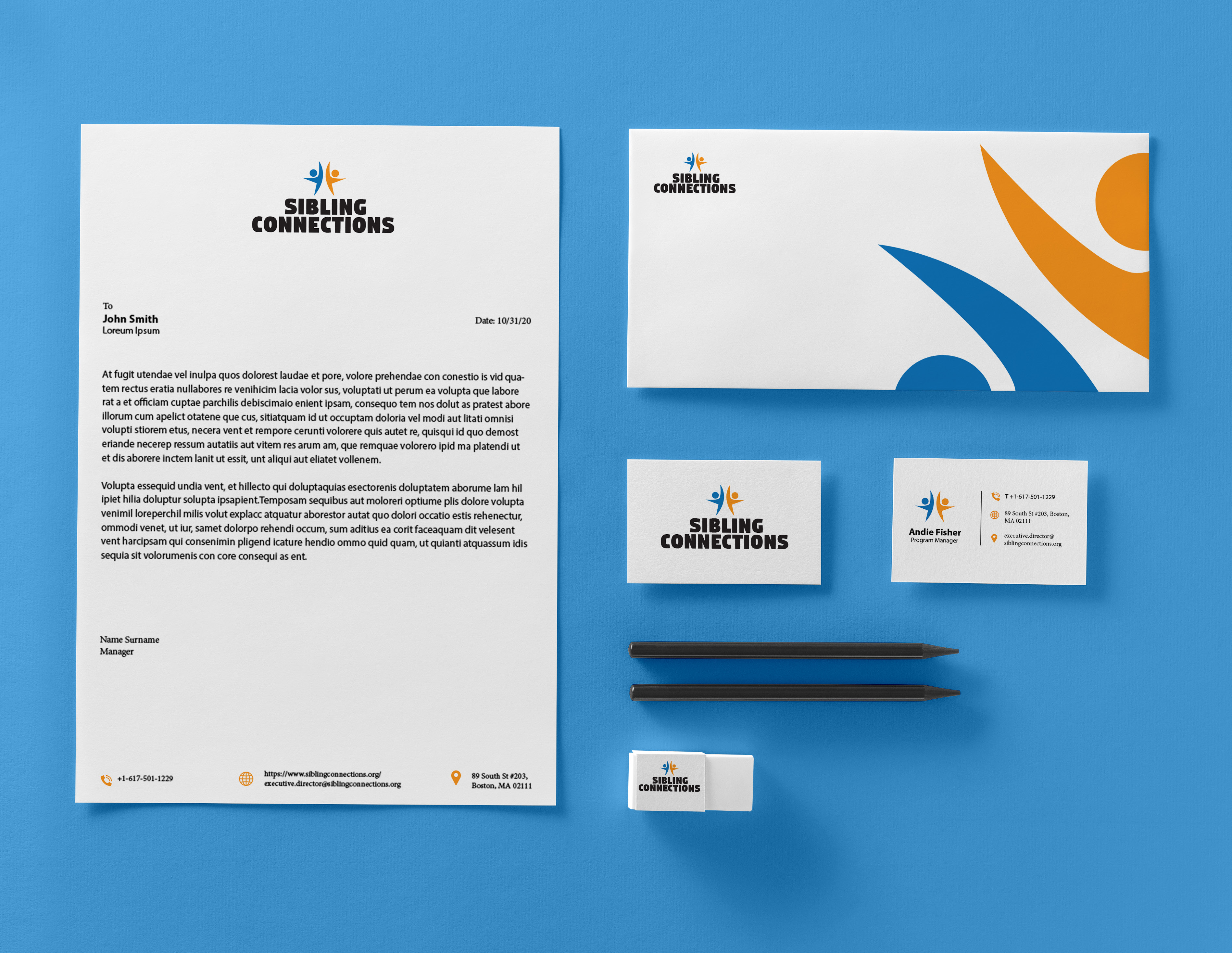
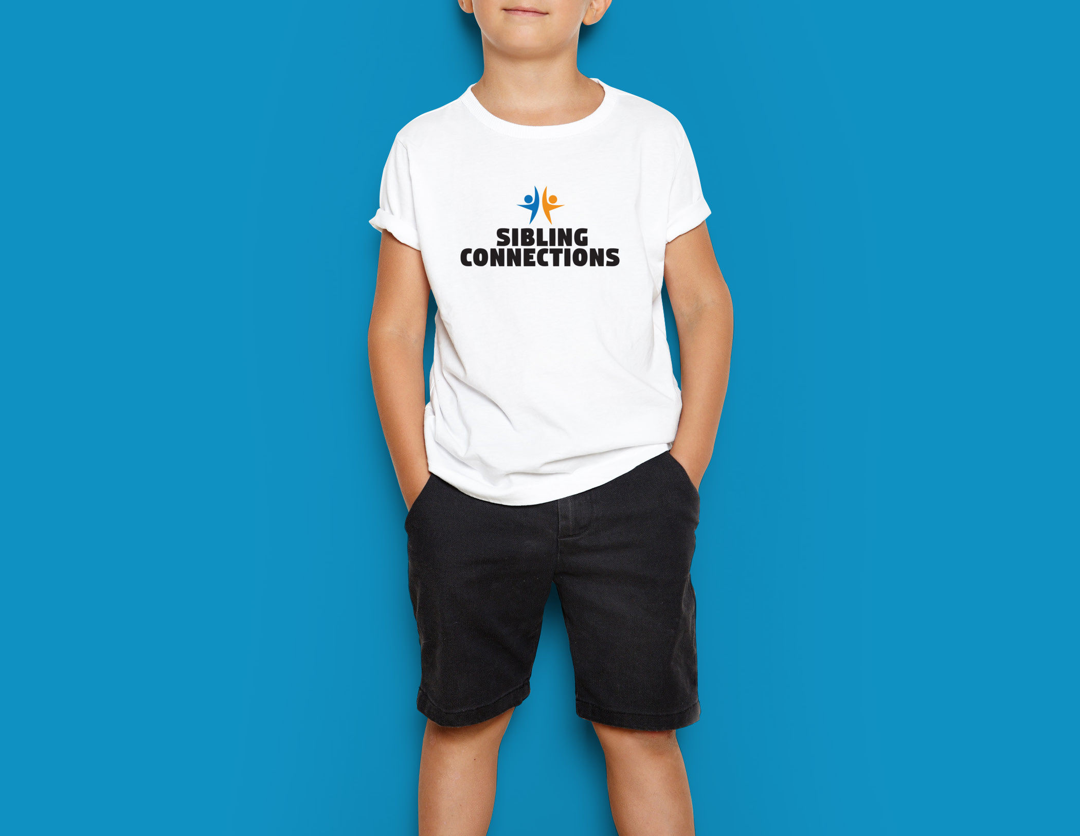
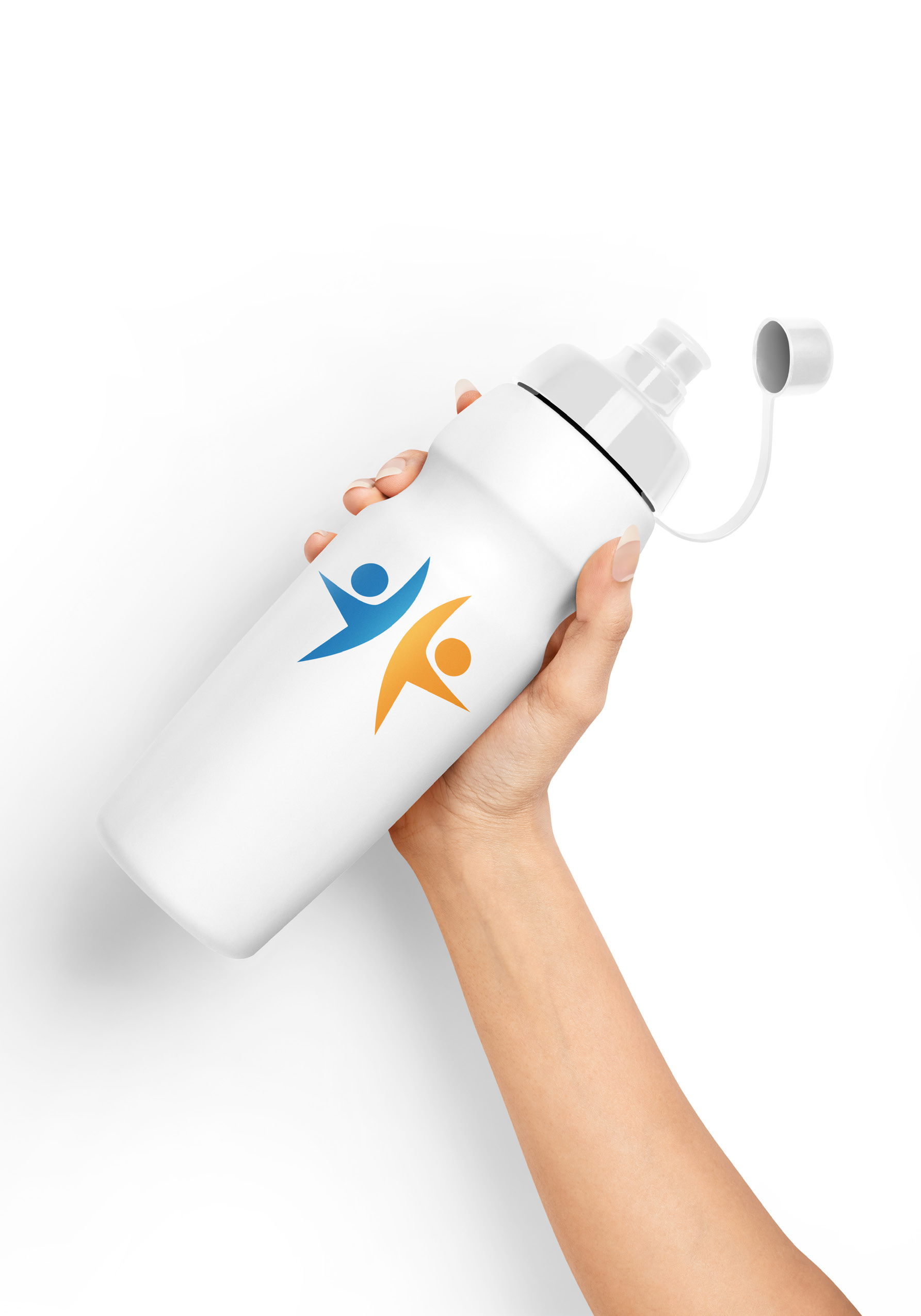
These applications come from the approved identity presentation. The mark stays consistent from correspondence to fundraising merchandise. The declined YLP exploration is shown separately.

THE IDENTITY IN USE
The identity has to work on ordinary nonprofit materials. The paired figures give those pieces some energy without making the organization’s name harder to read.
The paired figures make the central idea of connection legible before the organization’s name is even read.
Program names can attach to the core lockup without fragmenting the parent brand.
Orange and blue can trade emphasis to suit different audiences and backgrounds, including production constraints.
The bold silhouette and compact typography reproduce across print, apparel, totes, objects, and digital use.
The active gesture suits the participants. The compact name keeps donor and service communications easy to identify.
Every application returns to the same idea: separated siblings remain connected.
WHAT I DELIVERED
The approved identity uses the same paired figures across program communication and fundraising pieces. The color can change emphasis while the gesture stays clear. That gives the organization a consistent starting point for its daily design work.
VISIT SIBLING CONNECTIONS ↗