THE THREAT IS THE PROOF
The gull wants your fries. That familiar beach encounter gives the restaurant its character.

BRAND STRATEGY · IDENTITY · HOSPITALITY EXPERIENCE
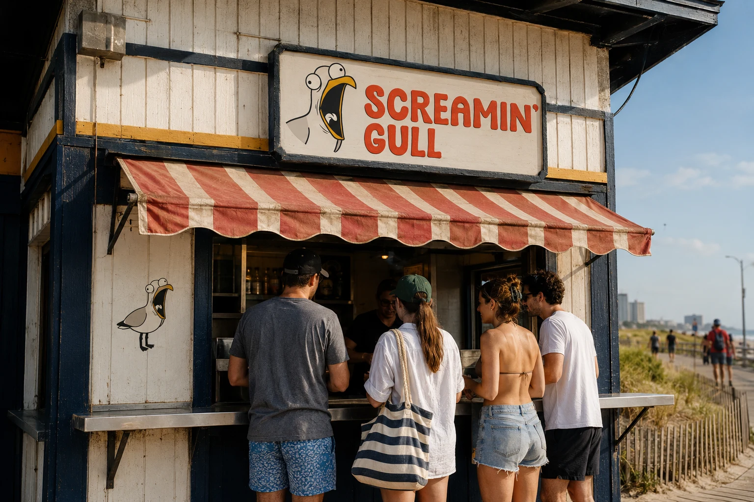
You’re at the beach with your fries. A gull steals one. I wanted someone to see Screamin’ Gull and recognize that feeling, then laugh and want to eat there.
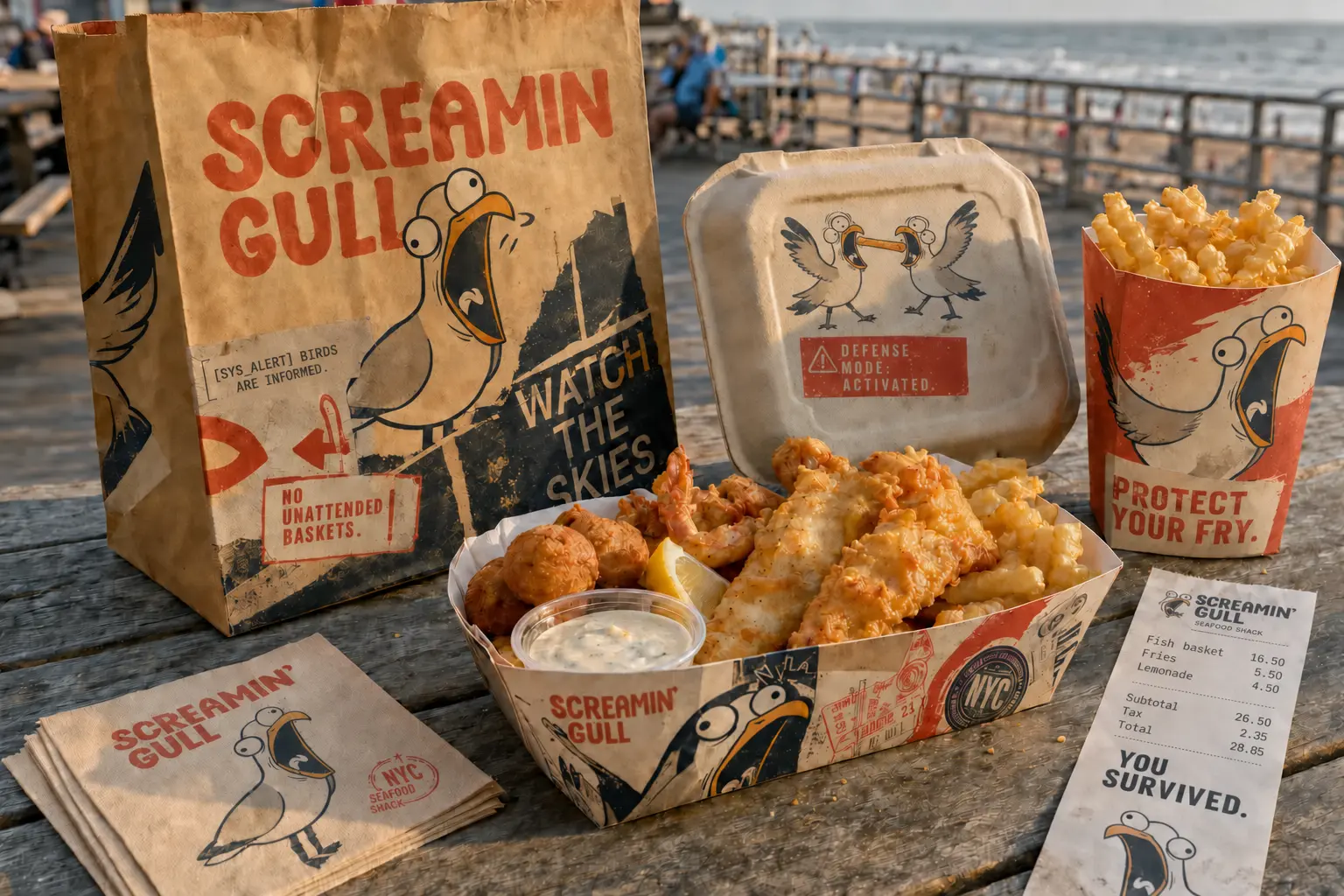
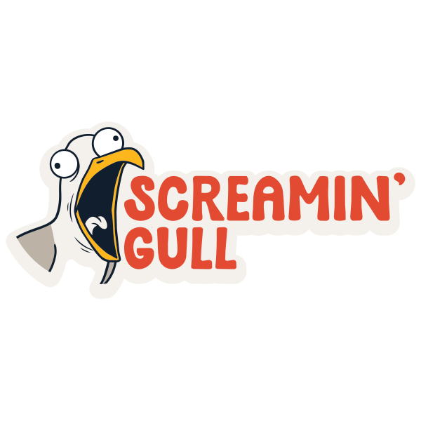
On a noisy boardwalk, that character needs to be recognizable before someone stops to read a menu. I carried the joke from the storefront warning through to the receipt, keeping the mark clear enough to work at both sizes.
THE MENACE BECAME
THE MASCOT.
PROPOSED FIRST EDITION
The nine venue studies show how the brand could travel. I would begin with one seasonal Coney Island counter. That puts the gull where the joke already happens, with a real queue and a short walk back to the sand.
All nine storefront designs remain in the location studies. Rockaway and Riis Park are possible next stops. The other beaches show adaptations for later operators, with local menus and service formats developed separately.
The gull makes a simple claim: this food is worth fighting for. That idea shapes the service language and the rest of the brand.
The gull wants your fries. That familiar beach encounter gives the restaurant its character.
The mascot can be frantic because the typography, spacing, pricing, and information hierarchy stay disciplined.
The experience builds from storefront warning to packaging reveal, receipt footer, uniform, and final fry.
FRESH CATCH.
HOT FRIES.
ZERO PRETENSE.

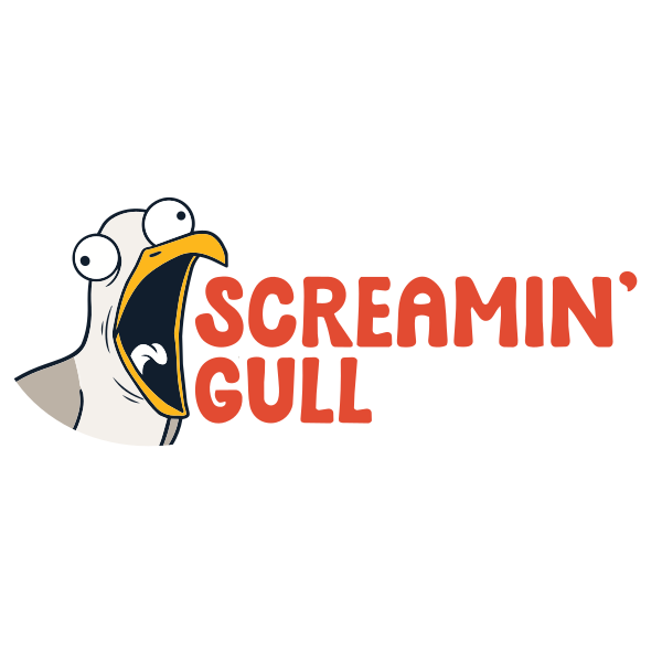
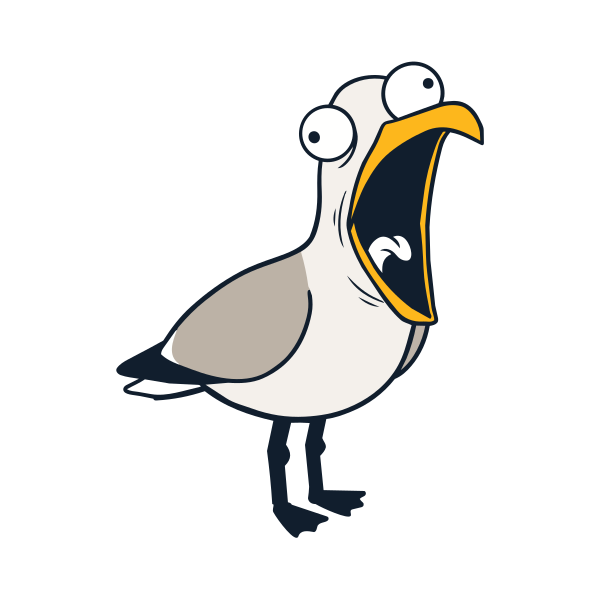
Keep the open beak readable on the building sign. On a receipt or embroidered uniform, simplify around that same silhouette.
SQUAWK LOUD. EAT FAST.
Fredoka gives the large headlines their rounded shape. Instrument Sans handles the menu descriptions, with Martian Mono for prices and order numbers. The warning copy fits into those smaller fields.
HEADLINES / LOGO / SIGNAGE
MENUS / STORY / SERVICE COPY
PRICES / RECEIPTS / WARNINGS
The open beak sets the motion. Headlines burst outward in waves, with utility copy trailing like an echo. The pictorial mark connects those movements as a repeatable transition.
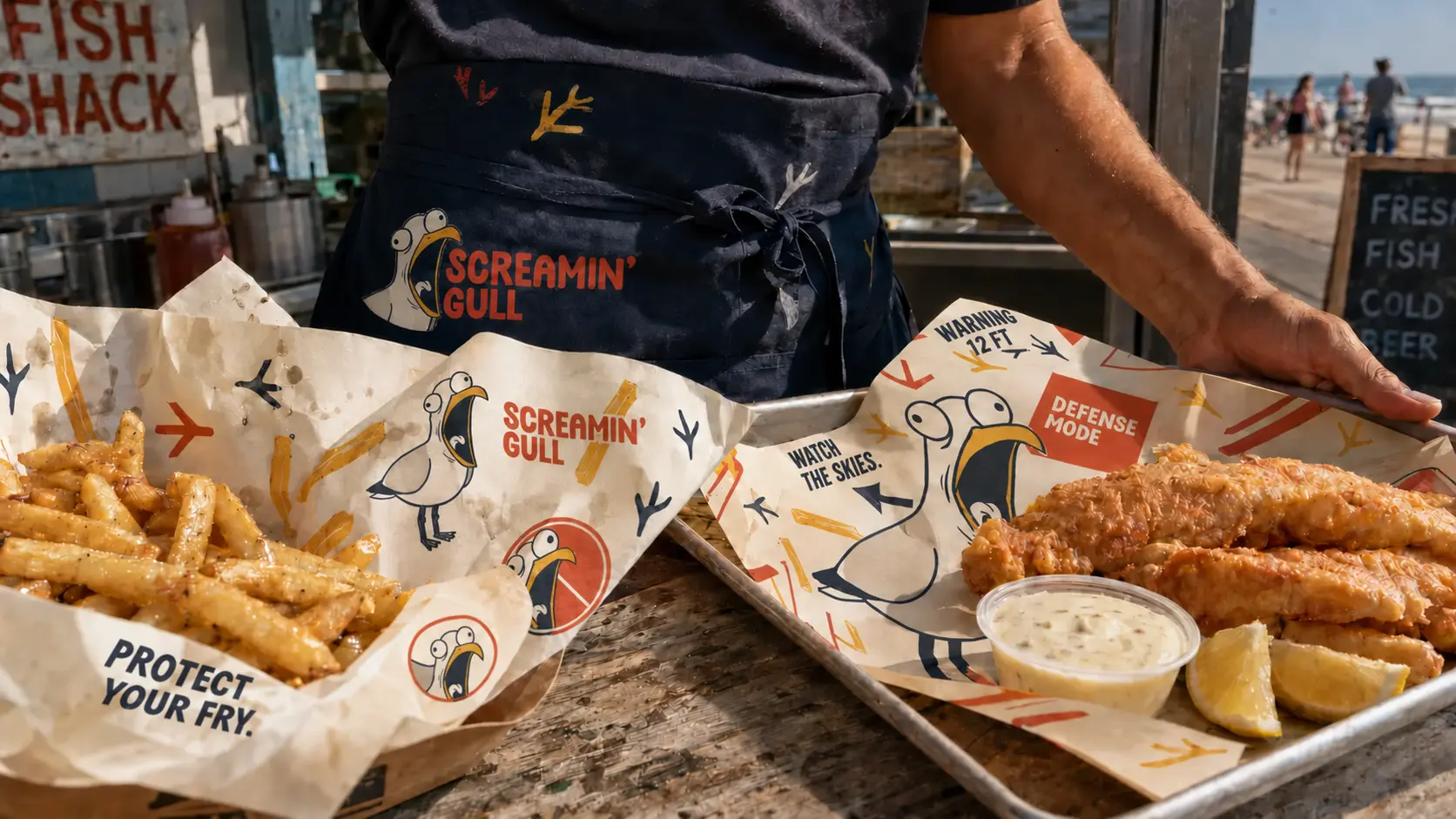
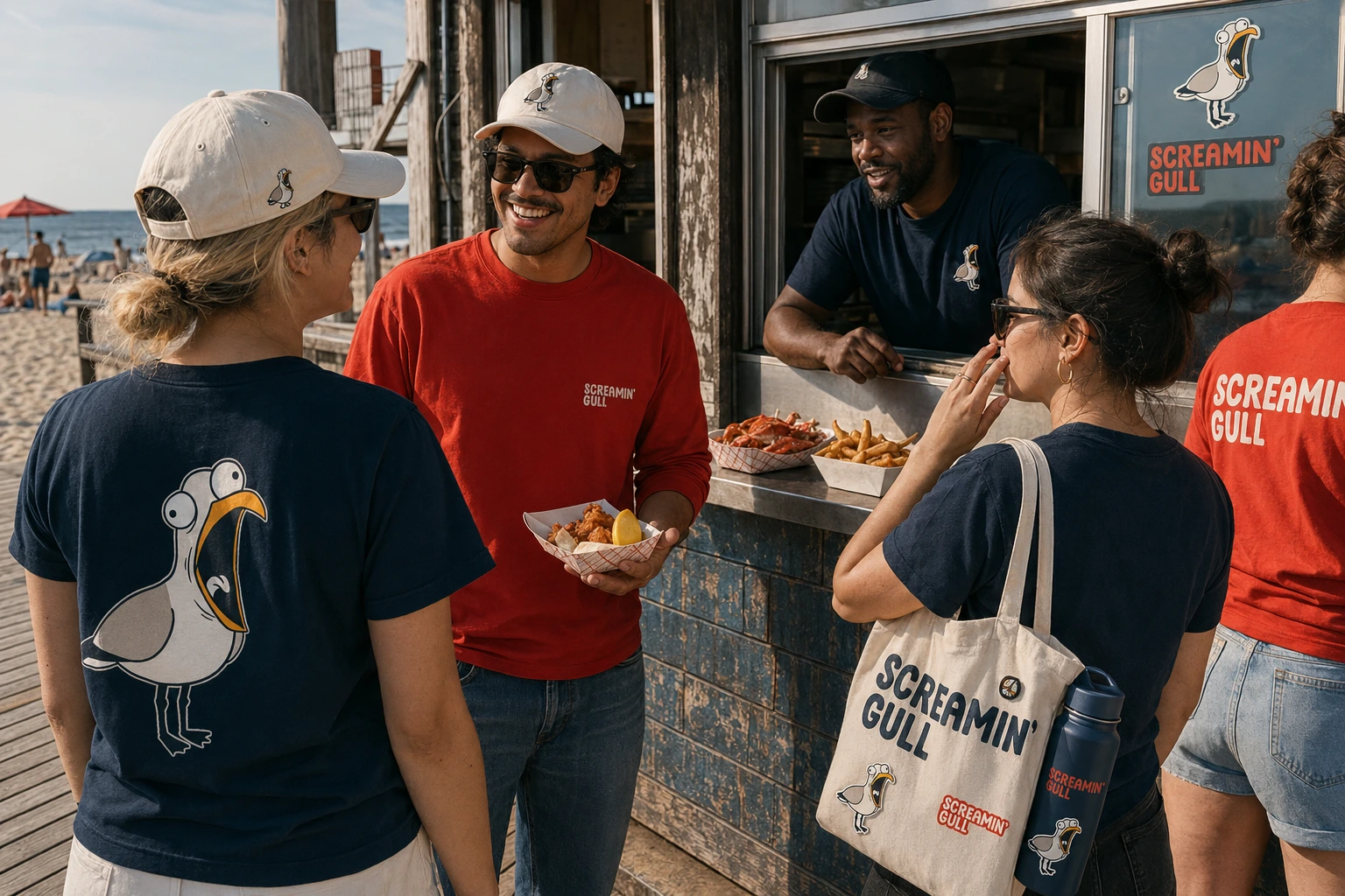
The pattern can take over the basket liner where a full logo would repeat too often. Smaller crops work on a bandana or social post, with the same beak forms visible.
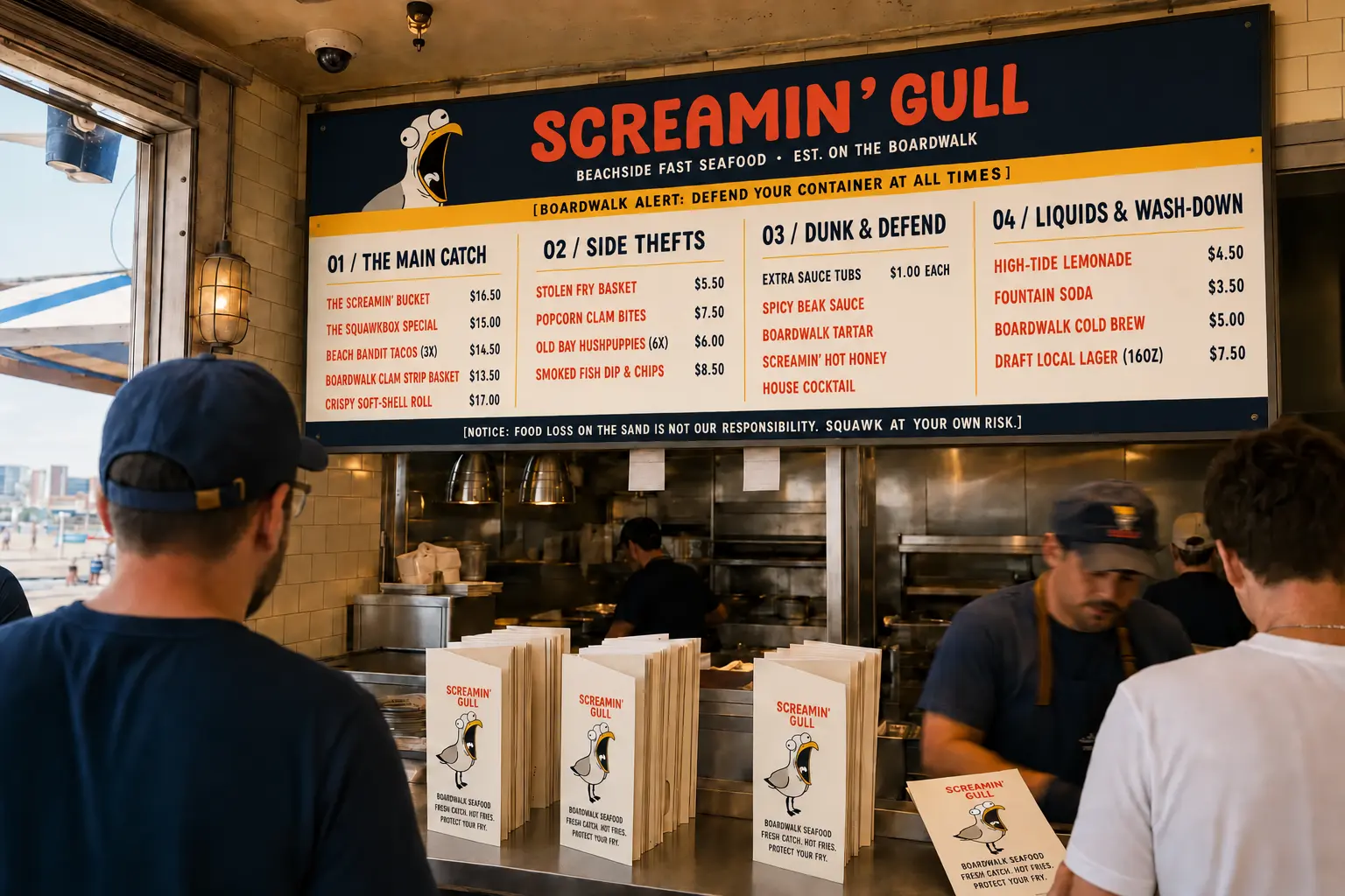
Short names, disciplined descriptions, hard-working price alignment, and clear groups make the menu readable from the queue. The voice stays present, but never gets between a hungry customer and an order.
 COMBO 01 / $22THE
COD BASKET + BOARDWALK FRIES
FOUNTAIN DRINK + GULL SAUCE
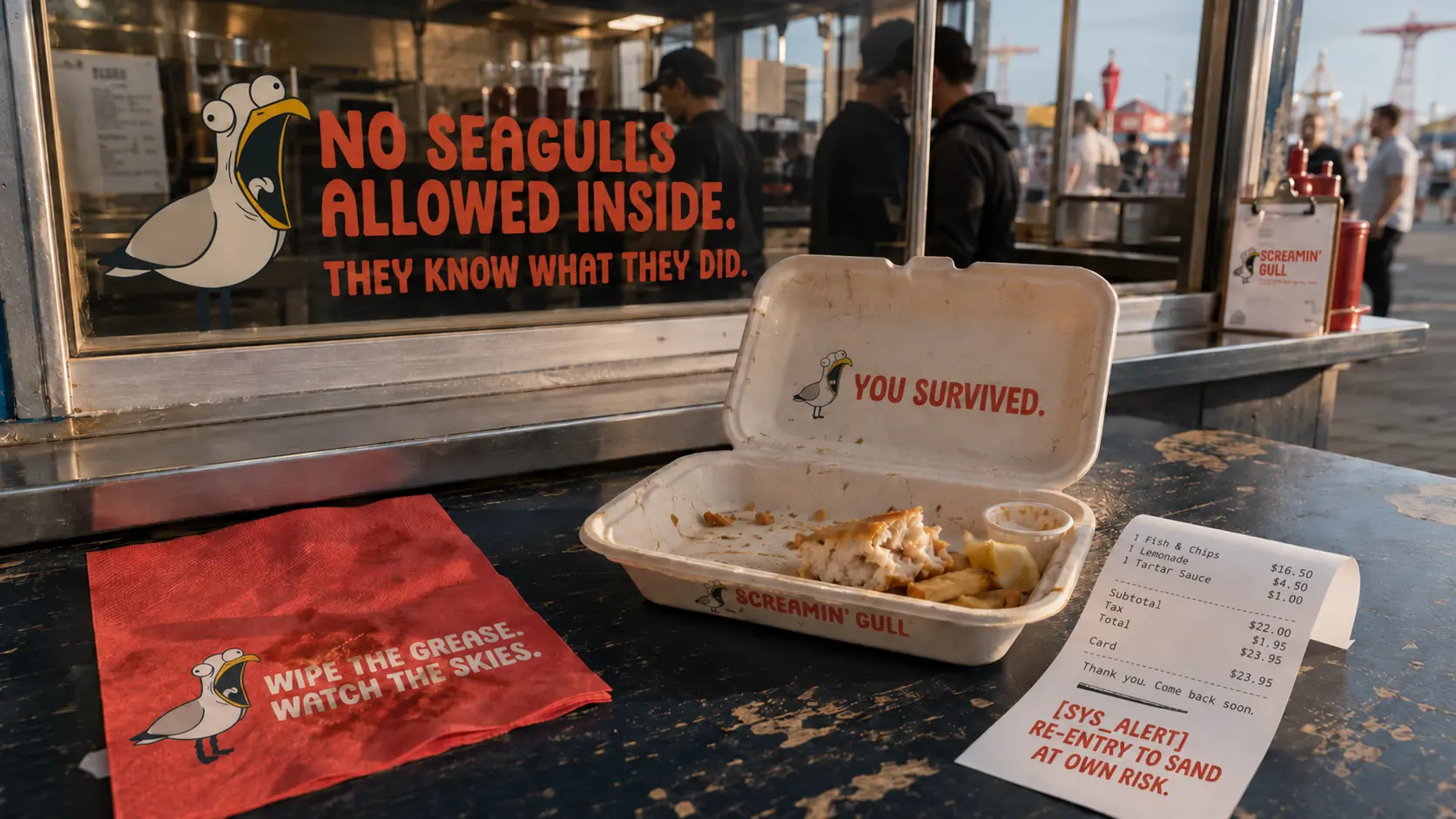
Let the material show. Kraft and greaseproof paper belong around the food. Screen print suits the apparel, while enamel and metal carry the mark onto longer-lasting objects.
These are future location studies, following the first Coney Island counter. Architecture and service format respond to each boardwalk. Local wording can change the practical signs while the core identity stays fixed.
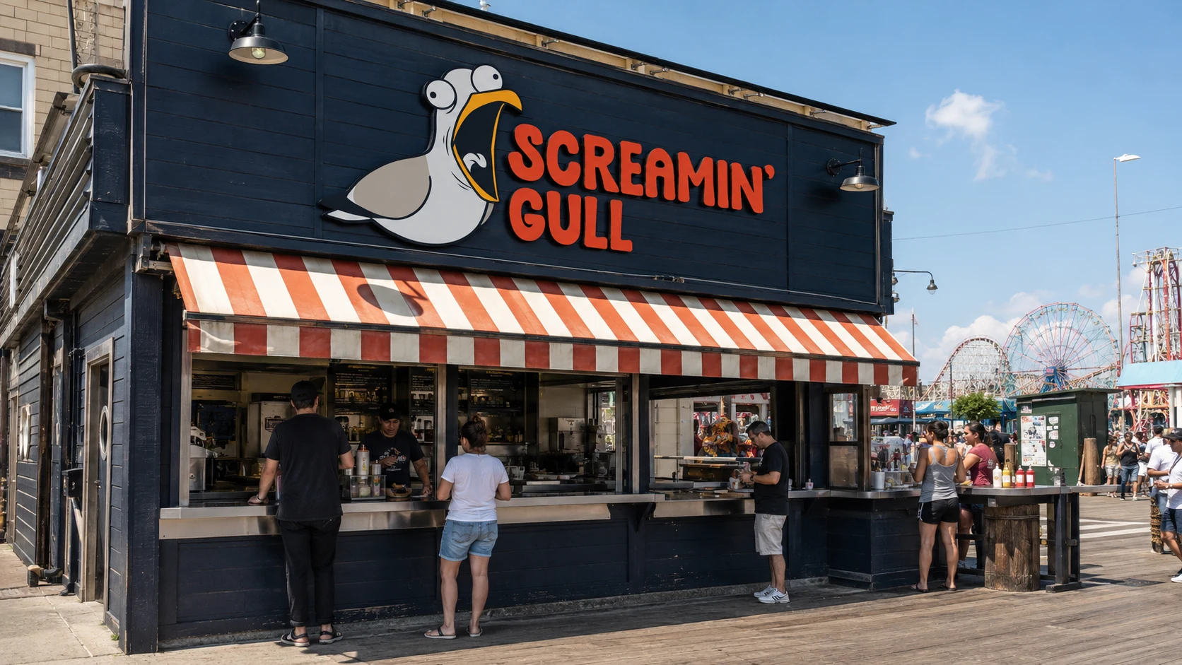
SURF AVE / BOARDWALK
FULL MENU + MERCH WINDOW
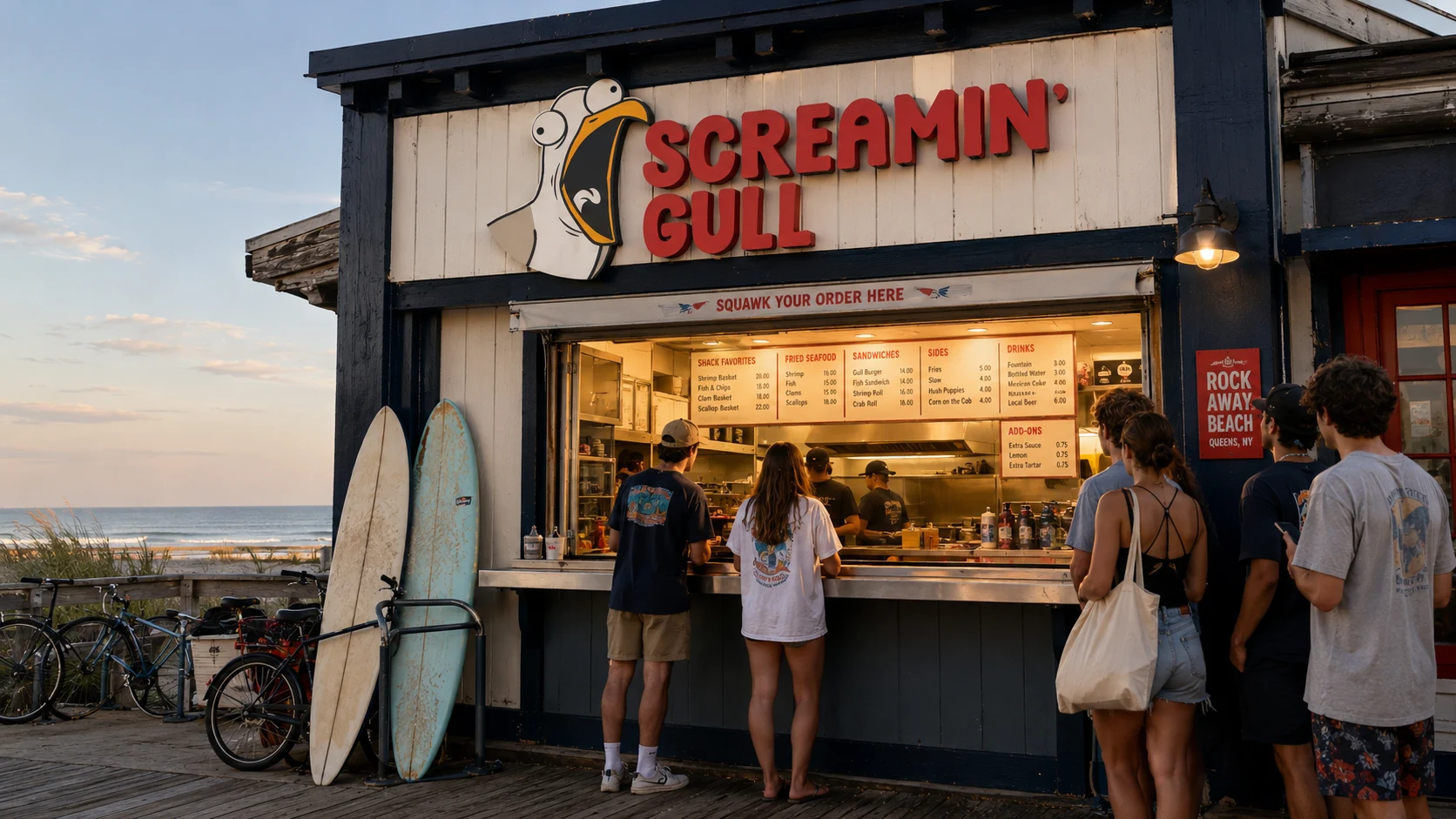
BEACH 97TH STREET
COUNTER + EVENING WINDOW
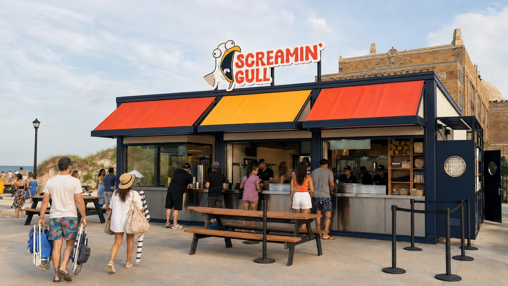
THE PEOPLE’S BEACH
WEEKEND MENU + BEACH KIT
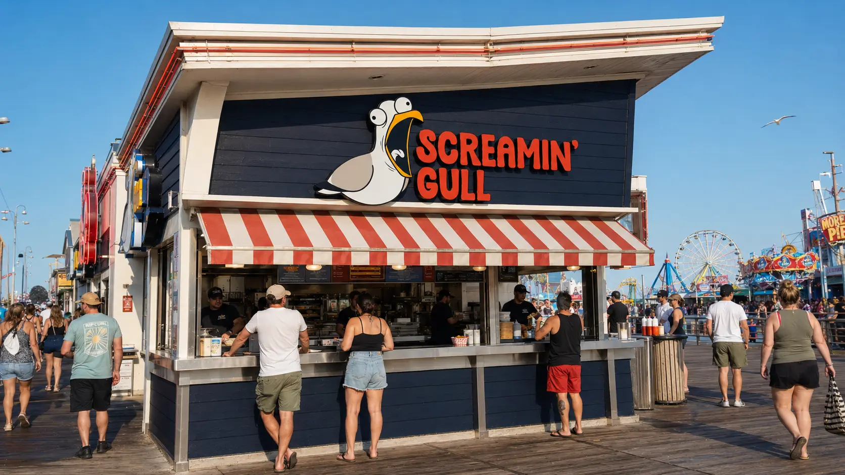
WILDWOOD BOARDWALK
HIGH-VOLUME WALK-UP
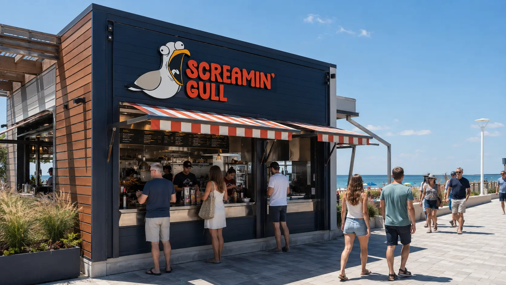
PIER VILLAGE / OCEAN AVE
YEAR-ROUND COUNTER
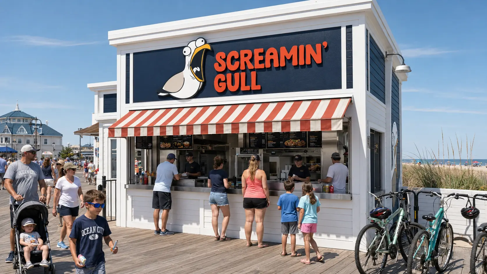
OCEAN CITY BOARDWALK
FAMILY MENU + BIKE WINDOW
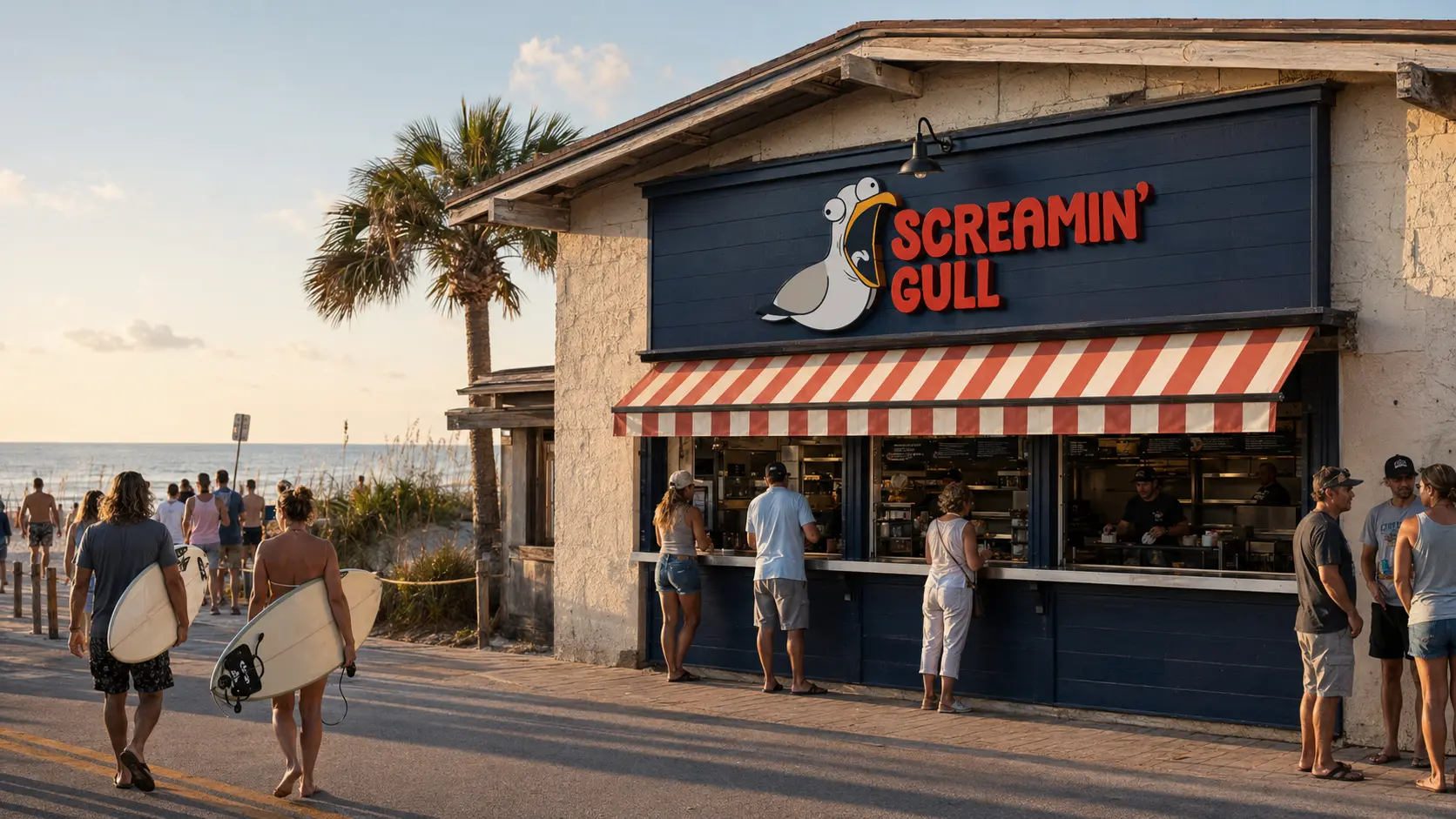
BEACH A1A / ATLANTIC
SUNSET SERVICE + BEACH KIT
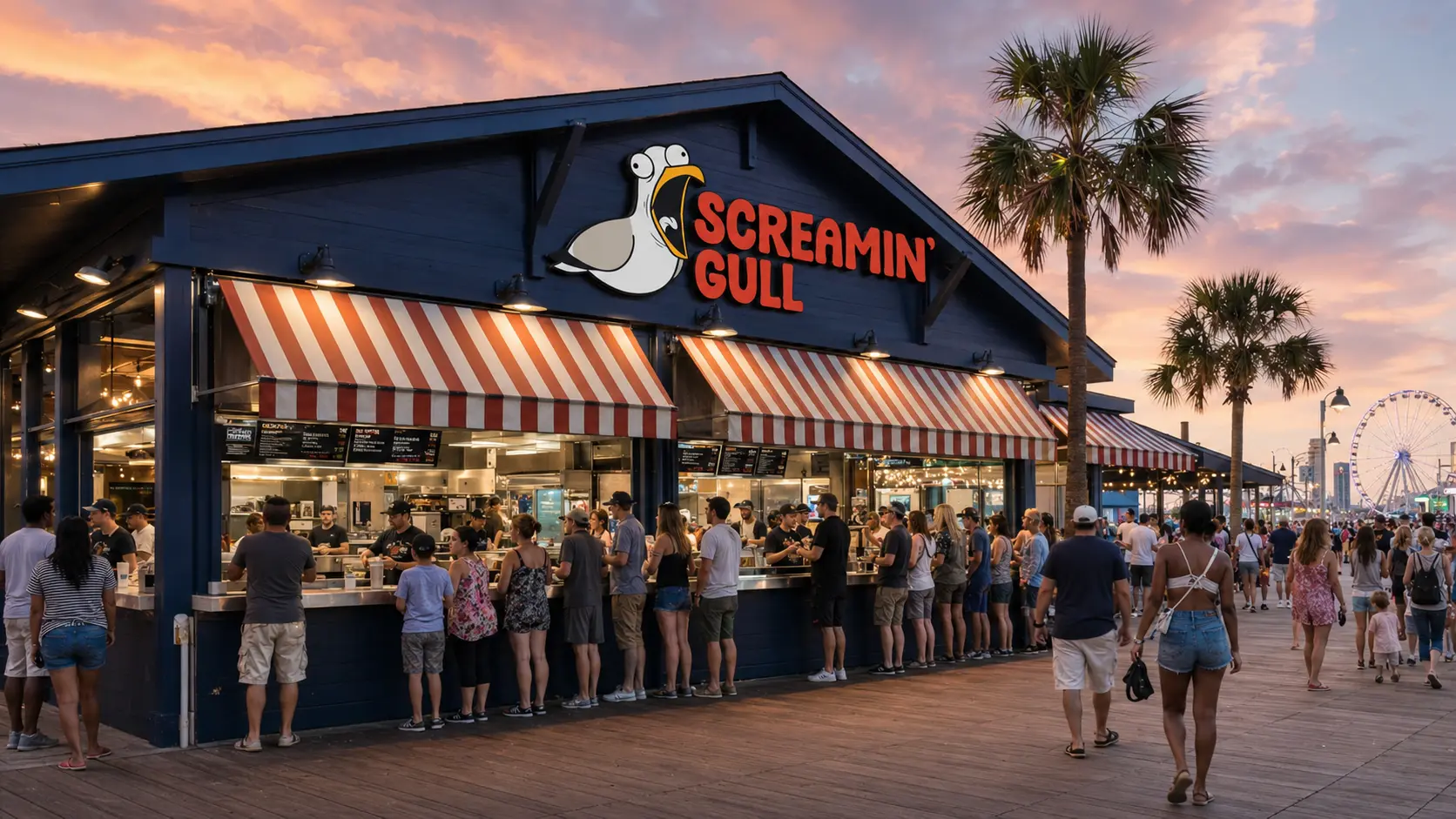
OCEAN BOULEVARD
MULTI-WINDOW SERVICE
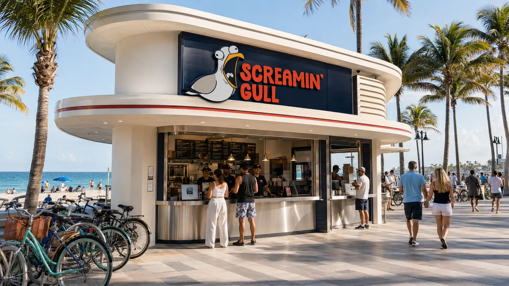
BEACHFRONT A1A
ALL-DAY COUNTER + LATE NIGHT
The proposed first opening uses the gull window and a reduced service menu. A small local preview would test the order and handover before opening to the full queue. The beach kit and a partner-led coastal cleanup are later additions once the counter works.
FIRST COUNTER / CONEY ISLANDThe gull appears in the service warnings and packaging. A new location can change its practical signs around the local boardwalk, keeping the mark and menu hierarchy fixed.
The seagull encounter gives the restaurant a joke people already recognize. I carried it through the menu and the objects around the order. The proposed rollout still has to adapt those pieces to each boardwalk.
I would test the menu at queue distance before a first opening. Can someone find a meal and its price quickly? The warning copy earns its place if people can enjoy the joke and still make an order.