Keep the interruption in the right place.
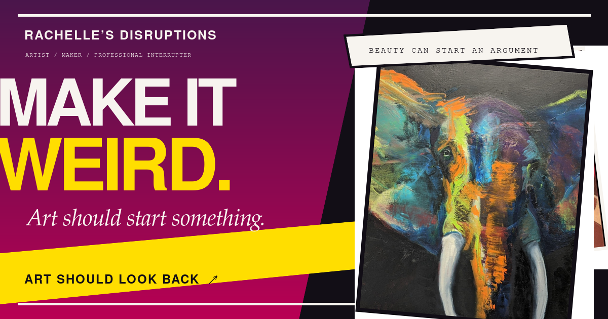
The homepage can play with scale and distortion. The shop uses clearer controls and a larger view of each painting. I kept the artist’s voice in the labels around those practical details.
CLIENT WORK / ARTIST IDENTITY + DIGITAL GALLERY
The paintings already had a voice.
I gave the website the nerve to keep up.
THE STARTING POINT
Look at the color. The orange buffalo holds your attention before you read a word. The calf is quieter, but it still looks straight at you.
I wanted the identity to carry that confidence. The hard part was deciding where to interrupt the page and where to leave the work alone. A loud headline can earn a first look. A painting needs time.
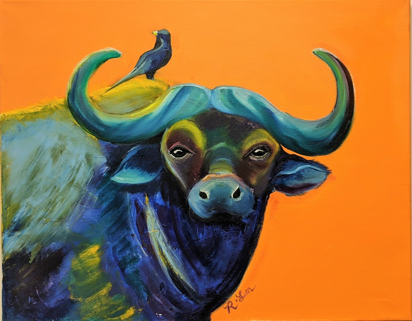
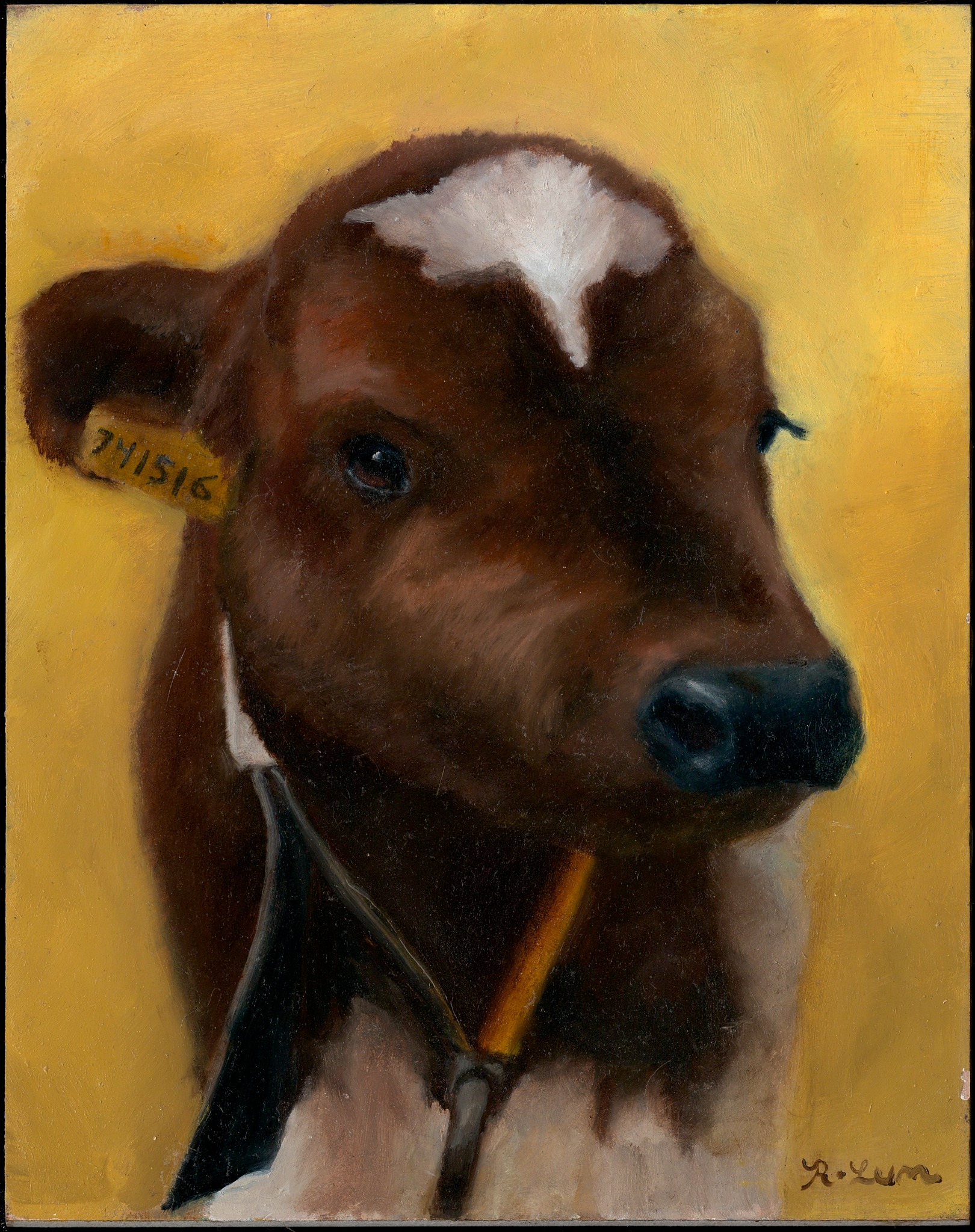
My work is the identity and the digital experience around these paintings. The artwork is Rachelle’s.
THE IDENTITY
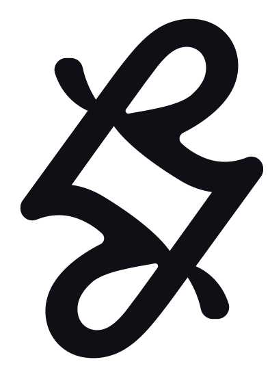
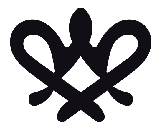
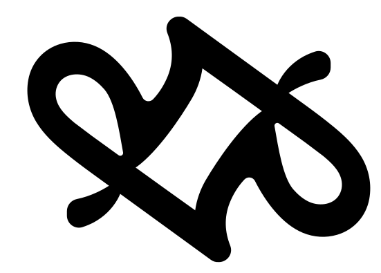
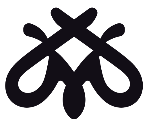
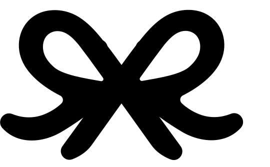
The R comes from Rachelle’s own signature. I carried that mark into the logo, then built every alternate icon from it. The artist’s hand stays in the identity, even as the shape changes.
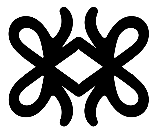
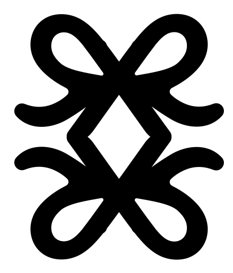
That was the point. Rachelle’s philosophy is that art can be anything. Make it weird. I wanted the marks to have that freedom, so I let one signature take seven different forms.
Those variations become mood tiles and small signals between statements on the website. You can still trace each one back to the same R.
TYPE FROM THE WEBSITE
THE PALETTE’S FIXED POINTS
The mood tiles push into pink and orange. Cream gives the paintings a clear field, while plum and yellow hold the identity together.
THE WEBSITE
The quotes change. So does the type. I used both to carry Rachelle’s philosophy into the page itself, deliberately breaking familiar typography rules about keeping a consistent font and leaving letterforms untouched.
On the full website, you can press and drag to distort the words. Making things weird is part of the experience. The visitor gets to interrupt the design.
You can also set a mood before browsing, or leave a drawing on the canvas. I gave the gallery a steadier pace so you can look at a painting and read its format choices without fighting the interface.
Make art that refuses to match your couch.
MAKE IT WEIRDThe quotes and fonts change to express Rachelle’s philosophy and deliberately break familiar typography rules. On the full website, you can also press and drag to distort the words.
The homepage can play with scale and distortion. The shop uses clearer controls and a larger view of each painting. I kept the artist’s voice in the labels around those practical details.
The acquisition flow lets you choose an original or print and add it to a demo cart. Checkout is still pending. The drawing canvas saves marks in the visitor’s browser, so it is a personal wall for that visit.
THE IDENTITY ON OBJECTS
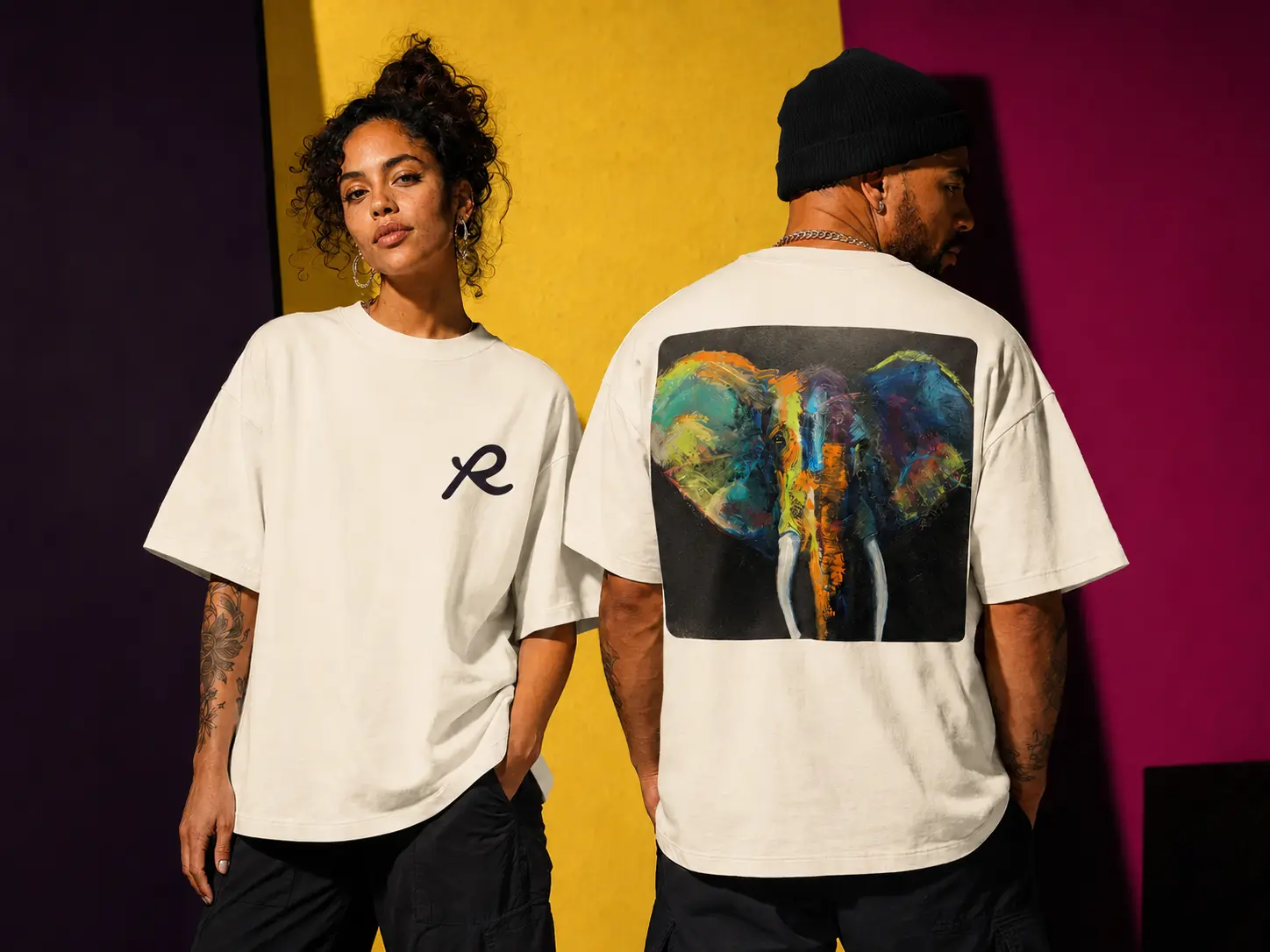
The website’s proposed merchandise carries the same language onto clothing and small objects. The elephant painting gets a full back print. The looping mark takes the chest.
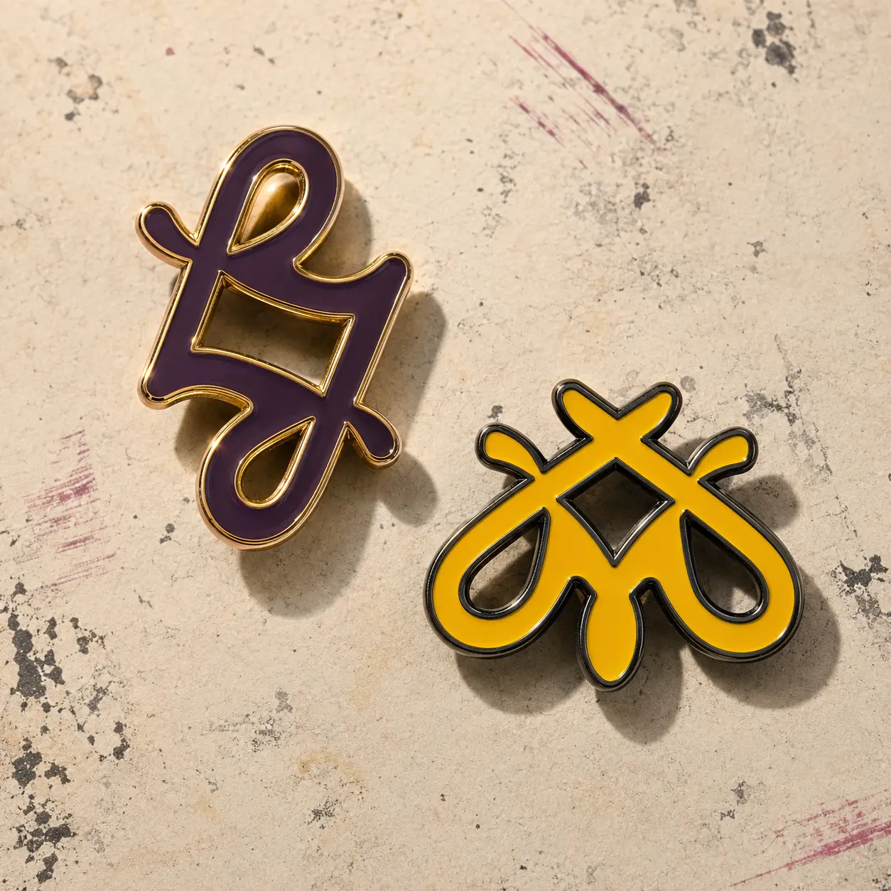
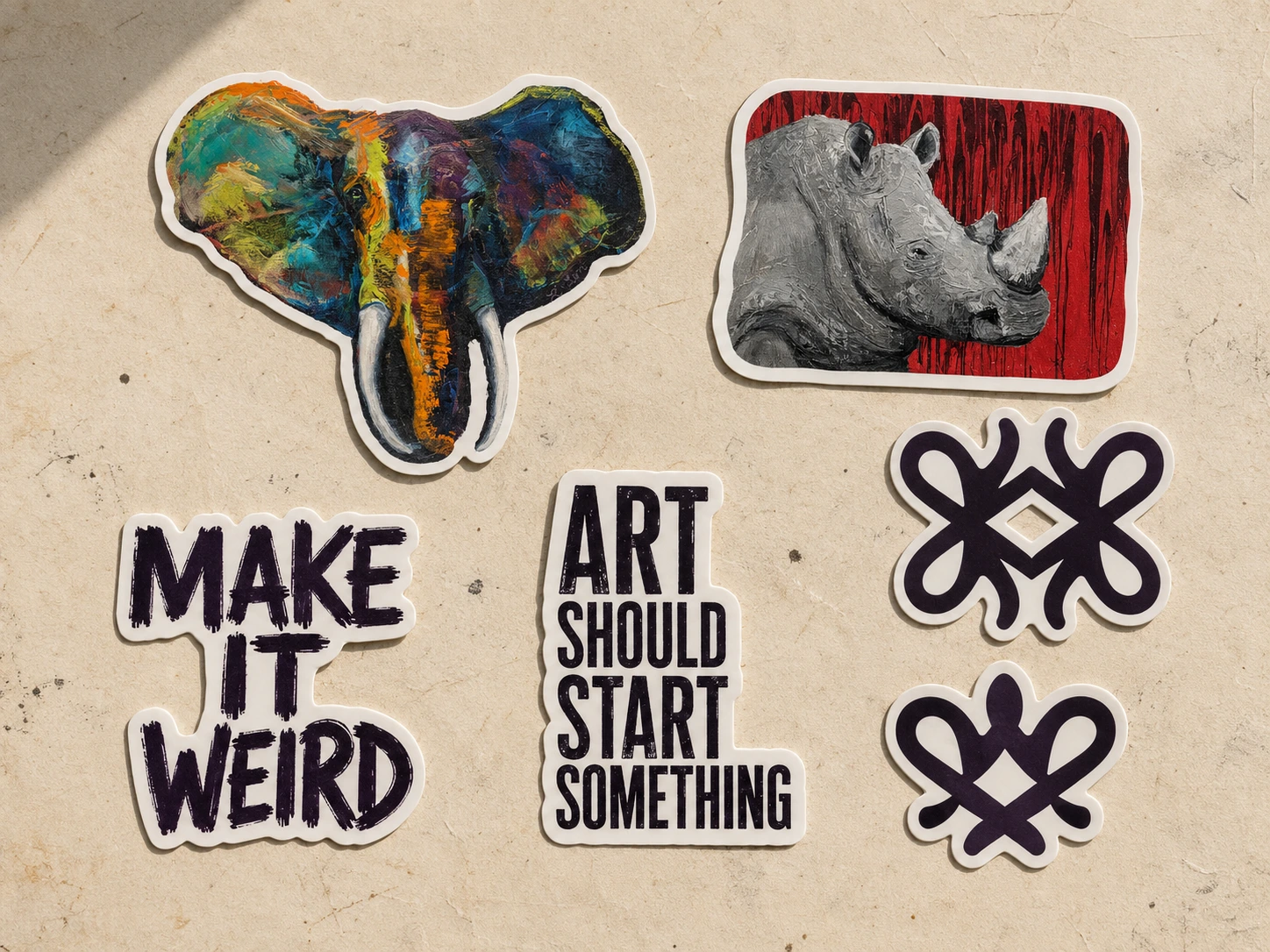
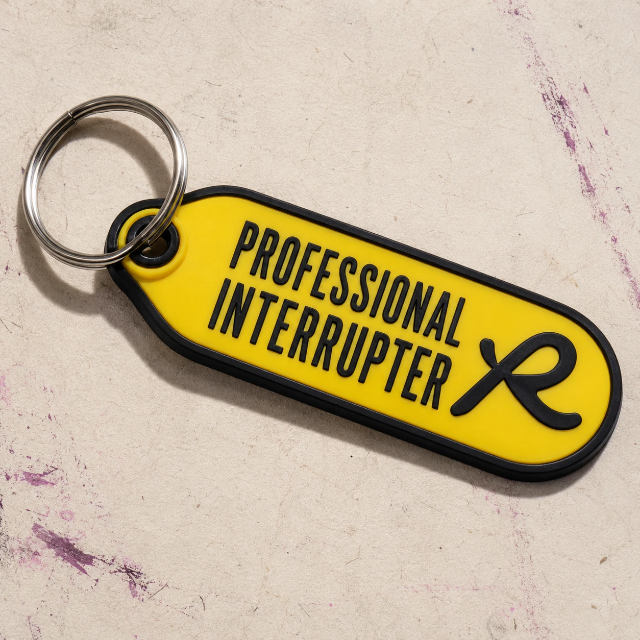
The pins and stickers give the shape family a smaller scale. A yellow key tag carries the voice. These are the mockups used on the Swag page, with production and fulfillment still to be confirmed.
WHAT I BUILT
I designed the identity and website as one system. The name stays readable while the symbol changes shape. The paintings have space to hold your attention, with the artist’s voice carrying through to the gallery and shop.
The working prototype shows those decisions in use. Connecting checkout is the next step, along with confirming the remaining artwork details and merchandise production.
PRISCILLA RIOS / SOLE DESIGNER