ONE EVENT, THREE PIECES
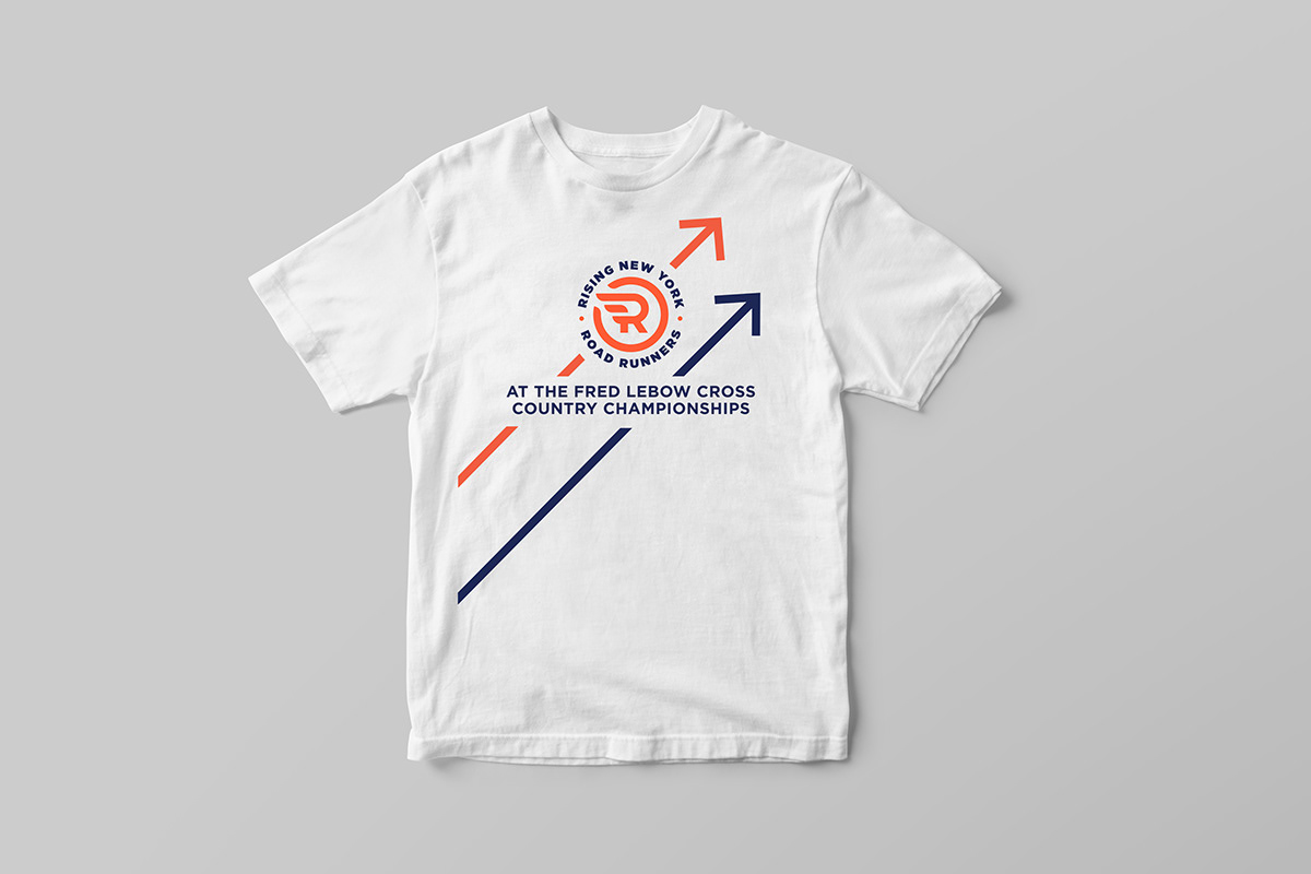
The T-shirt and lanyard share a visual rhythm with the bib. Each keeps a distinct layout.
EVENT DESIGN / APPAREL / LANYARD / RACE BIB
THE STRATEGIC HOOK
The assignment was specific: a T-shirt and lanyard, plus a race bib for a youth cross-country championship. I needed the pieces to belong together without treating them as identical layouts. A bib has to make the runner number easy to find. A shirt has more room to express the event.
“Use one visual language for race day and the objects runners keep.”
WORKING THROUGH IT
The T-shirt and lanyard share a visual rhythm with the bib. Each keeps a distinct layout.
Movement and color create excitement. Names and race numbers stay readable alongside event information.
Every choice responds to how the piece is worn, handled, photographed, and seen at a distance.
The T-shirt and lanyard continue carrying the event long after race day.
THE VISUAL LANGUAGE
Directional graphics and bold event colors frame readable information across all three pieces.
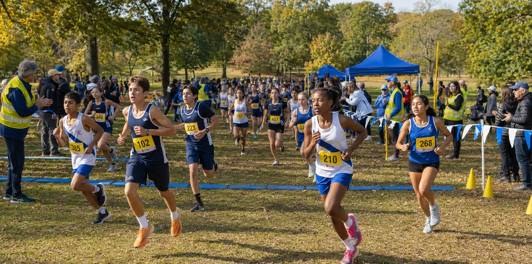
APPLICATION
I designed the shirt and lanyard alongside the participant bib. Red and navy connect the pieces. The information changes scale according to how each one is worn.
EXPERIENCE
The three pieces follow the participant through distinct race-day moments while maintaining one visual identity.
The T-shirt gives the field a shared visual presence.
The lanyard keeps event identification visible and accessible.
The bib prioritizes the participant number while carrying the same graphic language.
The completed NYRR assignment covers the shirt and lanyard alongside the bib. They share color and directional graphics, with a different information hierarchy on each piece.
REAL CLIENT WORK / THREE DELIVERABLES
The shirt gives the event graphics the most room. Its design can remain visible after race day.
A compact vertical format carries the event identity through check-in and gathering moments.
The most functional piece keeps the runner number dominant and the event recognizable.
Use the same red and navy across the pieces. Change the type size and layout according to what a runner needs to read.
01ARRIVAL / LANYARD ESTABLISHES THE EVENT
02START / BIB PRIORITIZES THE RUNNER NUMBER
03AFTER / T-SHIRT CARRIES THE MEMORY FORWARD
The three pieces give participants a consistent, usable race-day kit.
WHAT I DELIVERED
The finished pieces share red and navy graphics, with directional lines that connect the layouts. Each keeps the information it needs for its own job. The shirt can become a keepsake after the number on the bib has done its work.