THE TITLE IS THE SIGN
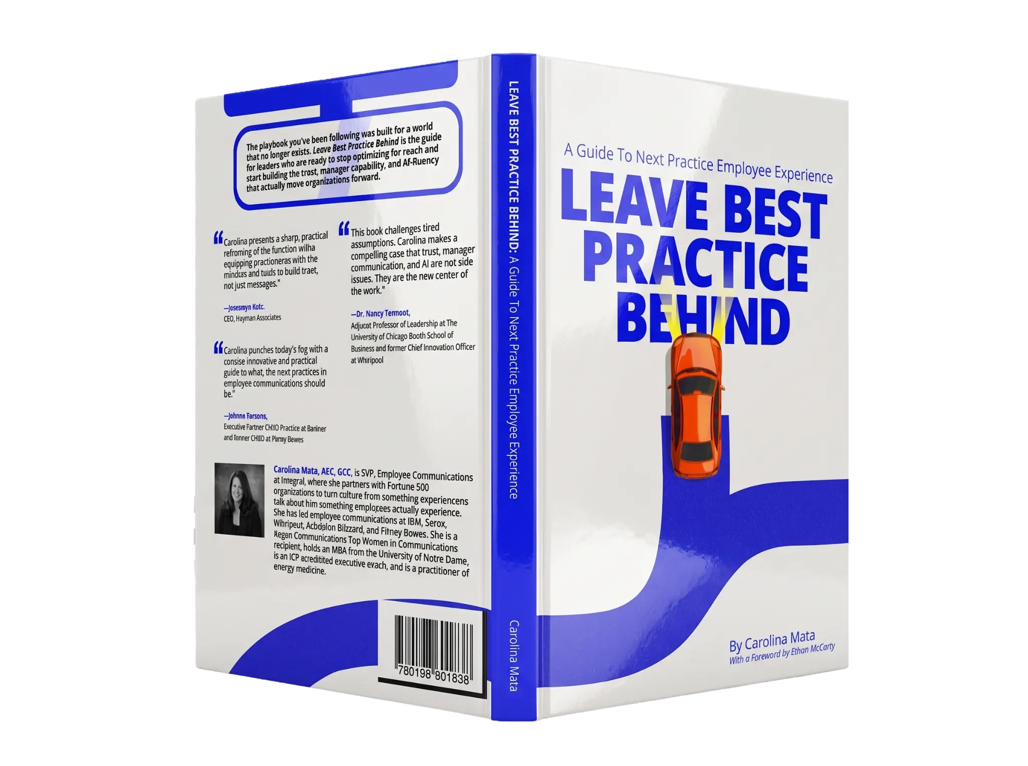
A dense, stacked wordmark gives the long title the force and immediacy of roadside information.
An identity and book-launch design for Carolina Mata’s guide to next-practice employee experience.
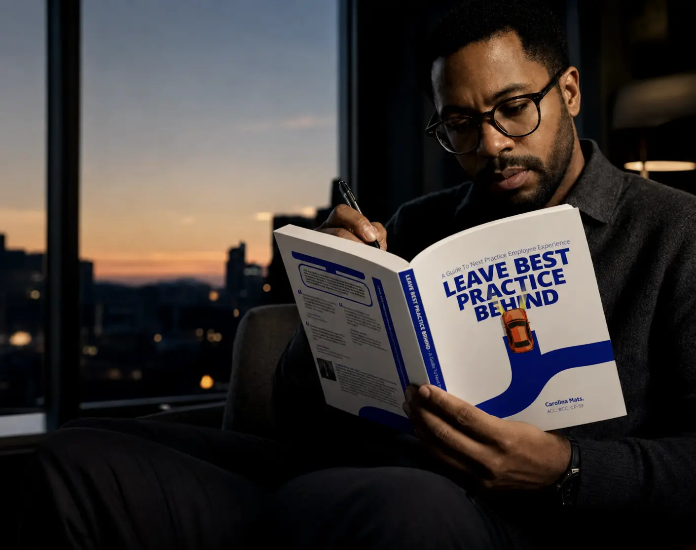
The title is long, and it makes a definite claim. I needed to give it enough force to work on a cover, then carry the same idea into launch material. The road and small orange car gave me a simple action to work with: choosing a different route.
Use the road and small orange car to show a choice about direction. The title carries the argument, while the route gives it a form you can follow.
THE PLAYBOOK WAS BUILT FOR A WORLD THAT NO LONGER EXISTS.
SO THE BRAND LEAVES THE ROAD IT WAS GIVEN.The visual language treats organizational change as a physical act of movement. Every element has a job in the story.
A dense, stacked wordmark gives the long title the force and immediacy of roadside information.
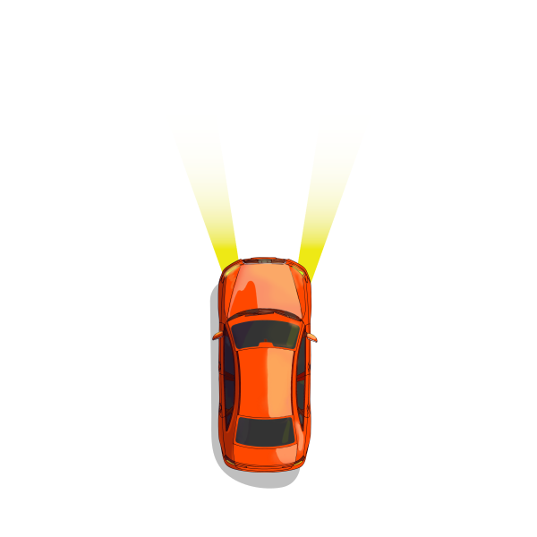
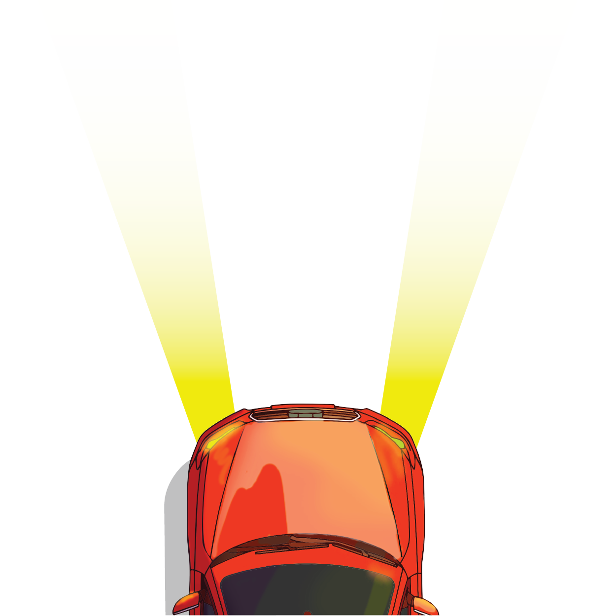
The small orange car makes a vivid choice: leave the expected route.
Curving blue routes frame content, create rhythm, form patterns, and connect the identity across scale.
The concept was designed to live across the book, launch communications, merchandise, environments, and digital promotion.
The stacked title is the first thing you read. The blue road leads toward the small orange car, carrying the idea of choosing a different route into the mark.
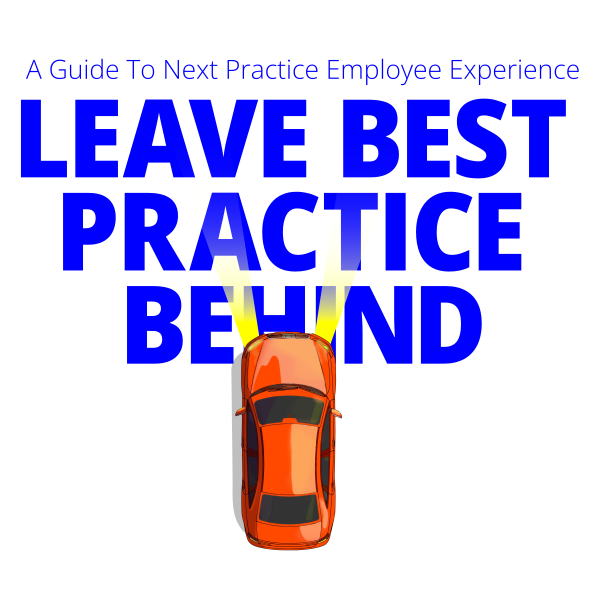 STACKED WORDMARK + ROUTE + VEHICLE
The car shows the brand's central action: a leader choosing to move beyond inherited convention.
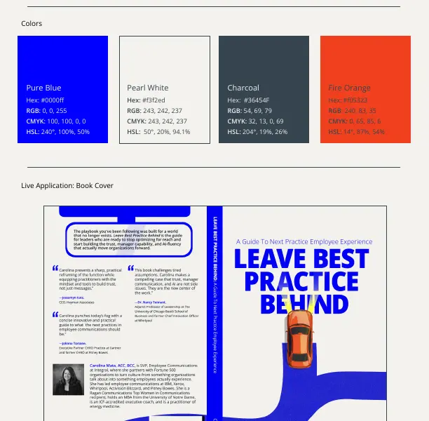
The guidelines show how to use the marks and palette. They also explain the book layout, with separate examples for merchandise and larger campaign placements.
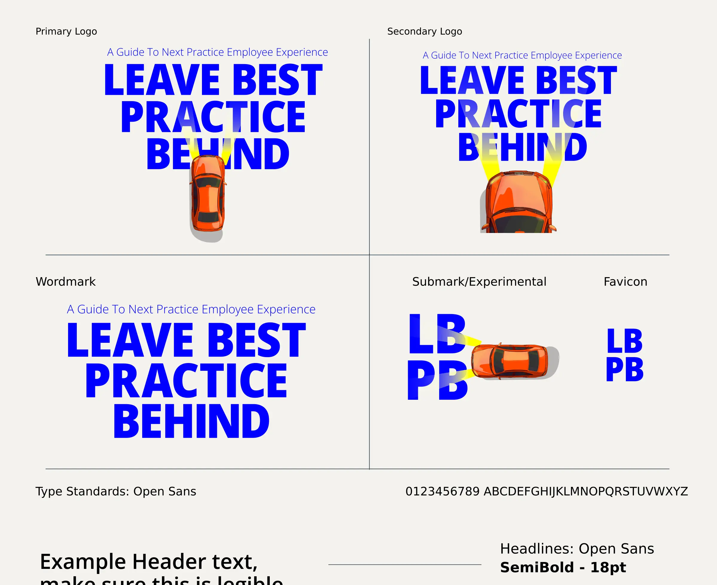
SEMIBOLD / 18 PT - HEADLINES
REGULAR / 12 PT - BODY COPY
ITALIC / 22 PT - PULL QUOTES
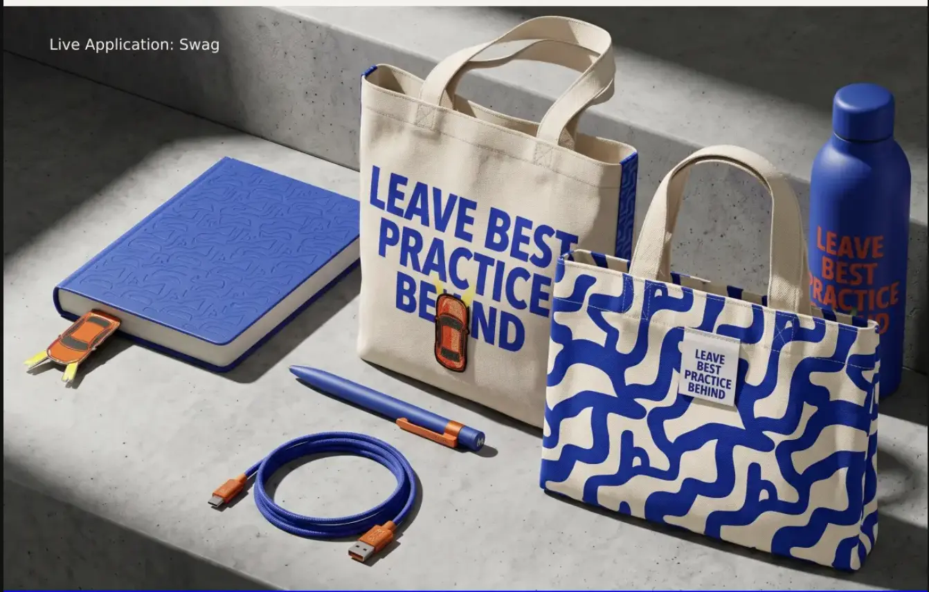
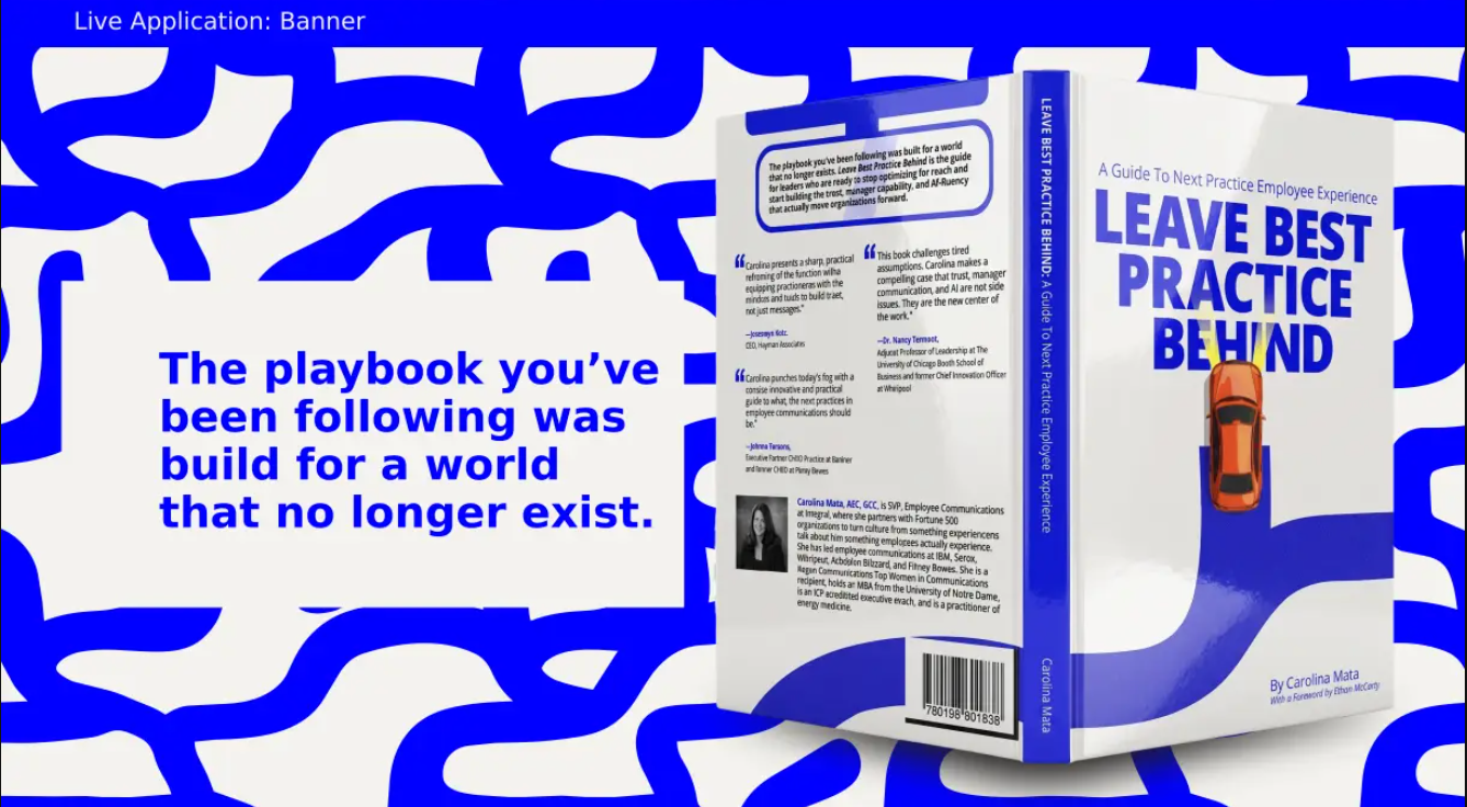
The identity expands beyond the published object into tactile brand pieces and campaign-scale communications. Each uses the same route language without repeating the same composition.
Best practice can help us move faster. It can also keep us moving in the wrong direction.
I wrote Leave Best Practice Behind for leaders ready to question inherited answers and design what comes next.
Paperback
$19.99A practical guide for leaders ready to challenge inherited workplace conventions and build what comes next.
The title needs enough presence on the cover to be read quickly. Inside, the typography has a slower job: helping someone stay with the argument. The road connects those two reading speeds.
VIEW THE BOOK ON AMAZON ↗The finished book carries the same route language as the identity and launch pieces. The stacked title gives it recognition at a glance. The smaller car supplies a detail you can come back to once the title has caught your attention.
BUY THE PUBLISHED BOOK ↗