INDEPENDENT CREATIVE CONCEPT / FERRIS WHEEL PRESS

ANALOG
RESISTANCE.

A sentence can appear before you have finished thinking. Ink asks you to spend a little longer with the thought.

MY ROLE
Concept and creative direction
Art direction and experience design
THE JOB
Turn curiosity about beautiful ink into a page someone actually writes.
THE AUDIENCE
Creative adults drawn to stationery who hesitate over the first mark.
PROJECT STATUS
Independent creative concept by Priscilla Rios. No brand affiliation or client commission.
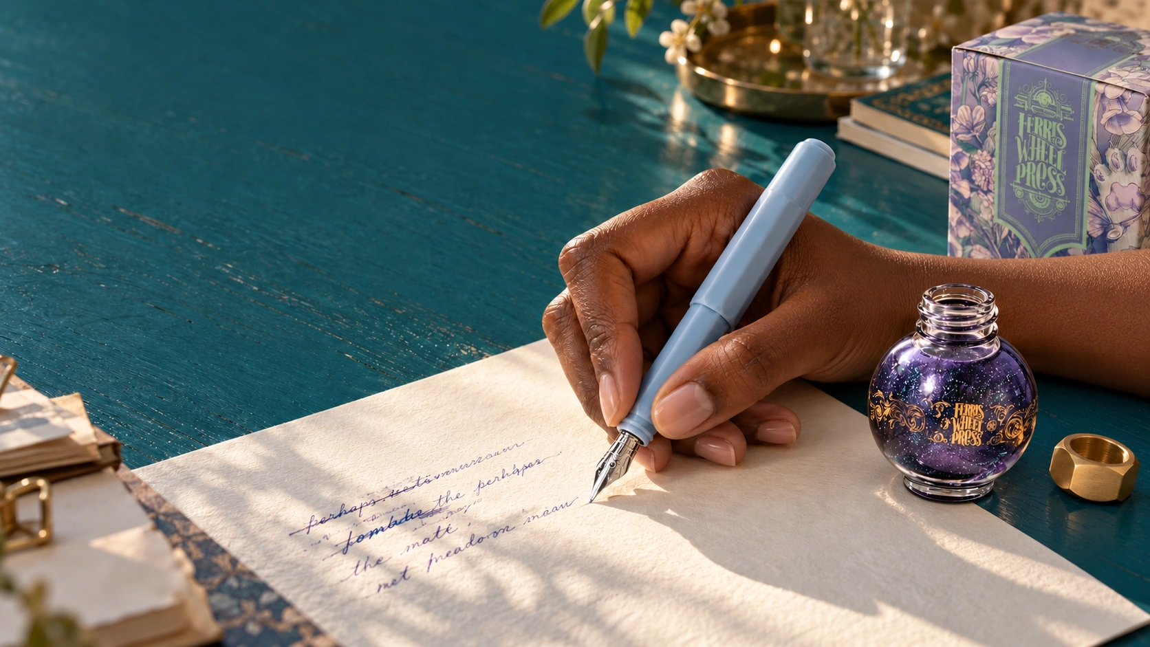
Campaign direction still: a writer continues a corrected line with a blue fountain pen beside a Ferris Wheel Press globe ink bottle on a teal desk
Ferris Wheel Press. Make Fancy Fun.

Ink has no
undo button.

Print your mind.

CAMPAIGN DIRECTION STILL / ANALOG RESISTANCE

THE OPPORTUNITY I SAW

Give a thought
time to dry.

We can generate a page in seconds. Writing by hand makes you wait for the next word, then for the ink itself. I saw room for Ferris Wheel Press to give that slower act a place in daily life.

The brand already makes the material inviting. A brass cap has weight. Shimmer catches the light as you move the page. Its illustrated boxes make you want to look closer.

I would cast Ferris Wheel Press as the Alchemist of Tone. You choose a colour for the thought you want to follow. A film draws you into the material, and the Ink Apothecary lets you put it to work. The pages people keep become the campaign’s next chapter.

A first draft is part of that story. Cross out a word. Leave it visible. You can decide what comes next.

Print your mind.

THE CAMPAIGN INVITATION

Make a thought physical. Give the ink time, and keep the changes that happen along the way.

THE BRAND’S WORLD
Keep the teal and gold, with the official lettering and illustrated packaging. The campaign should make fancy feel usable.
THE MATERIAL
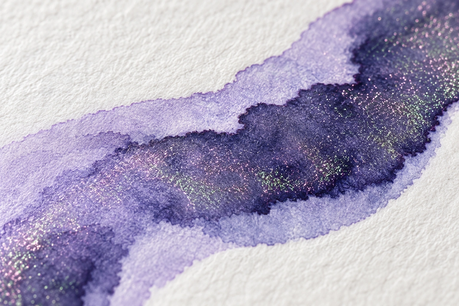
Show a named ink on real paper. Let light reveal the shimmer. A colour effect belongs to that formula and the conditions of the shot.
THE HUMAN ACTION
A person changes a word and keeps writing. Cast a working gesture with a natural grip, rather than a hand performing luxury.
THE VOICE
Warm and a little dry. The page can be untidy without needing a speech about authenticity.

THE COLOR OF THOUGHT / 60-SECOND FILM TREATMENT

First, the cursor.
Then, the cap.

The opening moves fast. A cursor blinks. Autocomplete finishes a sentence, and a correction disappears before you can read it. Fifteen seconds of cold screen light, held in silence.

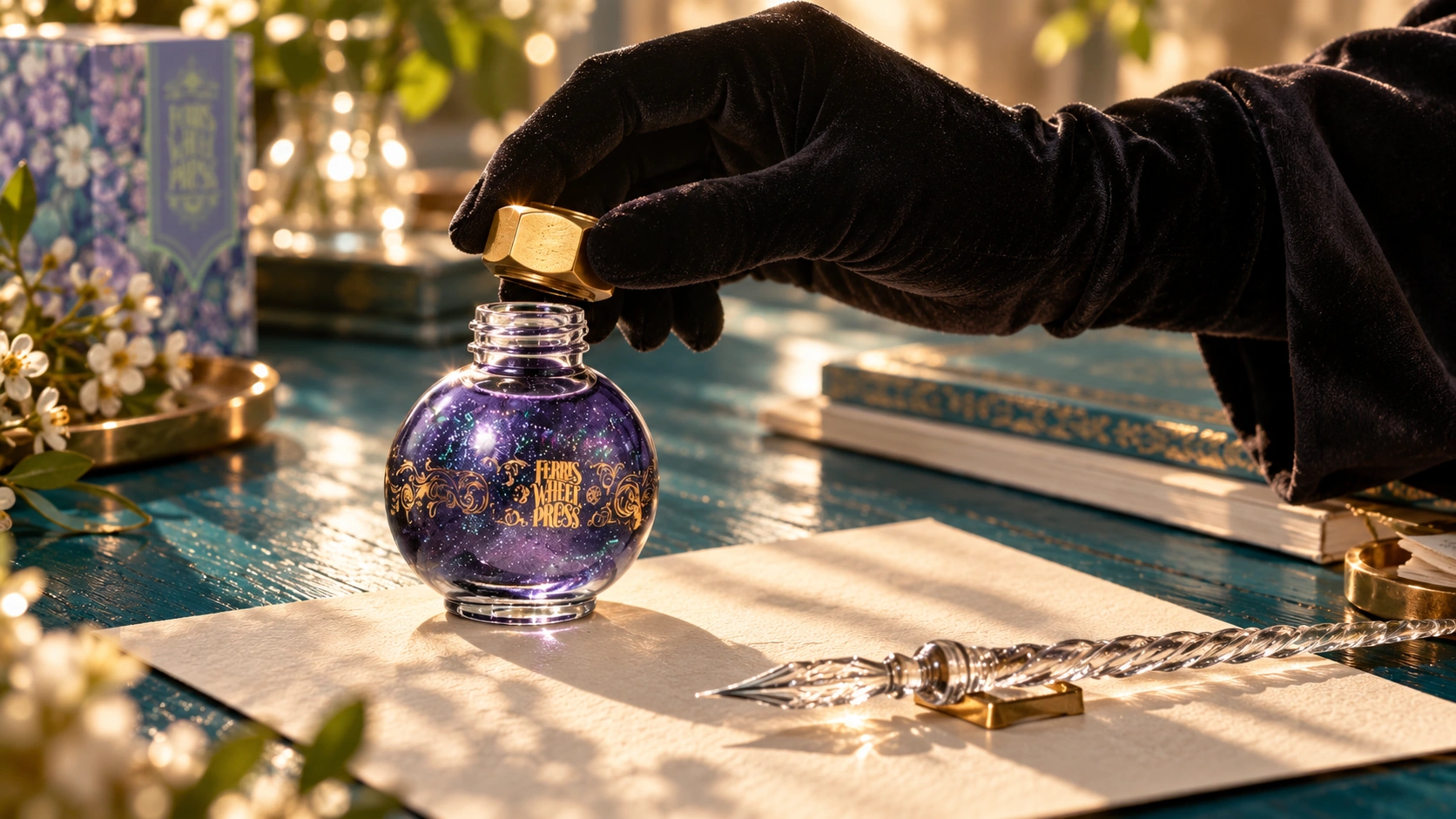
Then the cap turns. That small sound changes the pace. A velvet-gloved hand opens the bottle, and the camera moves close enough to see shimmer suspended in the ink. The writing hand takes over.

The final passage holds the nib against cotton paper. Let the stroke pool and settle. Film a real ink under moving light so the shimmer earns the close-up. Finish on the bottle and the campaign line.

These are storyboard studies for a proposed shoot. The drying insert would use the actual ink and stock, with any compressed elapsed time identified.

UNTITLED DOCUMENT

I was trying to say something else.

Suggested completion
Correction removed
OPENING INSERT / SILENT
00:00–00:15 / STORYBOARD STUDY

The sentence arrives early.

Fast cuts of a blank document, autocomplete and a correction disappearing. Cold light. The words move faster than the person making them.

THE SOUND
Silence. Keep the opening quiet enough for the cap to change everything.
THE DECISION
Two screen inserts and a face lit by the document. Build pace through the edit.
PROPOSED VOICEOVER / QUIET DELIVERY
“A sentence appears before I’ve finished thinking.
I turn the cap. Choose a word.
There’s a little ink on my finger now.
I wait for the line to dry.”

THE UN-OPTIMIZED GALLERY / PRINT & STREET

Take a piece
of the page.

A dark, tactile poster gives one handwritten sentence the whole wall. The mark carries the shimmer. Along the bottom, perforated cotton-paper strips let you take a dried ink swatch away.

The swatch names the ink and points you to the nearest participating counter. New York and London would be proposed launch cities. Paris and Tokyo could follow after the first placements show whether people keep the strip and come in to write.

The timing execution records how long a real sentence took to think through, write and dry. Those numbers would be measured during the shoot. The first layout below shows the idea without invented test results.

Direction study of lilac ink on paper with fine green and pink reflected shimmer
Ferris Wheel Press

Let the ink
take its time.

Analog Resistance.
Make a mark. Stay with it.

Ferris Wheel PressANALOG RESISTANCE

I’ll start
tomorrow.
here.

Ink has no undo button.
Print your mind.

A THOUGHT, LEFT ON THE PAGE

The first word stays visible. The next line carries on.

Ferris Wheel PressTHE UN-OPTIMIZED GALLERY

I needed a little
longer with
this thought.

Time to think.
Time to write.
A while to dry.

Analog Resistance. Print your mind.

PERFORATED COTTON PAPER / PLACEMENT STUDY

The poster gives
something back.

Each strip carries a dried ink swatch and its name. The reverse directs you to the local Ink Apothecary, with the retailer’s approved campaign address.

The dark surface holds the handwritten line. The stock and foil treatment would be proofed against the real ink before print production.

The timed version would replace the lines above with the observed thinking, writing and drying times from the shoot.

Select a strip to try the tear-away layout.

THE INK APOTHECARY / PROPOSED RETAIL EXPERIENCE

An ink of
your own.

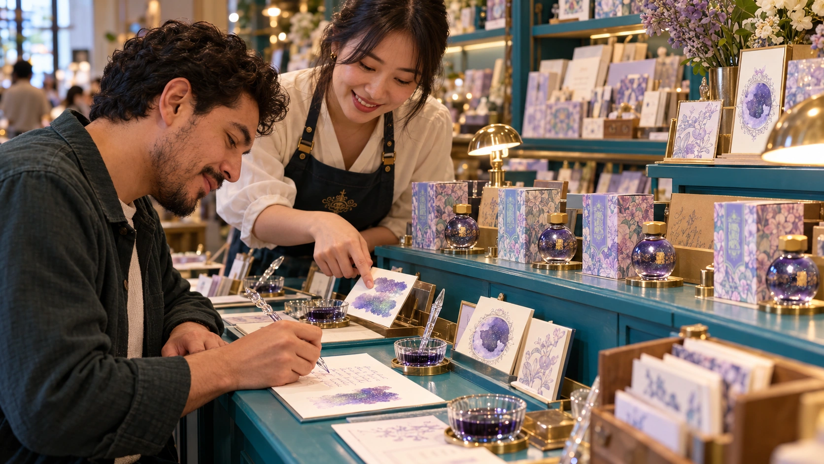
You meet an Ink Sommelier at a working table. They ask what idea you keep returning to, or what you have been putting off writing. You can answer with a colour. Nothing personal needs to become part of the record.

The sommelier shows you the ink on the paper you will use. Try a dedicated dip pen. Let the mark dry before you decide.

The full concept offers a hand-blended 38ml edition from a formula menu developed with Ferris Wheel Press. You choose a tone and the way you want the shimmer to catch. The host records the recipe, then seals the presentation sleeve with wax and a brass stamp.

Le Bon Marché, Harrods and Bergdorf Goodman are proposed hosts for a later luxury-retail edition. The first test would happen with one stationery retailer, using existing inks while the blend menu is developed.

Proposed Ferris Wheel Press writing counter: a guide helps a visitor use a dip pen, with prepared inks and illustrated cartons on a teal worktable
PROPOSED RETAIL COUNTER / WRITING AND INK TESTING

Choose a colour

The host shows named inks on the same paper you will use. Share as much about your page as you want.

Try the material

Use a dedicated tester. Compare the stroke with the dried swatch and notice what the light changes.

Keep writing

A correction stays on the page. You decide what the next line will be.

Take your page

Leave with the sheet and an ink-reference card. Optional product discovery follows the ink you used.

Ferris Wheel PressThe Ink Apothecary / proposed starting menu
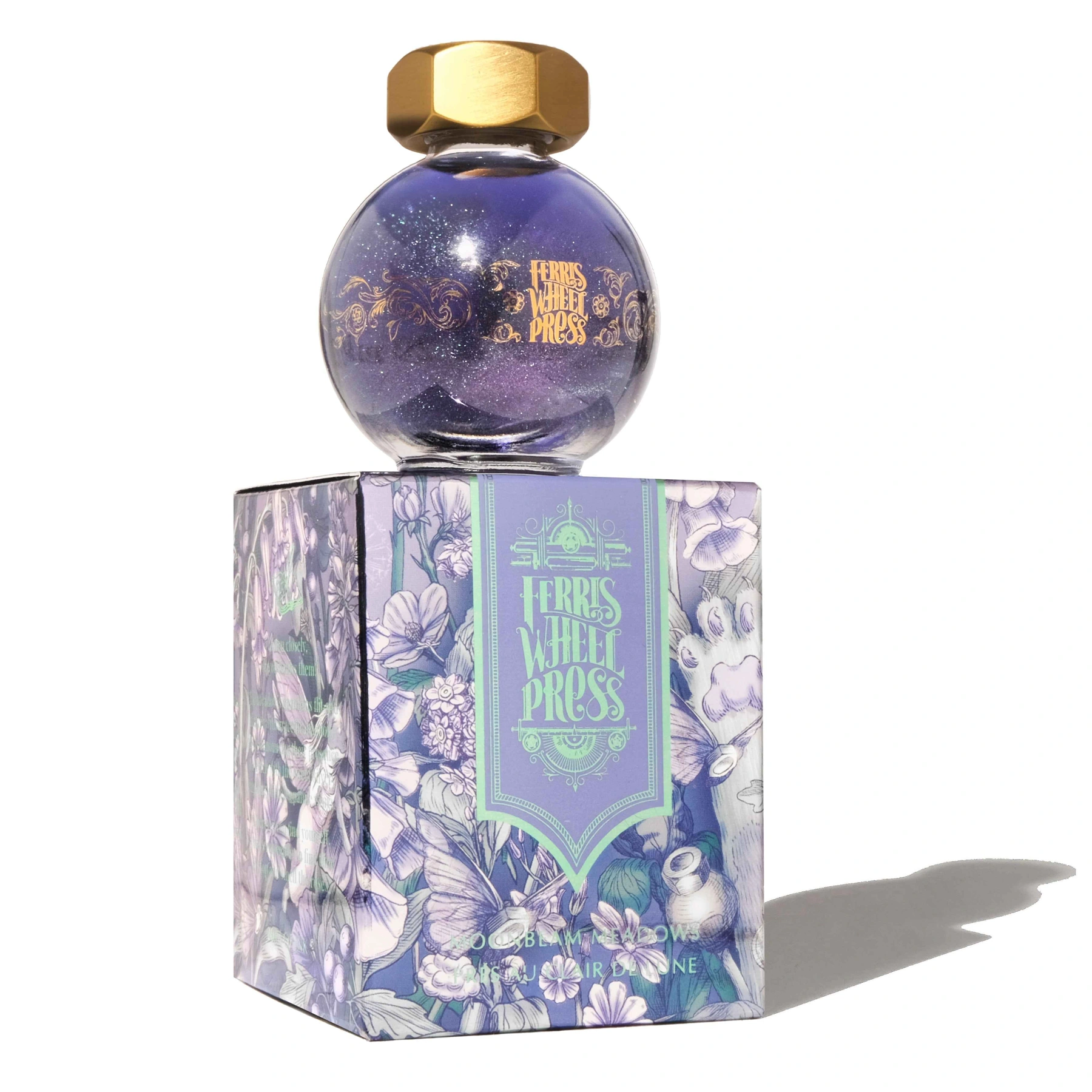
Official Moonbeam Meadows 20ml globe bottle and illustrated packaging

Moonbeam Meadows

The lilac stroke carries green and pink reflected shimmer. The illustrated carton keeps the brand’s story world in view at the counter.

THE COLOUR
Soft lilac
THE LIGHT EFFECT
Green/pink duochrome shimmer
THE FORMAT
20ml glass globe with brass cap
THE INVITATION
Write the opening of something you have been putting off.
Explore the ink at Ferris Wheel Press

INK SOMMELIER / PROPOSED CUSTOM EDITION

A colour for
your next page.

What idea do you keep returning to? Keep the answer to yourself if you prefer. Choose a direction and give the bottle a name.

A presentation study. Your entry stays on this page and is not submitted.
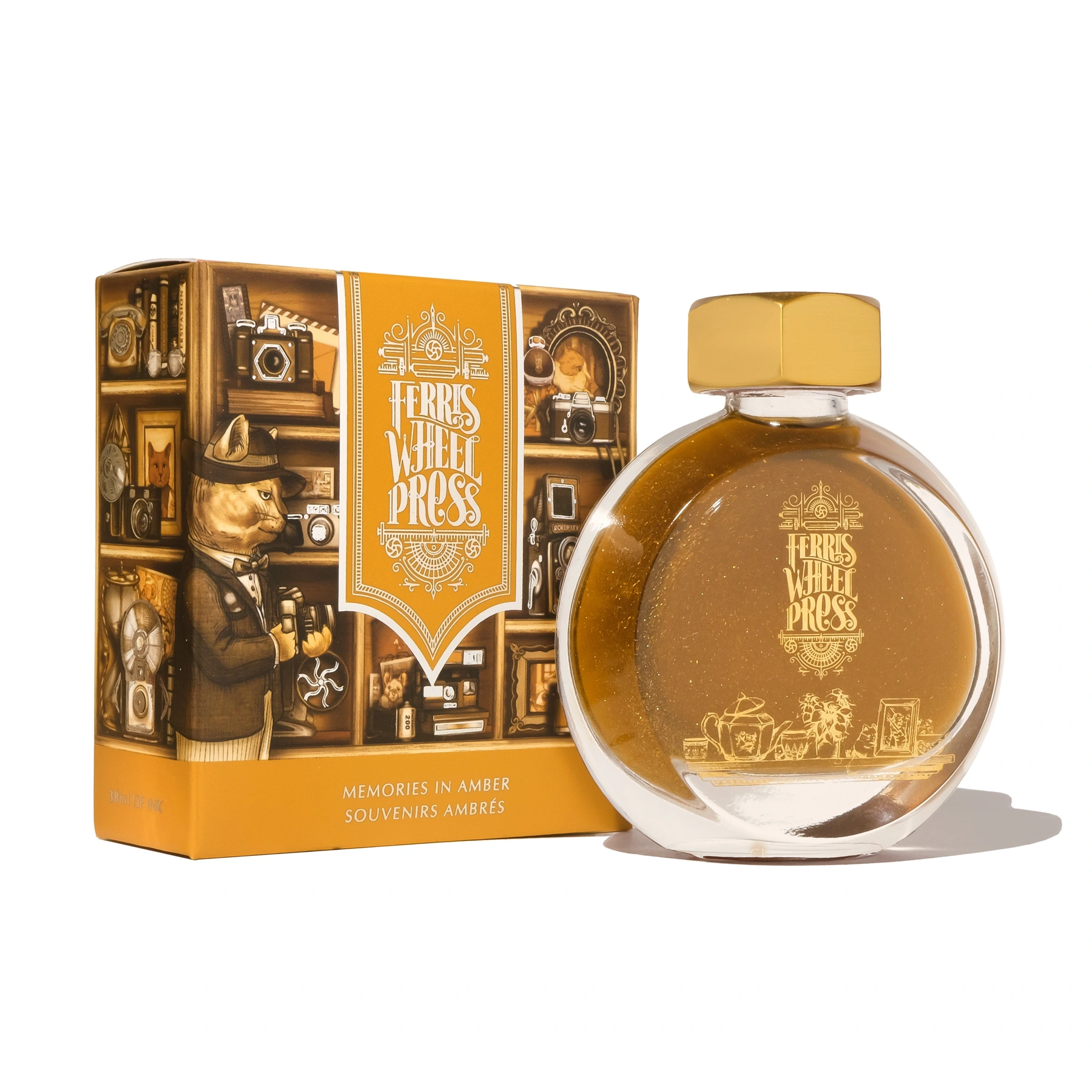
Official 38ml Ferris Wheel Press bottle, used as a format reference for the proposed custom edition
38ML BOTTLE / EXISTING FORMAT REFERENCE
Ferris Wheel PressTHE INK APOTHECARY

The next chapter

Lilac with green and pink reflected shimmer

COLOUR BRIEF
A thought at dusk
THE RECIPE
Ink names and ratio recorded by the sommelier after the approved blend test.
THE PRESENTATION
38ml edition. Guest-named card and a wax-sealed outer sleeve.
FWP
PROPOSED RECIPE & NAMING CARD

The blend preview shows the proposed naming and presentation system. Colour directions are creative studies. Recipes and added shimmer would need the brand’s product development before any visitor service.
THE IMPERFECTION ARCHIVE / DIGITAL & CREATOR CAMPAIGN

Keep the page
you nearly hid.

Cross It Out invites working designers and writers to share a page before they clean it up. Keep the abandoned sentence and the mark in the margin. A caption explains what changed and what happened next.

Commission the opening entries, then invite readers to submit a page through the brand’s campaign channel. Contributors choose what is shown and approve its use. The counter can give them a card explaining how to take part.

A second strand stays with the material. Shoot short 16mm studies of a cap opening or a nib drawing ink, with no background music. Hold each gesture at its recorded speed. The sound is close enough to hear the table.

THE IMPERFECTION ARCHIVE

She took the shortest
long way home.

Ferris Wheel Press
CREATOR PAGE / LAYOUT STUDY

The sentence found another route.

A proposed creator page could hold the first word and its replacement together. The caption asks what the writer did next, in their own words.

This is original campaign copy, laid out as a page study. A commissioned writer would choose the actual passage.

UN-SPEEDED / 16MM SOCIAL FILM TREATMENTS

No music.
Hear the mark.

Four proposed cuts for the brand’s social channels. These stills and sound notes describe the shoot, with no finished footage or audio implied.

Velvet-gloved hand uncapping the ink bottle, a proposed capture direction
16MM / REAL-SPEED GESTURE

The cap

Thread against brass, then the cap set down.

One turn. Hold the pause afterward.

Proposed duration. Final timing follows the recorded gesture.

WHAT I WOULD DIRECT

Keep the idea
in the execution.

The difficult choice is how polished the page should become. A styled mess can feel as managed as a perfect page. I would brief the writer to work on something real and let the camera follow the correction that actually happens.

Product accuracy belongs in the shoot brief. The 20ml Moonbeam Meadows globe has a brass hexagonal cap. Its lilac ink has green and pink duochrome shimmer. Reflected shimmer gives the camera a light effect to observe.

MY DIRECTION
The continuing-page idea and the sequence of the encounter. I would approve the film edit and carry the same action into the print campaign.
THE FILM TEAM
A director and macro cinematographer follow the hand and ink. The sound recordist captures the table. Test the actual stock before locking the shots.
THE BRAND & RETAIL HOST
The product team checks the ink information and any later blend recipes. A trained host sets up dedicated testers and helps visitors begin.
THE CREATORS
Commission the page and caption together. Agree usage with each contributor and keep their approval over what is shared.
Official Moonbeam Meadows 20ml globe bottle and illustrated FerriTales packaging

EXISTING PRODUCT / OFFICIAL PHOTOGRAPHY

The material
earns the close-up.

The globe and illustrated box anchor this treatment in Ferris Wheel Press. The official swatches provide the colour reference. Campaign stills show a proposed photographic direction.

See Moonbeam Meadows at Ferris Wheel Press

A FIRST EDITION WORTH LEARNING FROM

One table.
A page you keep.

Start with one stationery retailer and a two-ink menu. Shoot the film in that same writing setup. Commission a small set of creator pages for the digital archive, with the material test informing the print.

I would observe whether visitors begin writing and continue after a correction. Ask which ink they tried and what they would use it for at home. A counter that attracts only swatch collecting needs a different invitation to write.

Optional follow-up can ask whether they used the ink again. Compare those responses with product interest before proposing another location. This study claims no campaign results.

RESEARCH & AUTHORSHIP

Independent creative concept by Priscilla Rios. The film and retail experience are proposals. Ferris Wheel Press has not commissioned or endorsed this project. Retail collaborations are prospective.

Return to Creative Worlds