ESTAIT
GROUP.
An architectural brand identity, carried from the first mark into a working website prototype.
EXPLORE THE PROTOTYPE ↗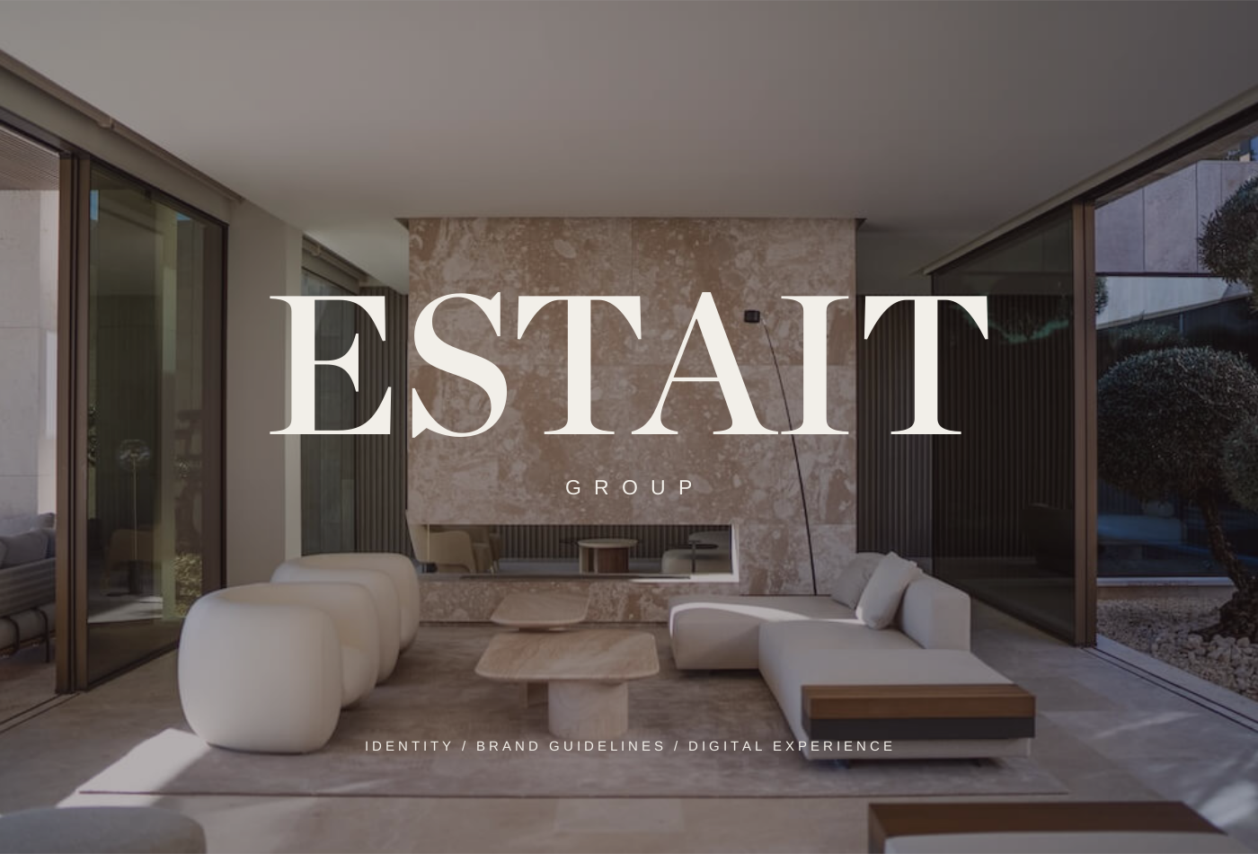
A sense of place.
Before the address.
ESTAIT Group wanted a luxury real estate identity grounded in architecture, materiality and restraint. The brief called for a mark with enough presence to stand alone and enough simplicity to work in one color, on screen or across physical materials.
I designed the project solo, creating the logo, brand system, guidelines and pattern, then carrying that identity into a website prototype. The same decisions about proportion, space and tone run through the whole experience.
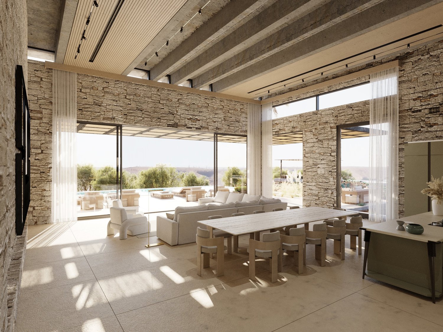
The visual direction came from stone, plaster, wood and natural light. I used those references to give the brand a calm, editorial character.
Structure
in a few lines.
The nested roofline gives the identity a simple architectural form. Overlapping angles suggest shelter and structure, while the serif wordmark brings an editorial weight to the lockup.
The mark and wordmark can work together or separately. That gives the system room to move from a small website header to a larger brand application without changing its character.
 ARCHITECTURE / PROPORTION / SHELTER
 THE SAME IDENTITY AT A SMALLER SCALE
The original brand palette. Charcoal carries the type, with pale stone and blue-grey shaping the surrounding space.
One roofline.
A larger rhythm.
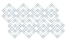
I extended the roofline into a repeating lattice. The pattern gives ESTAIT a recognizable surface beyond the logo, with interlocking lines that connect back to the original mark.
Used tonally, it adds texture without competing with text or photography. The guidelines show how the same geometry can carry across digital fields and material applications.
A consistent geometry.
Room to build around it.
Weight in the type.
Air around it.
The identity pairs Chronicle Display with Baskerville. Strong serif headlines establish the hierarchy, with italic accents for quieter moments and a comfortable reading rhythm for the body copy.
The website prototype carries those proportions into an editorial layout. Large photographs show material and light, while small interface labels keep navigation and property information clear.
structure.A quieter point of view.
Chronicle Display / identity headlines
Baskerville / reading text
The identity
becomes a place.
I designed and built the website prototype around the same architectural perspective. The homepage opens with a full-width interior and a clear invitation into the property collection. Image-led listings lead into the details of each home.
The prototype extends across Properties, Who We Are, Our Team, Careers and Contact, with a dedicated brand-guidelines page. Consistent spacing, restrained motion and a shared type hierarchy carry the identity through each route.
EXPLORE THE WEBSITE PROTOTYPE ↗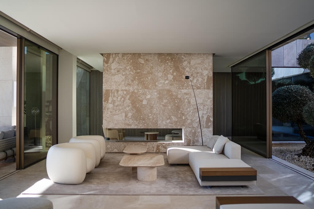
Distinctive homes.
Considered living.
Real estate for those who see the difference
in the details.
Places with a point of view.
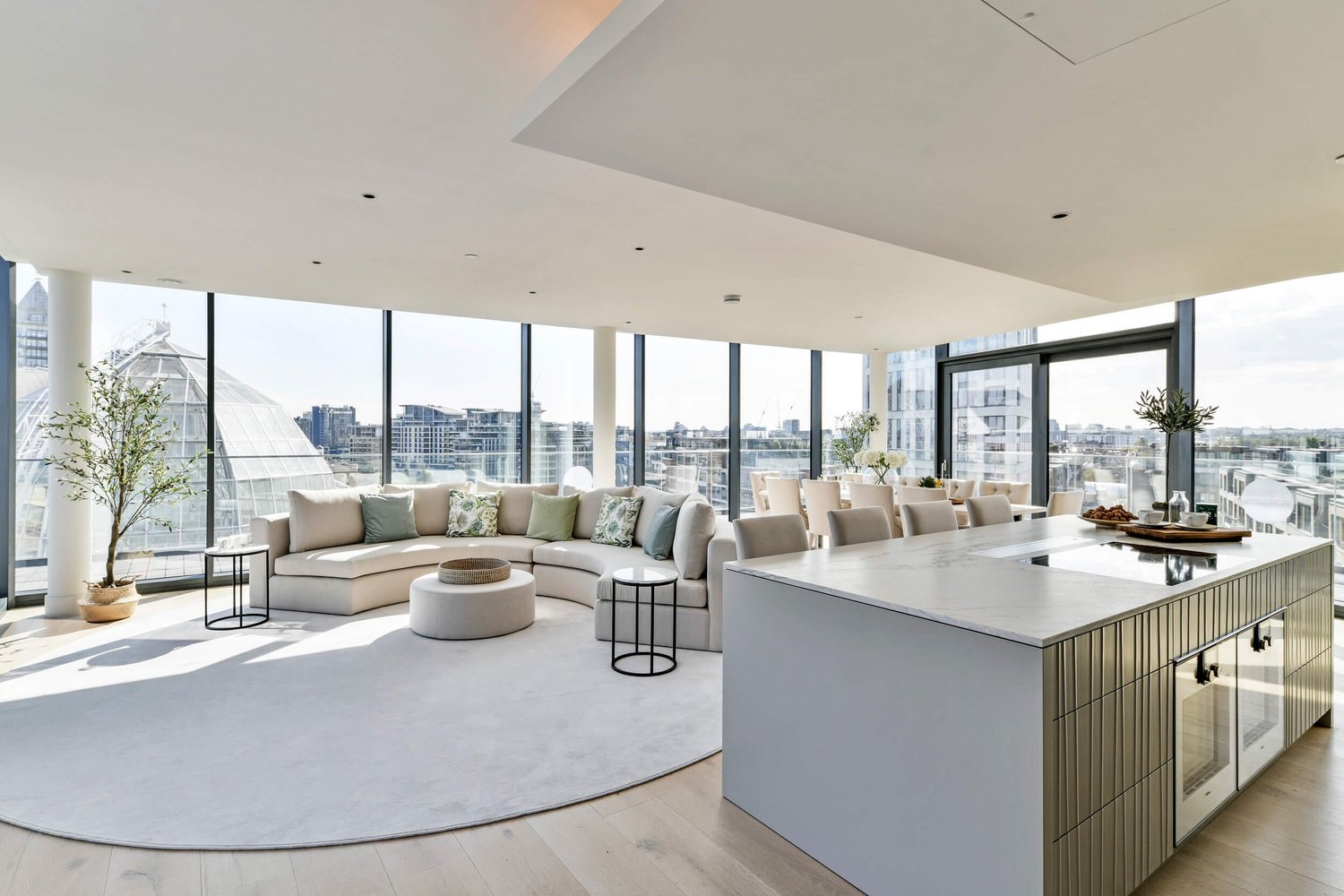
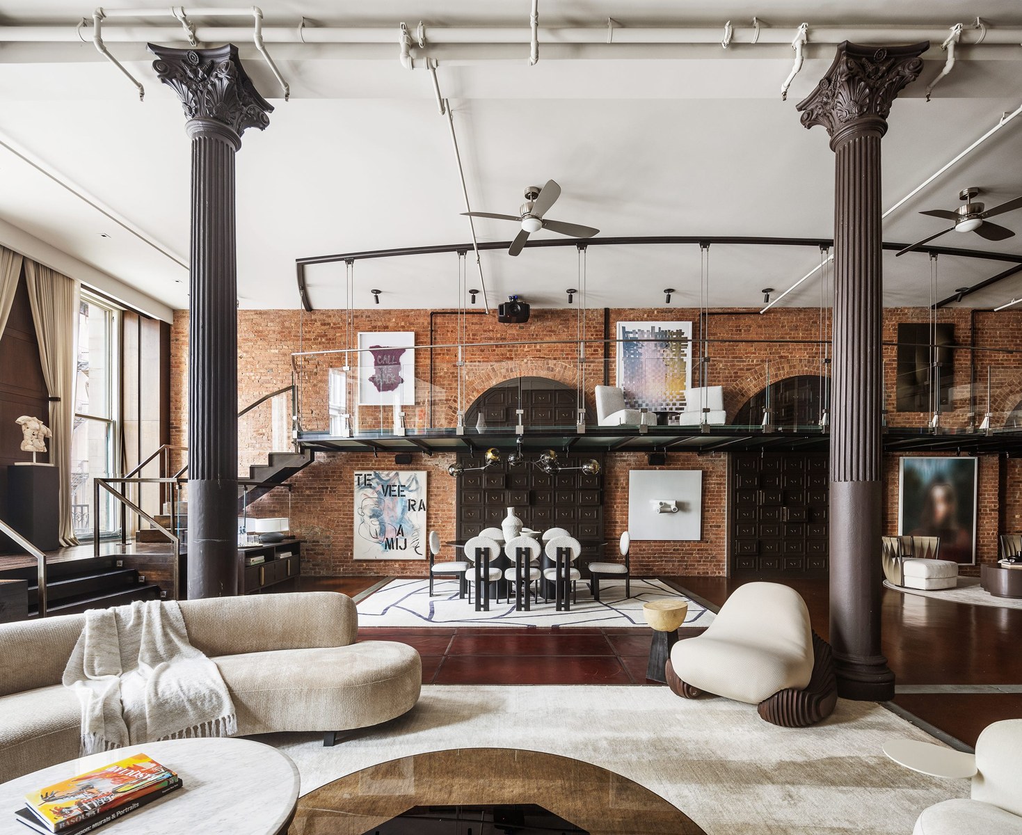
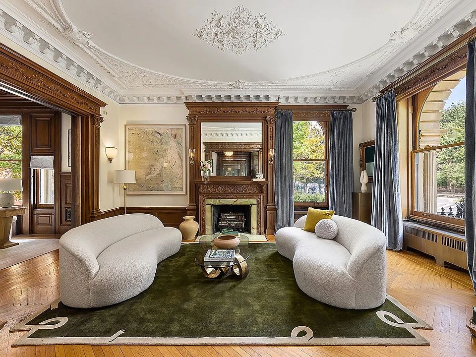
Website prototype presentation using its artwork and content. Property listings, prices and specifications on the site are illustrative. Photography is architectural reference imagery.
A system
with a reference.
I brought the identity together in a brand sheet covering the logo, palette, typography, icon variations, pattern and photographic direction. It gives the work a single point of reference as the brand develops.
The website’s guidelines page extends that reference with logo-use guidance and digital color values. The original sheet remains available alongside it.
VIEW THE BRAND GUIDELINES ↗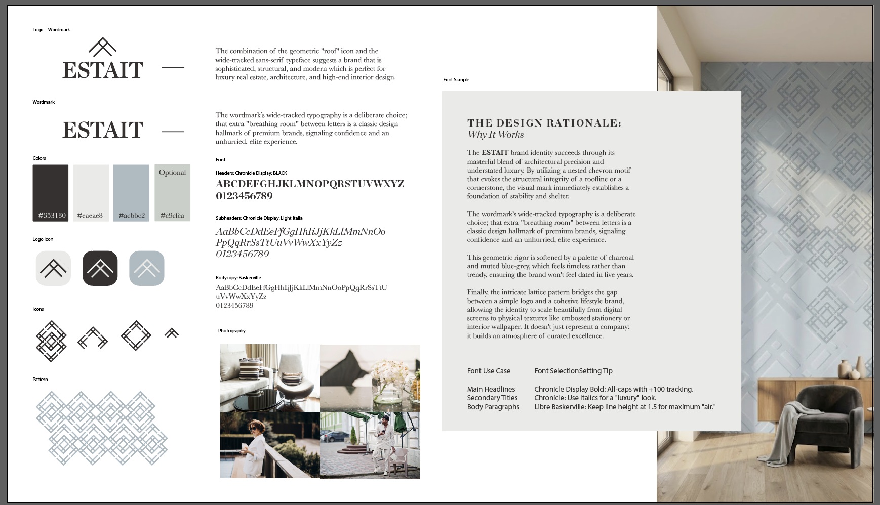
Original brand sheet / select to view full size.
One designer.
The whole system.
I handled the design from the logo through the website prototype. The roofline, type, pattern and digital layouts were developed as parts of the same identity, giving ESTAIT a consistent presence across the work.
The project shows my ability to carry a client brief through a complete brand and working website prototype, with a documented system to support what comes next.
Logo design
Designed by Priscilla Rios
Brand identity
Designed by Priscilla Rios
Brand guidelines
Designed by Priscilla Rios
Pattern system
Designed by Priscilla Rios
Website prototype
Designed by Priscilla Rios