THE SYMBOL IS THE LOGO
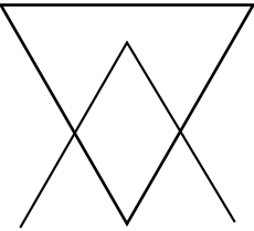
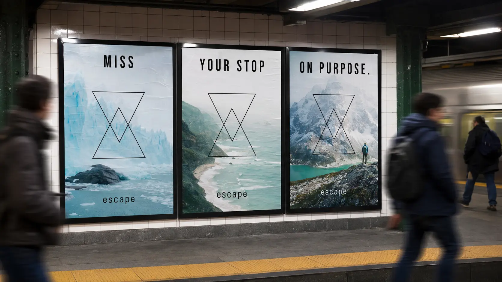
Two overlapping triangles form an open passage. The simple geometry stays readable over destination photography.
BRAND IDENTITY / EDITORIAL / CAMPAIGN / EXPERIENCE
WHERE I STARTED
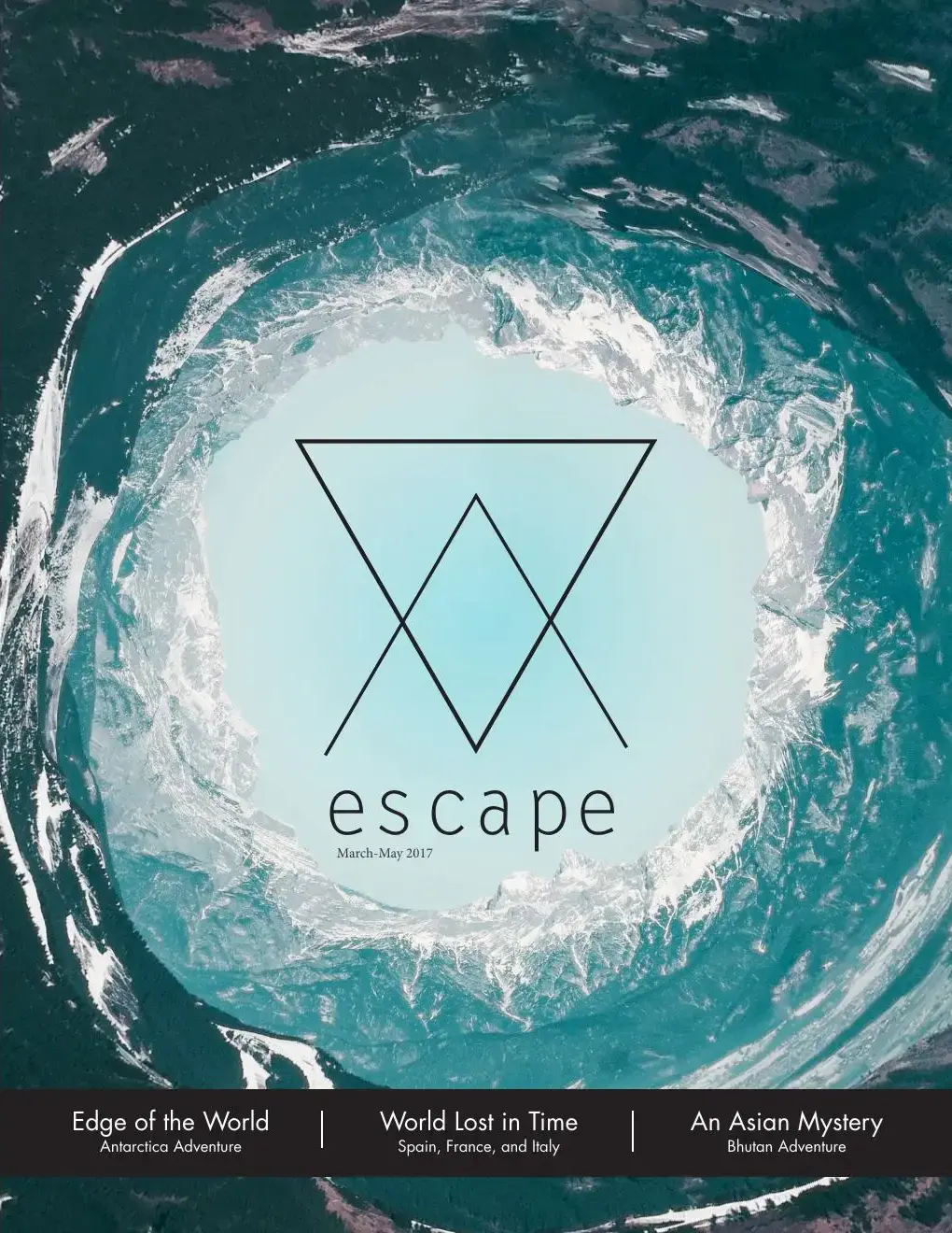
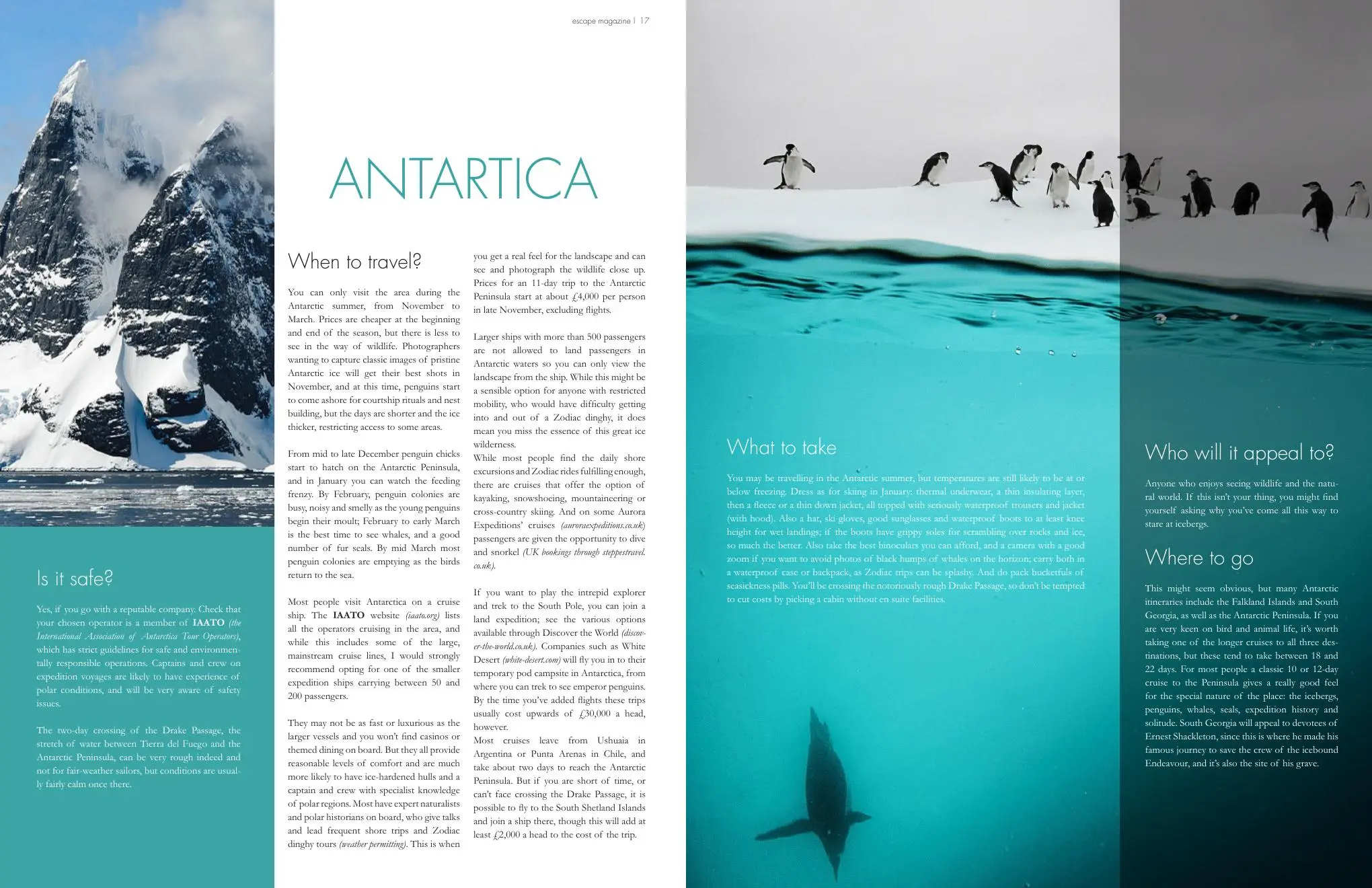
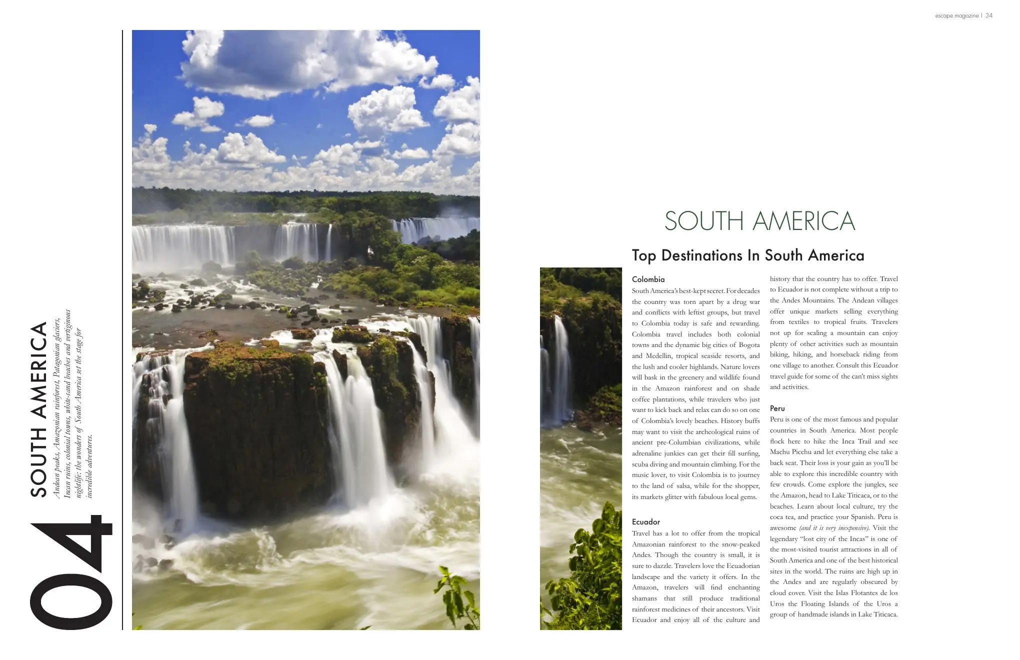
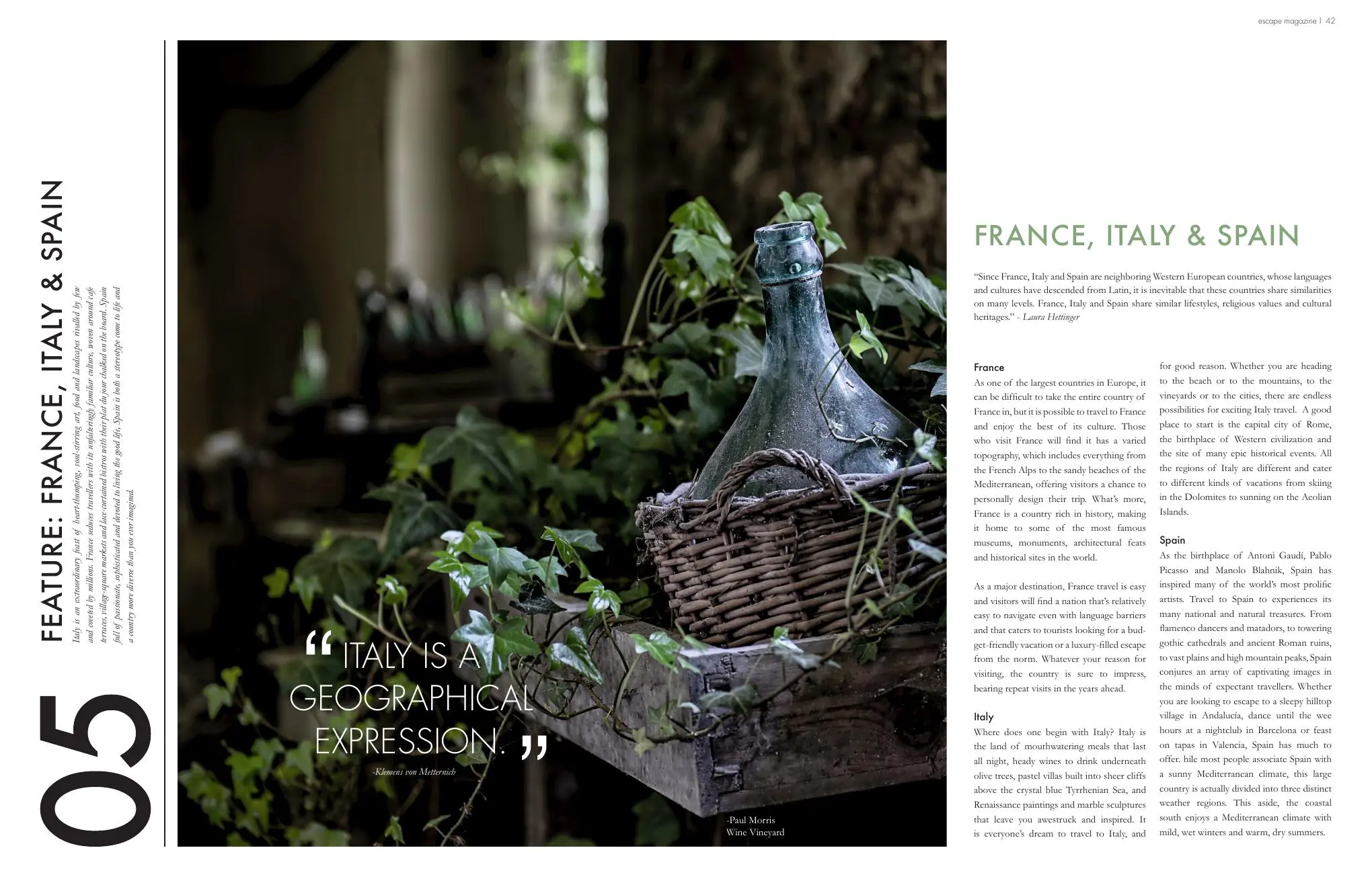
Escape began as a forty-page travel magazine. Different places needed different pacing, but the issue still had to feel like one publication. I used shifts in image scale and quieter text pages to make that work. The later campaign concepts grew from the same interest in the change you feel when you leave your routine.
“The world is wider than your routine.”
WORKING THROUGH IT
Two overlapping triangles form an open passage. The simple geometry stays readable over destination photography.
Cinematic destination photography carries the emotion. Typography provides the information and sets the reading pace.
Thin rules and restrained type sit in broad white spaces, giving readers room to leave one location before entering the next.
The logo keeps its geometry as it moves from a quiet image overlay to a view into another place, then an environmental portal.
THE IDENTITY
The primary symbol comes directly from the original 2017 magazine artwork. An inverted outer triangle overlaps an upright inner triangle to form a single open passage.
Leave ordinary behind.
THE VISUAL LANGUAGE
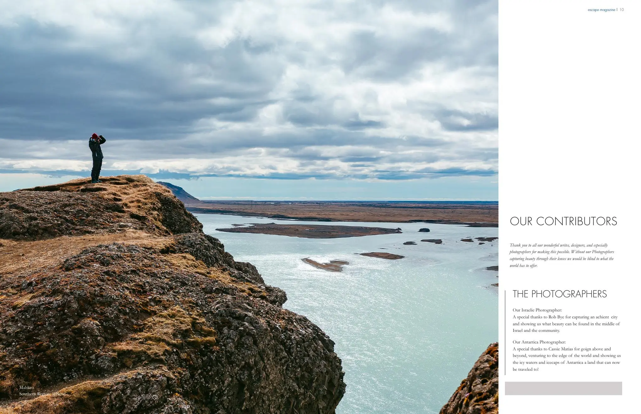
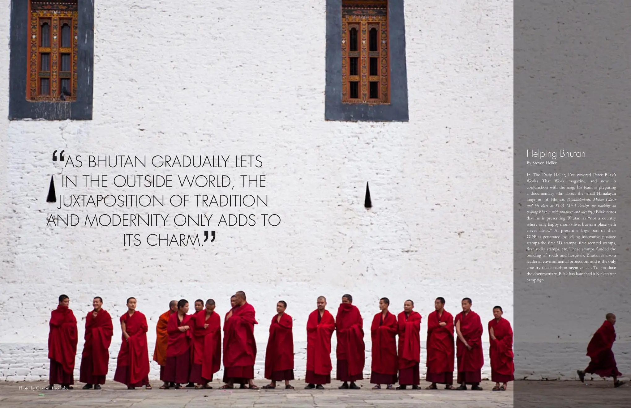
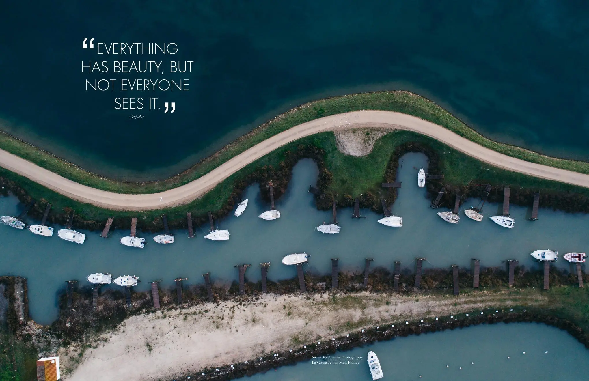
Some stories need a full-bleed opening. Others need a quieter text page. I changed the image scale and orientation through the forty-page issue, using the same fine rules and typography to hold it together.
APPLICATION
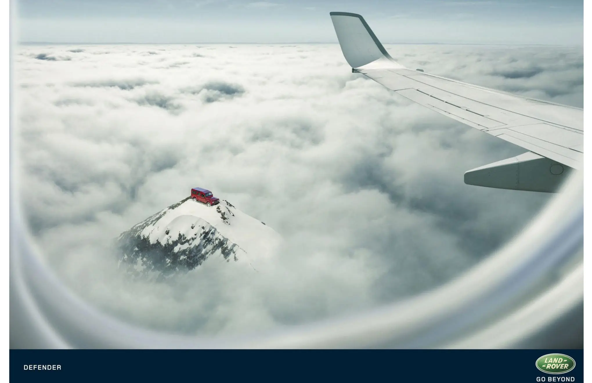
I brought the original symbol into the later transit ads. It frames a view of the destination, keeping the photograph large and the invitation brief.
CAMPAIGN + EXPERIENCE
The later concepts ask how a reader might follow the photograph into a trip. A weekend guide makes time and cost easier to judge. Field equipment has a practical use, while the transit idea puts the destination inside an everyday journey.
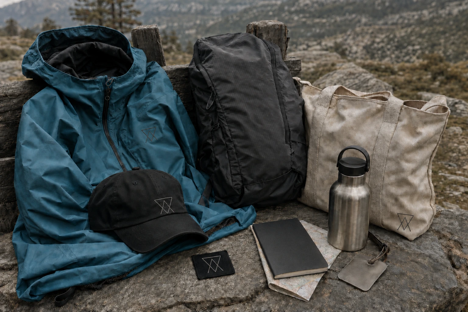
A jacket, cap, tote, passport notebook, tag, patches, and postcards treat merchandise as practical travel equipment.
A large projection interrupts the commute with destination footage and sound. A printed guide gives riders a route they can take away.
One-weekend itineraries set clear limits on time and distance, with a budget that makes each escape achievable.
Writers, photographers, local guides, and readers document how a place changed their perspective.
Independent stays, rail, outdoor brands, and local experts connect editorial discovery to credible ways to go.
A reader campaign brings the brand full circle by recording the perspective people carry home.
THE BRAND IN THE WORLD
The magazine remains the starting point. A campaign image can interrupt a commute, but the guide needs to help someone decide whether the trip fits their weekend.
 ESCAPE / CAMPAIGN 01THE 48-HOUR ESCAPEA BOOKABLE WEEKEND DROP / TRAIN + STAY + FIELD GUIDE
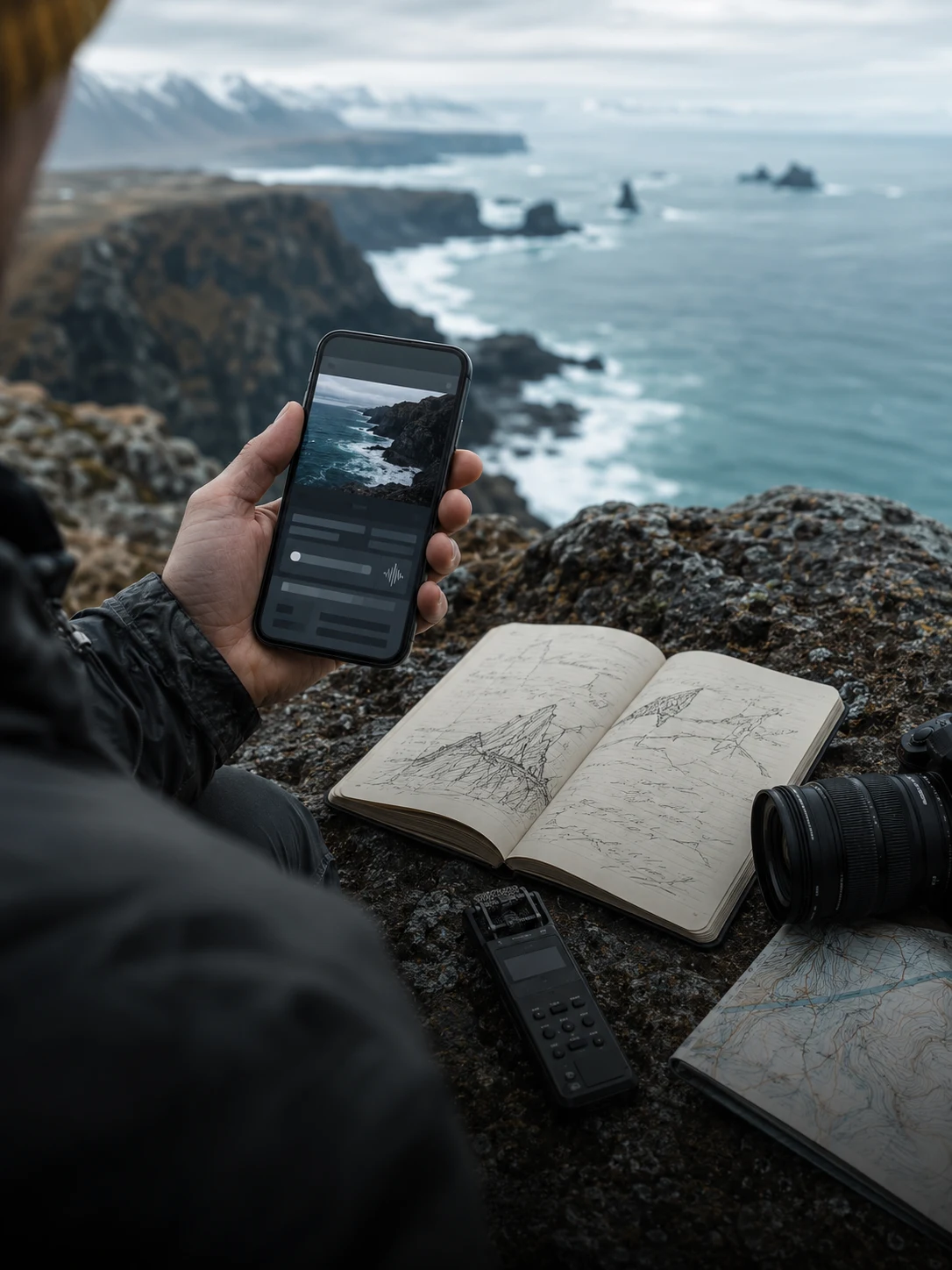 ESCAPE / CAMPAIGN 02FIELD NOTES / 001CONTRIBUTOR STORIES / MOBILE + AUDIO + ANALOG
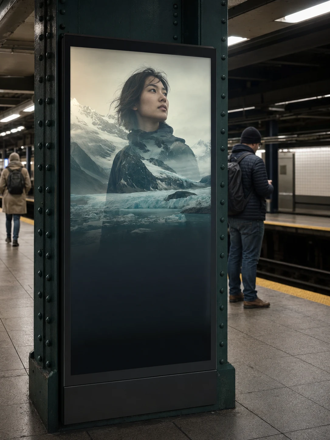 ESCAPE / CAMPAIGN 03RETURN DIFFERENTREADER PORTRAITS / WHAT THE JOURNEY CHANGED
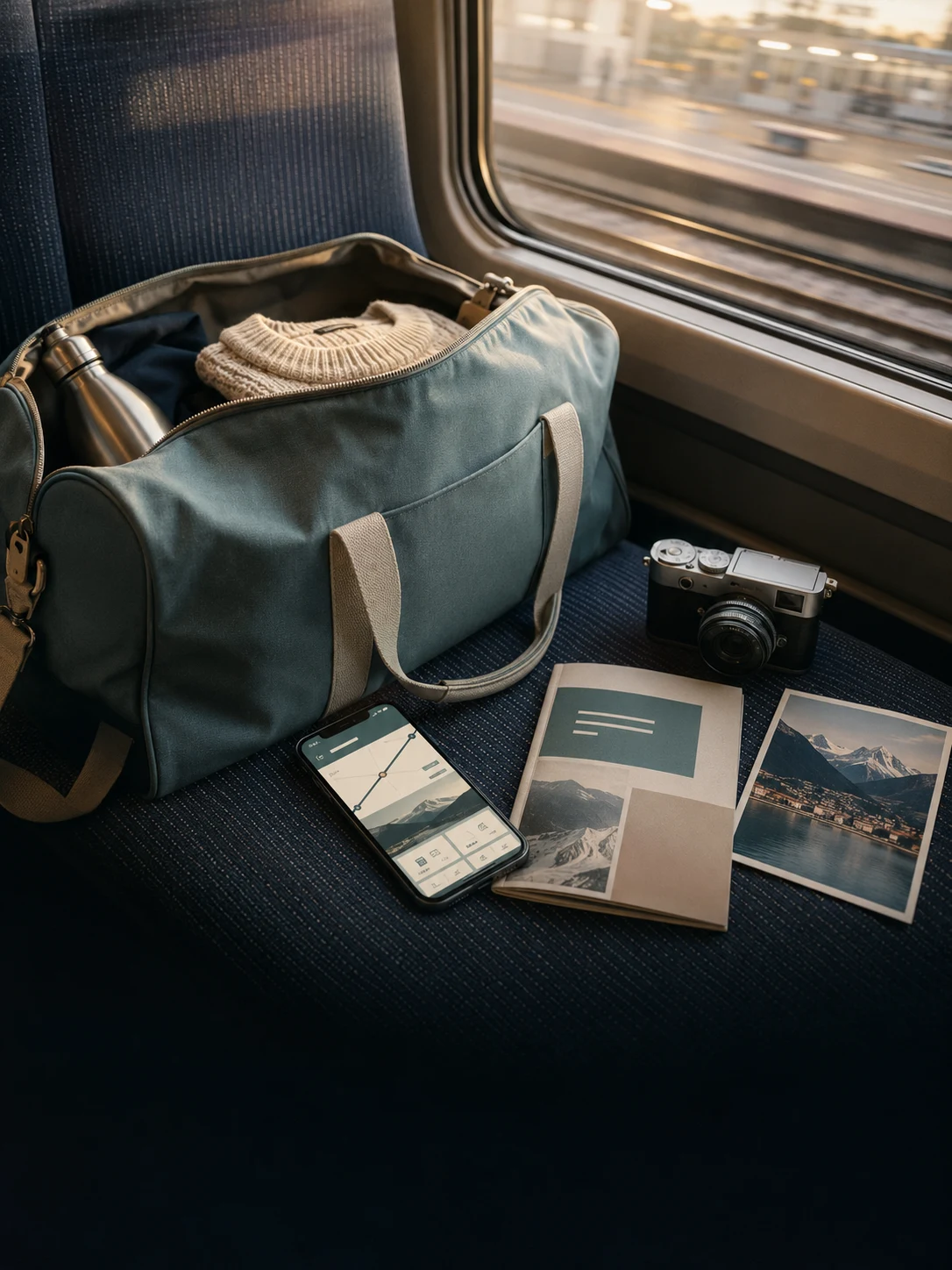
A weekend kit holds a weatherproof shell, carryall, cap, field notebook, map, luggage tag, and collectible patch. Glacier teal and charcoal identify the collection. The original symbol appears as an expedition mark.
The proposed Patagonia collaboration starts with the gear people already own. Repair it, prepare for a small conservation trip, then record the work in an Escape field-note edition. Program proceeds would return to local environmental projects.
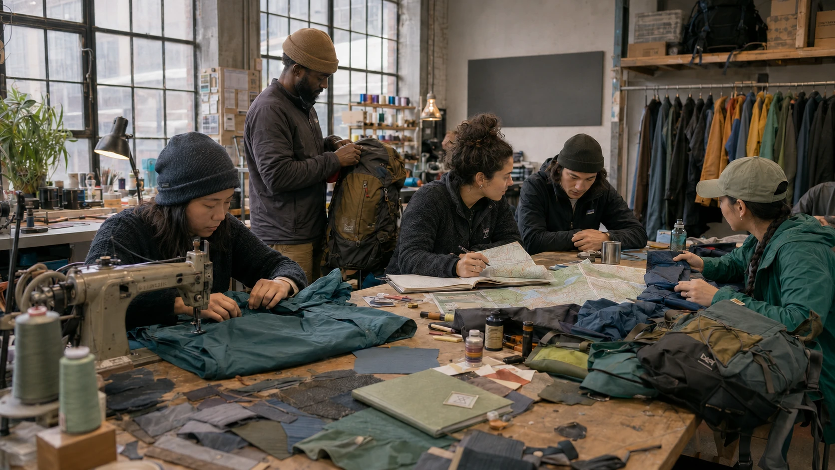
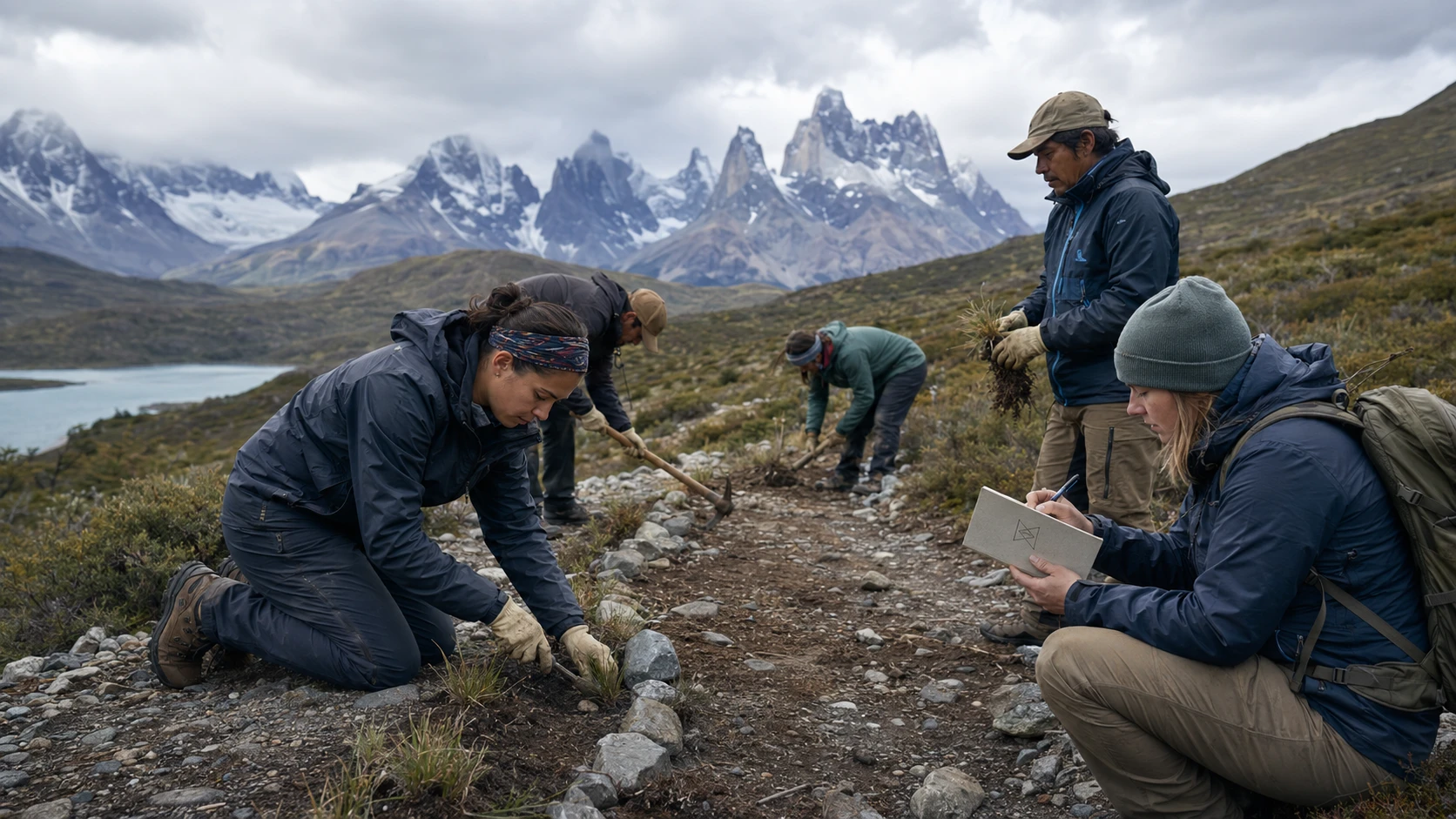
Bring worn outerwear or a pack to a guided repair and trip-preparation workshop.
Join a small-group weekend supporting a local trail or habitat through a conservation partner.
Use observations and portraits to document the work in an Escape field-note edition.
Direct program proceeds and the next issue’s attention back to local environmental action.
A full wrap and projection system carries riders down the station's long escalator. New York snowfall gives way to fractured glacial ice, then a luminous frozen ocean before the train arrives.
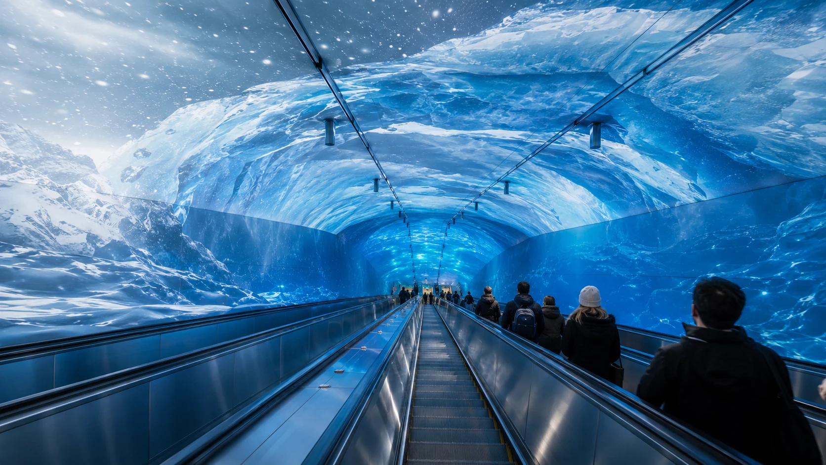 ESCAPE / ARCTIC CIRCLE
Snow falls across the city. Wind opens a white horizon.
Layered ice wraps the walls and ceiling as the escalator descends.
Light shifts underwater. Moving caustics and distant silhouettes deepen the illusion.
The platform presents the issue cover and destination guide, inviting riders to keep going.
Work with the building’s existing movement. The elevator climbs through a mountain scene. A travelator follows a river, while an arrival corridor opens onto a wide view. The stair carries a route along its walls.
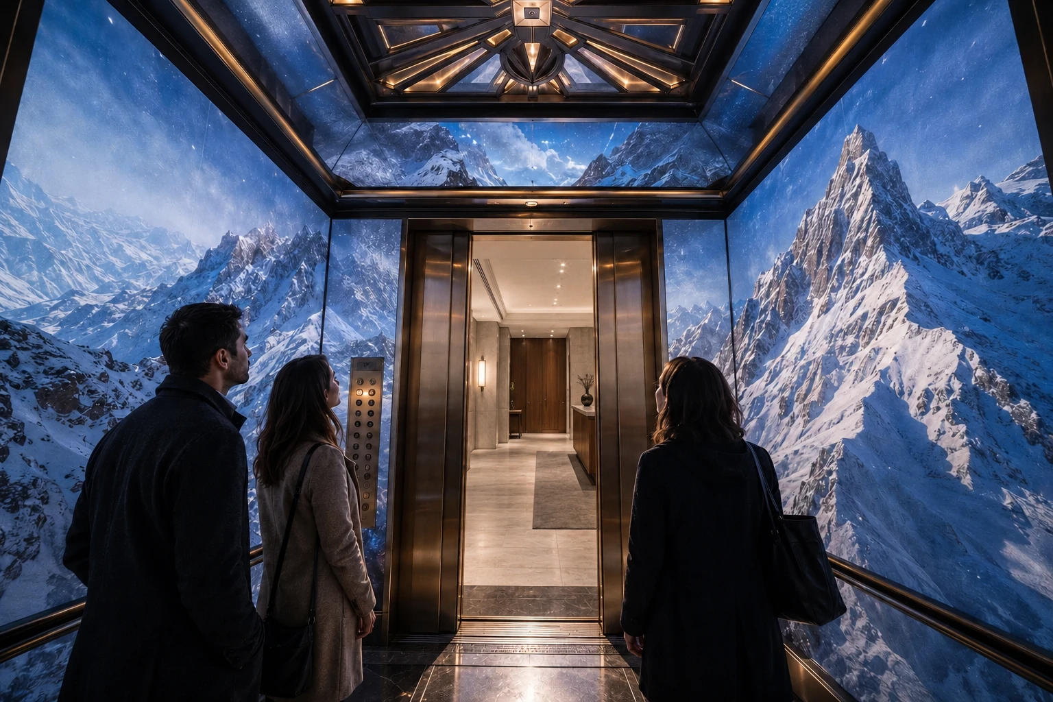
A landmark observation-tower elevator transforms only the cab into a Himalayan ascent, then opens back onto the building's observation-deck lobby.
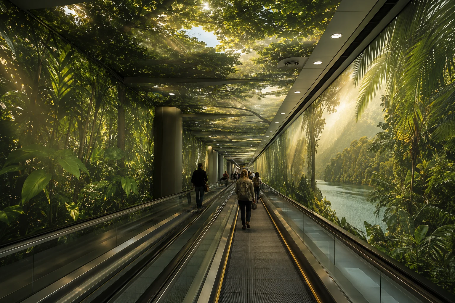
A long travelator carries riders beneath rainforest layers. Warm light falls through the trees toward the river.
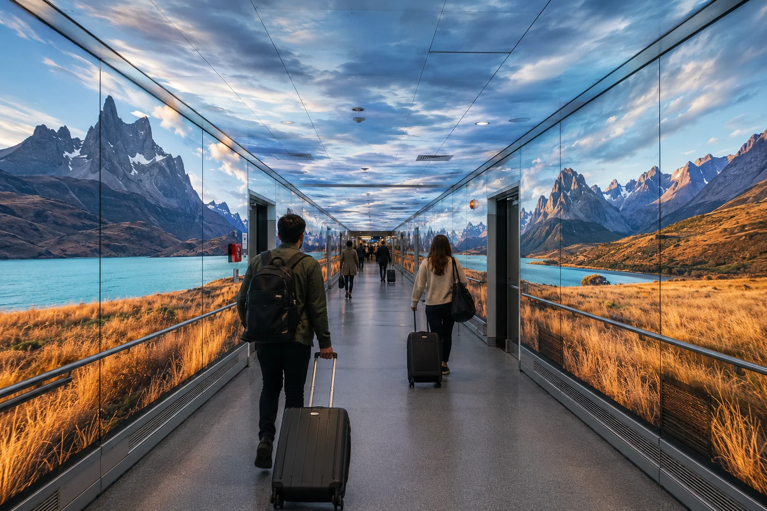
An airport corridor opens onto Torres del Paine, with glacial water running beside windswept grass.
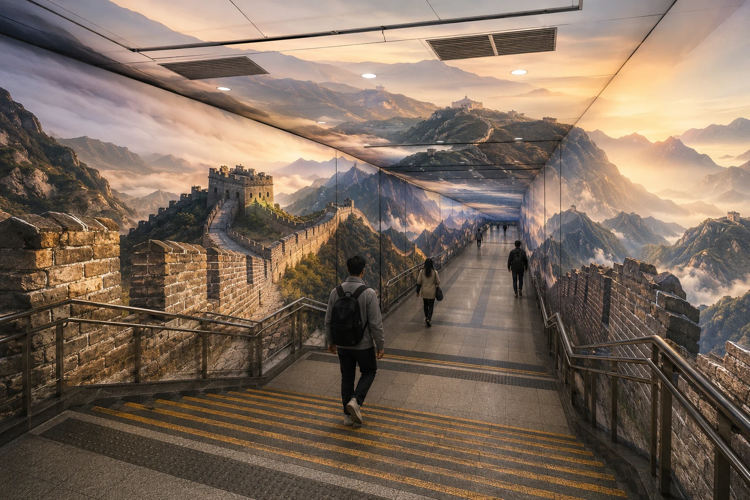
A monumental transit passage extends the wall, watchtowers, ridges, and morning mist through the commute.
The twelve concepts do different jobs. A projection offers a brief change of scene. A repair session or weekend guide helps someone leave. Those practical ideas need as much attention as the larger installations.
Appear inside a repeated behavior: commuting, waiting, crossing, or leaving work.
Use architecture, atmosphere, motion, and sound to make the transition felt.
End every encounter with a route, time window, field tool, or bookable next move.
 01
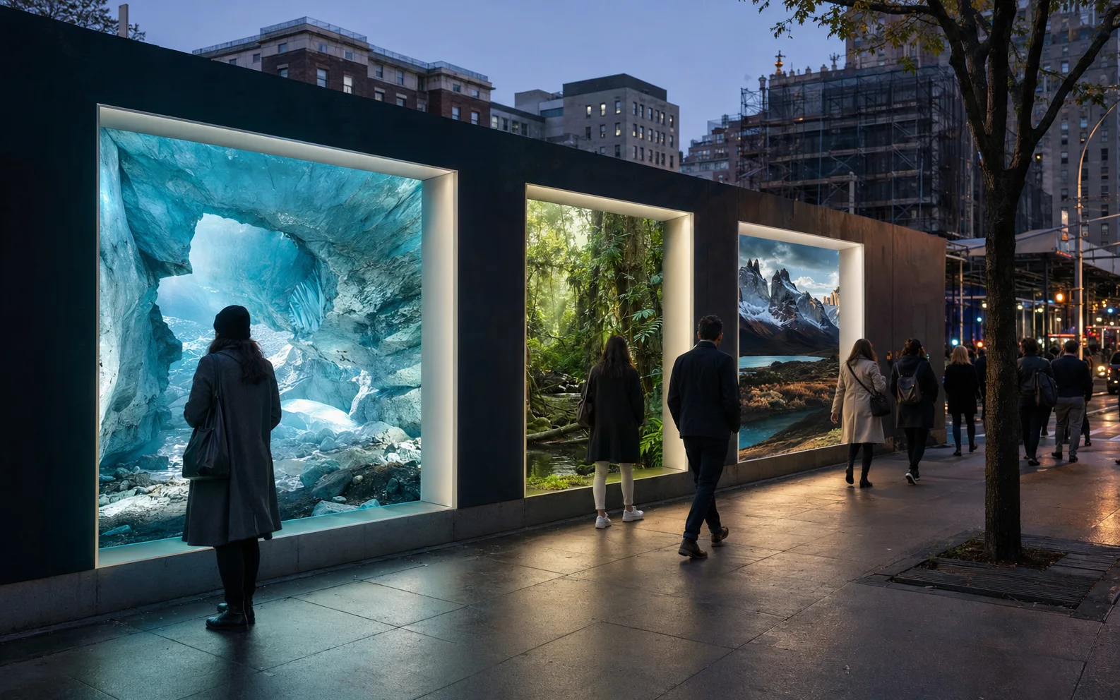
01Cut a destination-sized window into a blank city wall. The illuminated image catches someone on the street, and its code opens the route to that place.
 02
02Ask how much time someone has this weekend. Pair it with a reachable departure and available room, then give them one itinerary to consider.
 03
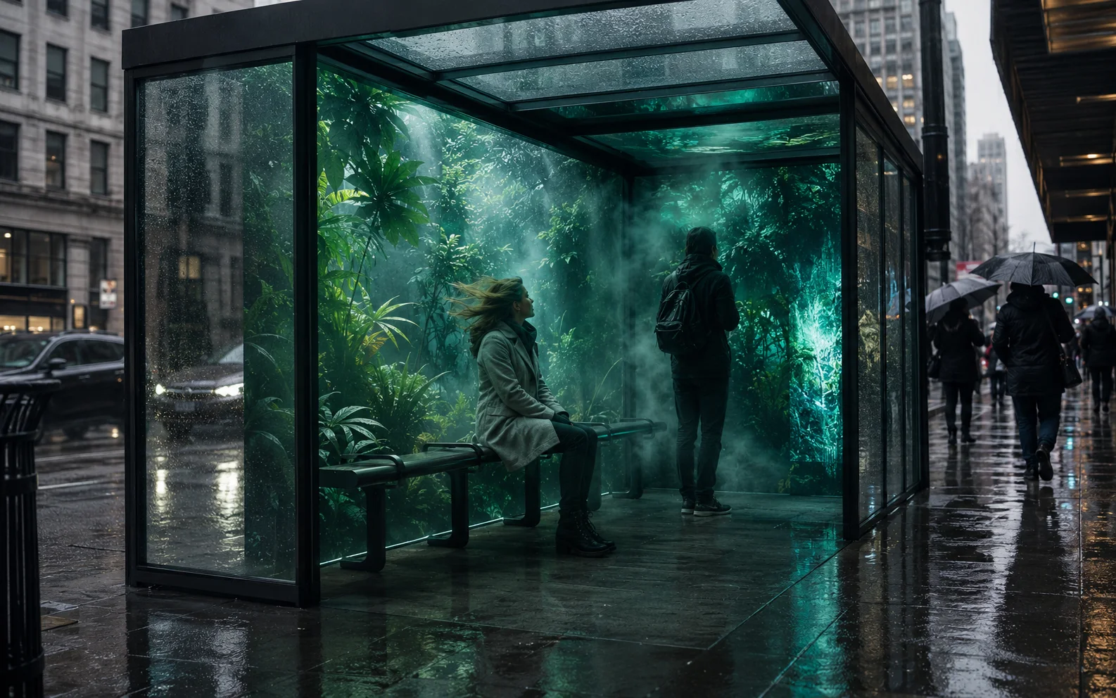
03Bus shelters borrow the climate of a featured destination through controlled mist, air, sound, scent, and responsive light while the ordinary city remains visible outside.
 04
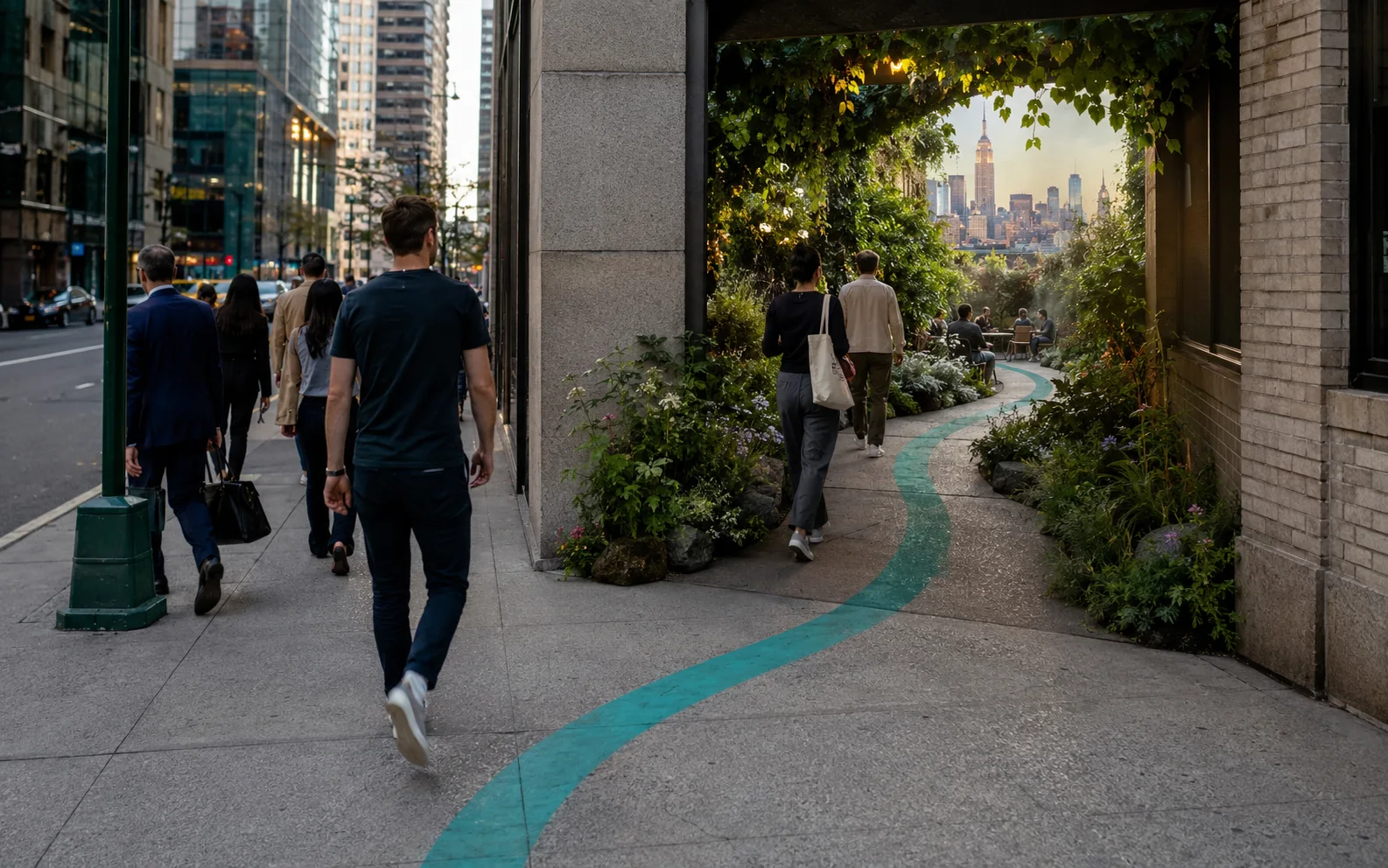
04A teal line breaks away from the familiar commute. It leads to a small garden or view nearby, with a local field note at the end.
 05
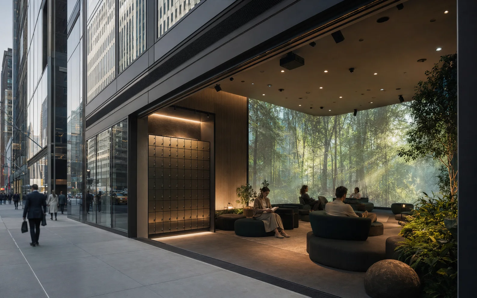
05Leave your phone at the door for ten minutes. Sound and changing destination images fill a quiet room, with no feed to keep checking.
 06
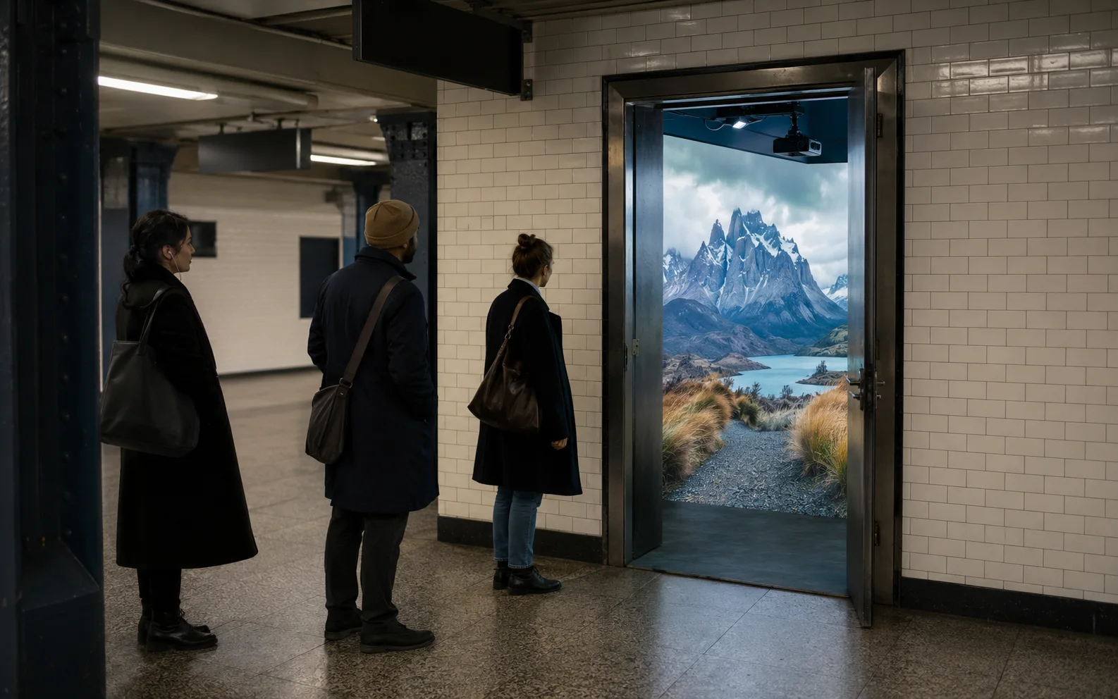
06Wrap the inside of an ordinary door in a destination scene. The street remains behind you when you step through it.
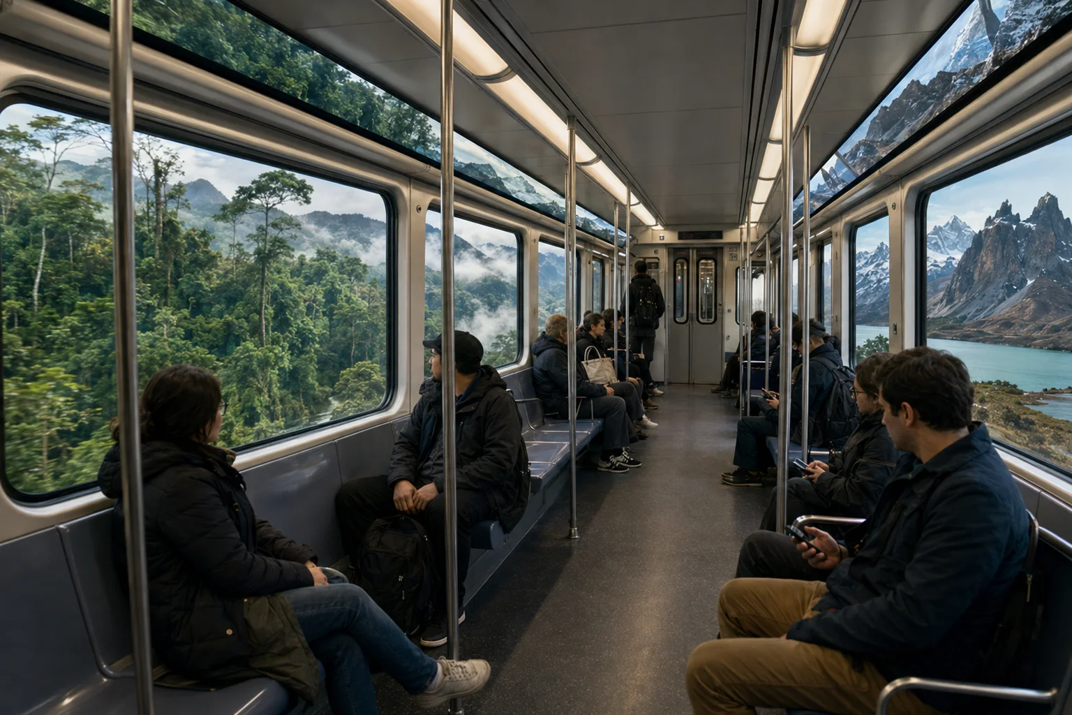 07
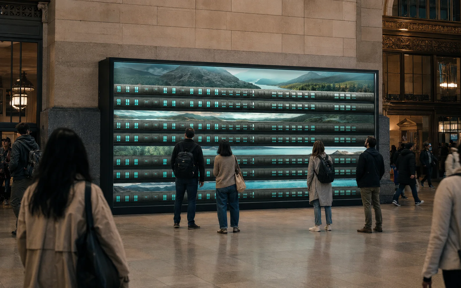
07Train and tram windows join ferry windows as continuous panoramas. Riders appear to cross the Amazon or Patagonia, with a Himalayan version also proposed, while traveling through New York.
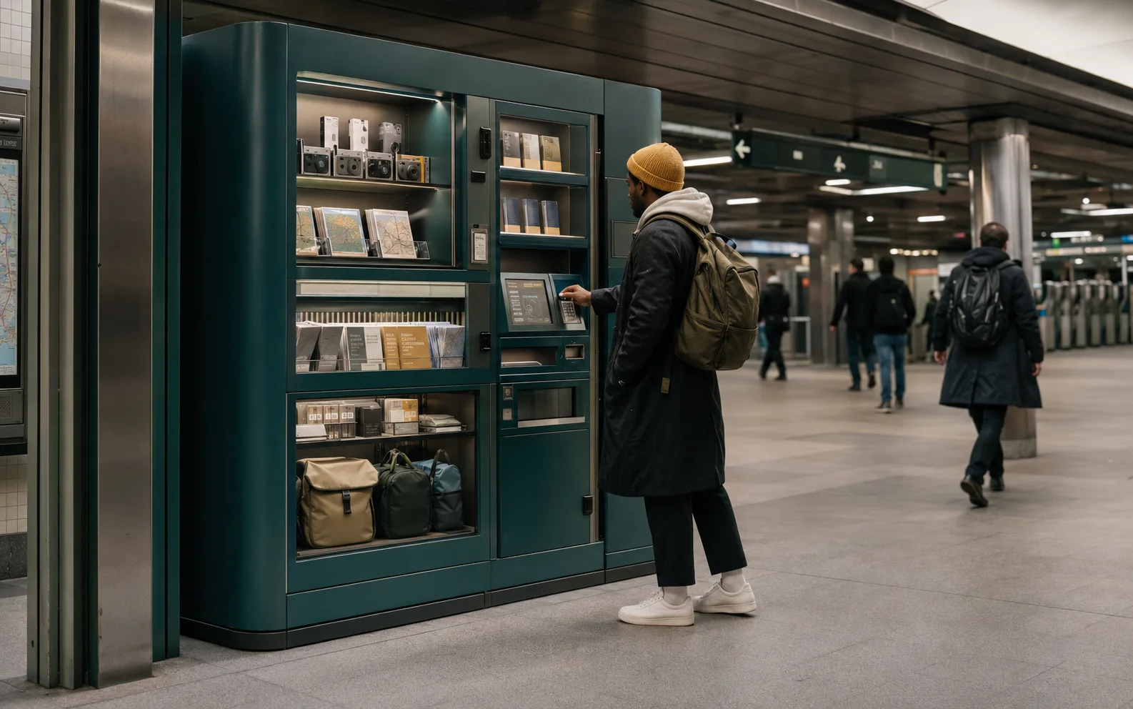 08
08A vending cabinet holds pocket maps and field cards, alongside cameras and repaired travel essentials. Pick up what you need for a short departure.
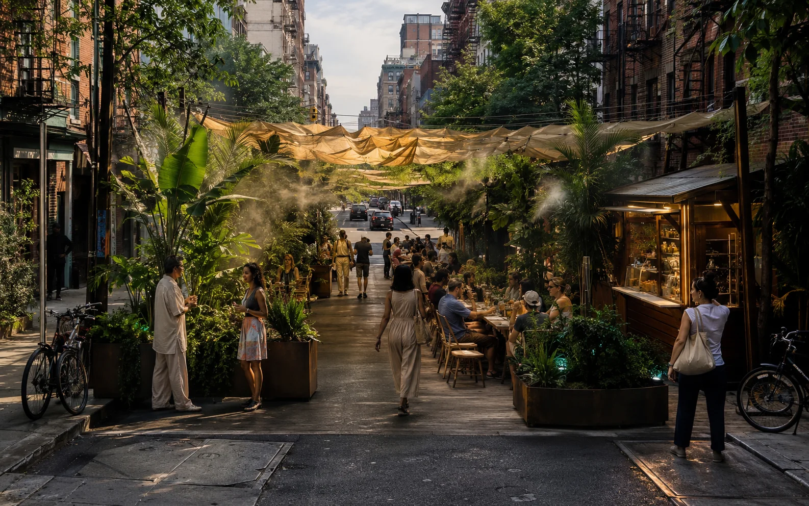 09
09Invite local hosts to build an evening around a place they know. Planting and recorded sound establish the setting, with food and field stories adding detail beyond the image.
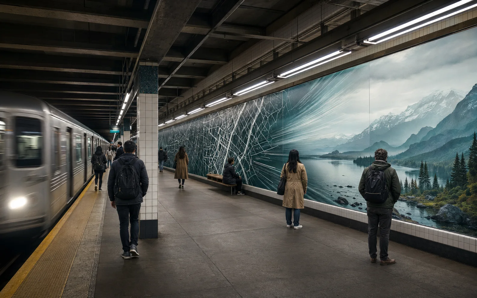 10
10Use the length of a station platform to unfold a destination. Each panel shows another part of the route while commuters wait.
 11
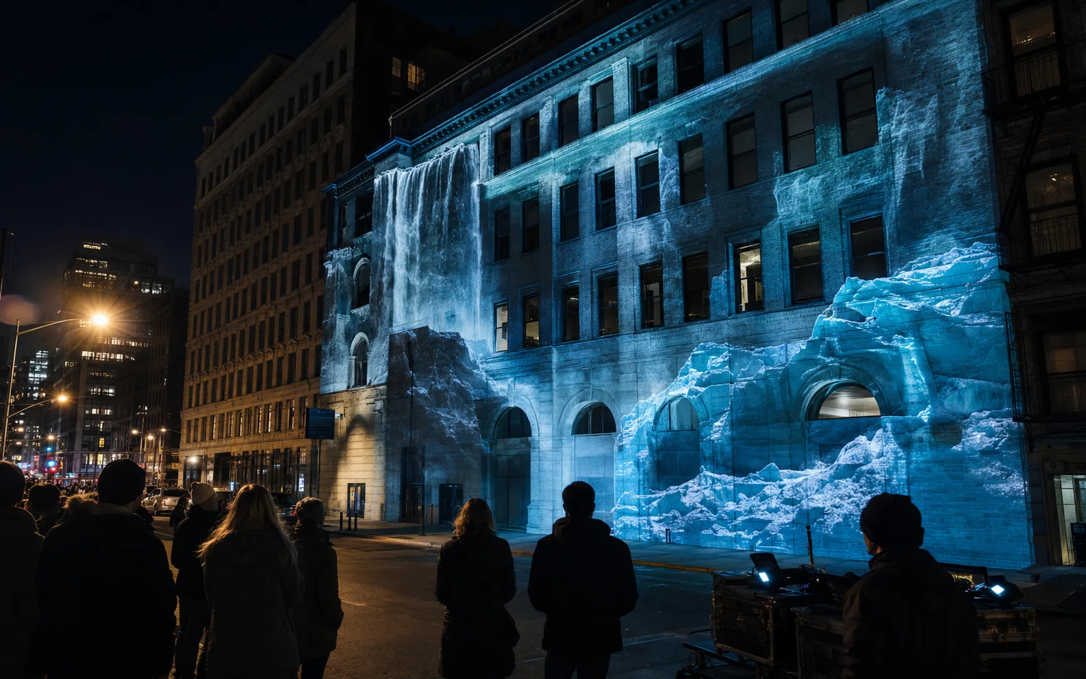
11After sunset, blank architecture carries moving weather. A waterfall runs down one façade. Elsewhere, a glacier fractures across concrete and a forest canopy moves over the street.
 12
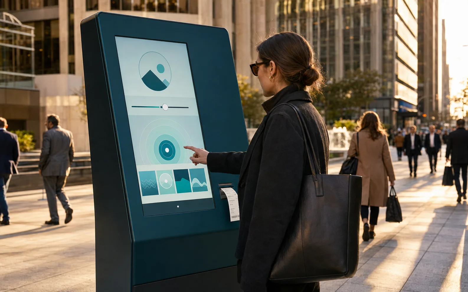
12Choose a free afternoon and a train radius at the kiosk. It prints a practical trip with an out-of-office note to go with it.
The original symbol and restrained typography stay fixed. Photographs and scale change with the place and the format.
Destination drops sized for a free weekend and one carry-on. Say yes and go.
↗Writers and photographers share road observations, with local guides adding context.
↗Printed and digital itineraries connect independent stays, food, nature, and culture.
↗I used the symbol to frame a glimpse of the destination. The same crop works at the size of a social post.
↗Readers describe how travel changed their perspective.
↗Adapt a destination story to the way people already move through a building. A lift and a long corridor need different treatments.
↗WHERE THE CONCEPT STANDS
The original logo and magazine establish Escape’s visual language. The proposed campaigns take that language into the city, with practical prompts for a short trip. They extend the publication’s idea of discovery without changing where the project began.