REST IS THE SERVICE
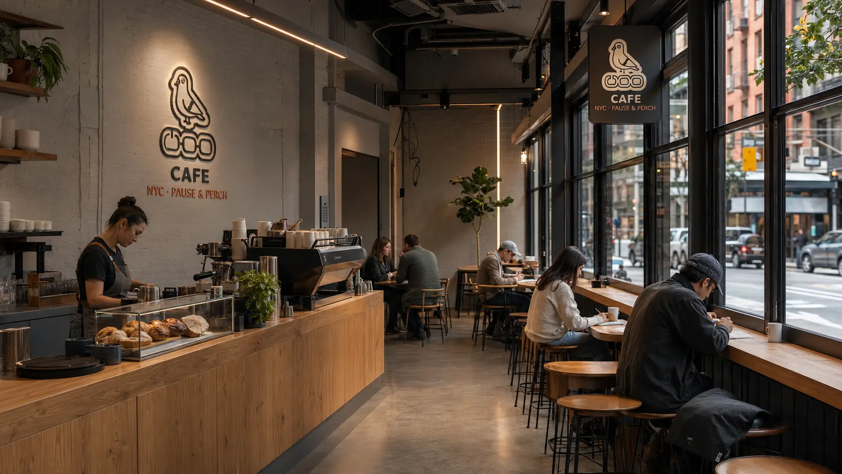
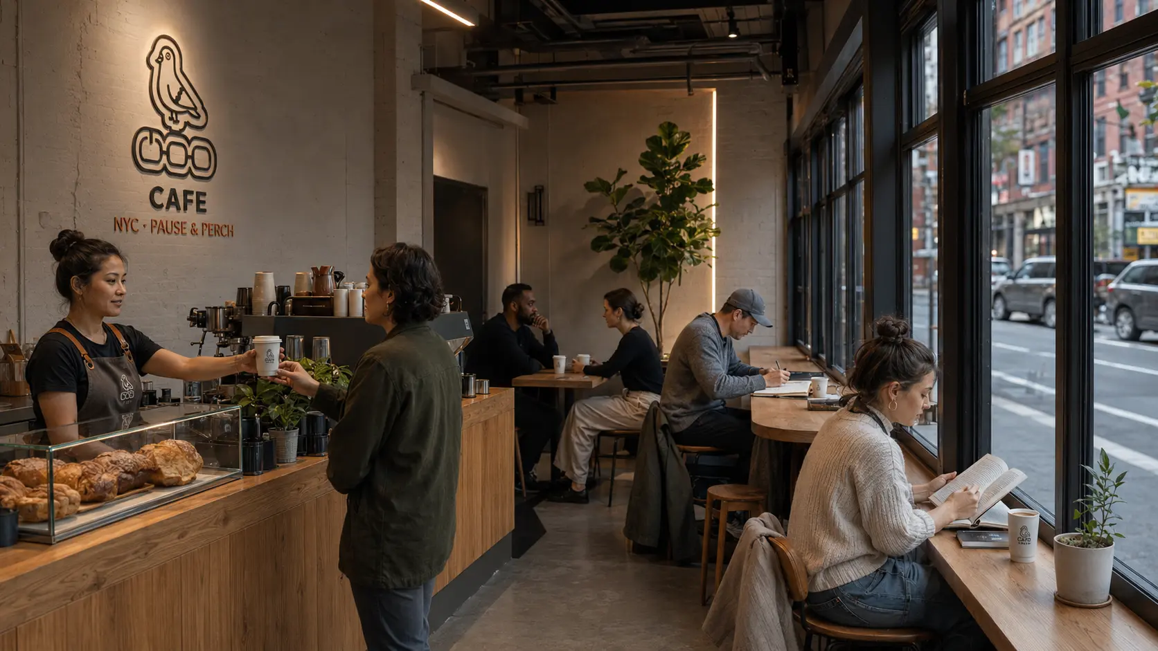
A solo seat should feel ordinary here. Low lighting and quiet language let guests take a break without being asked to make the visit productive.
BRAND / HOSPITALITY / CAMPAIGN / RETAIL
THE STRATEGIC HOOK
I started with the city pigeon. It is familiar, overlooked and somehow still getting through the day. That gave COO a character people could recognize before they read a line of copy. The café concept had to make rest practical, from a seat facing the street to language that leaves you alone when you need it.
“I made the city pigeon the cafe’s regular. Tired New Yorkers could recognize a little of themselves in it. The rest of the brand follows that permission to pause and perch.”
WORKING THROUGH IT
A solo seat should feel ordinary here. Low lighting and quiet language let guests take a break without being asked to make the visit productive.
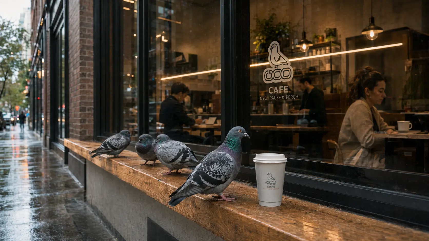
The pigeon already belongs to the city. Its tired expression gives the café a dry sense of humor before anyone reads the menu.
Concrete and steel keep the space close to the street. Warm oak and low light make it somewhere you might stay.
Use the pigeon where it adds something. A cup can carry a small observation, while a narrow sign needs a compact mark.
THE IDENTITY
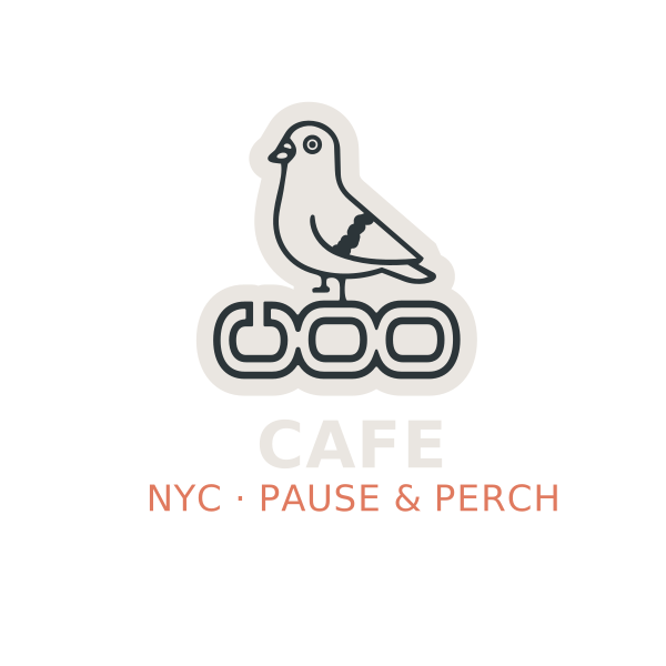
The four lockups solve different space problems. The pole mark fits a narrow sign. The pigeon-led version has room for character, while the compact wordmark works on small objects. Rounded lettering softens the line drawing.
NYC · PAUSE & PERCH
THE VISUAL LANGUAGE
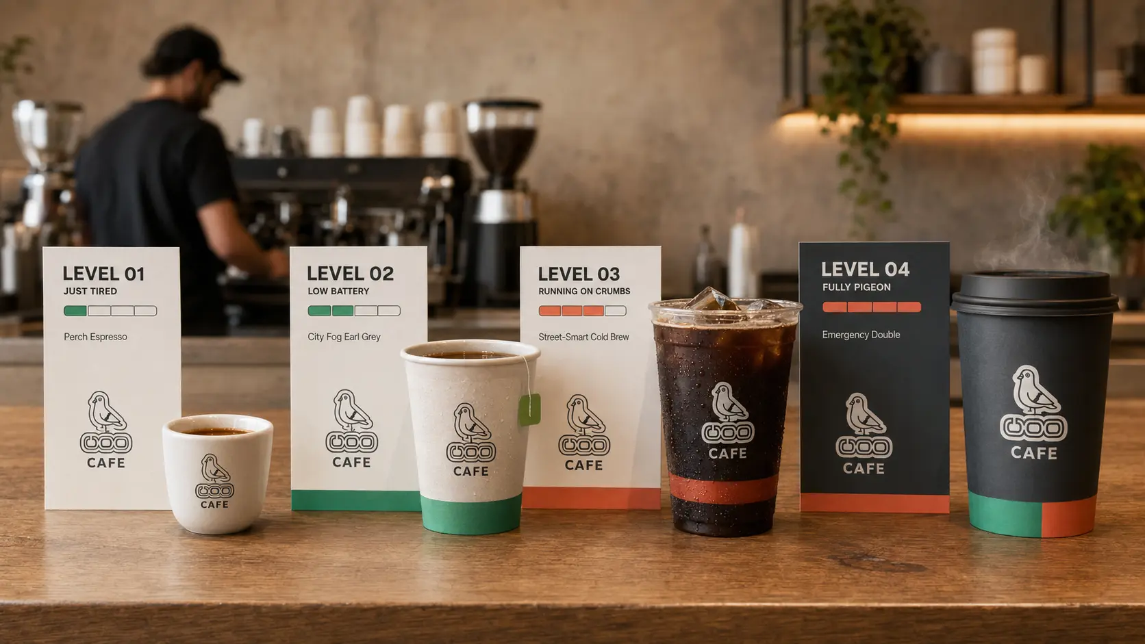
The line-drawn pigeon sits beside photographs of warm industrial spaces. Grids keep the menus readable. Iridescent accents borrow a little color from the bird, and the copy sounds tired in a familiar New York way.
APPLICATION
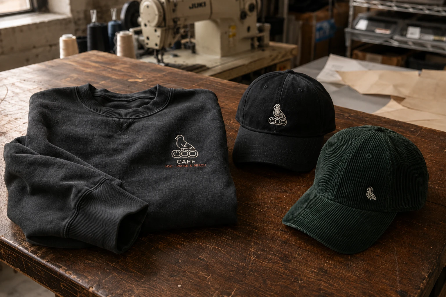
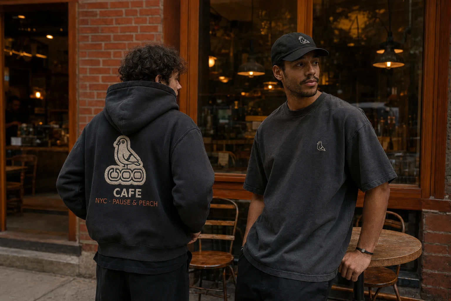
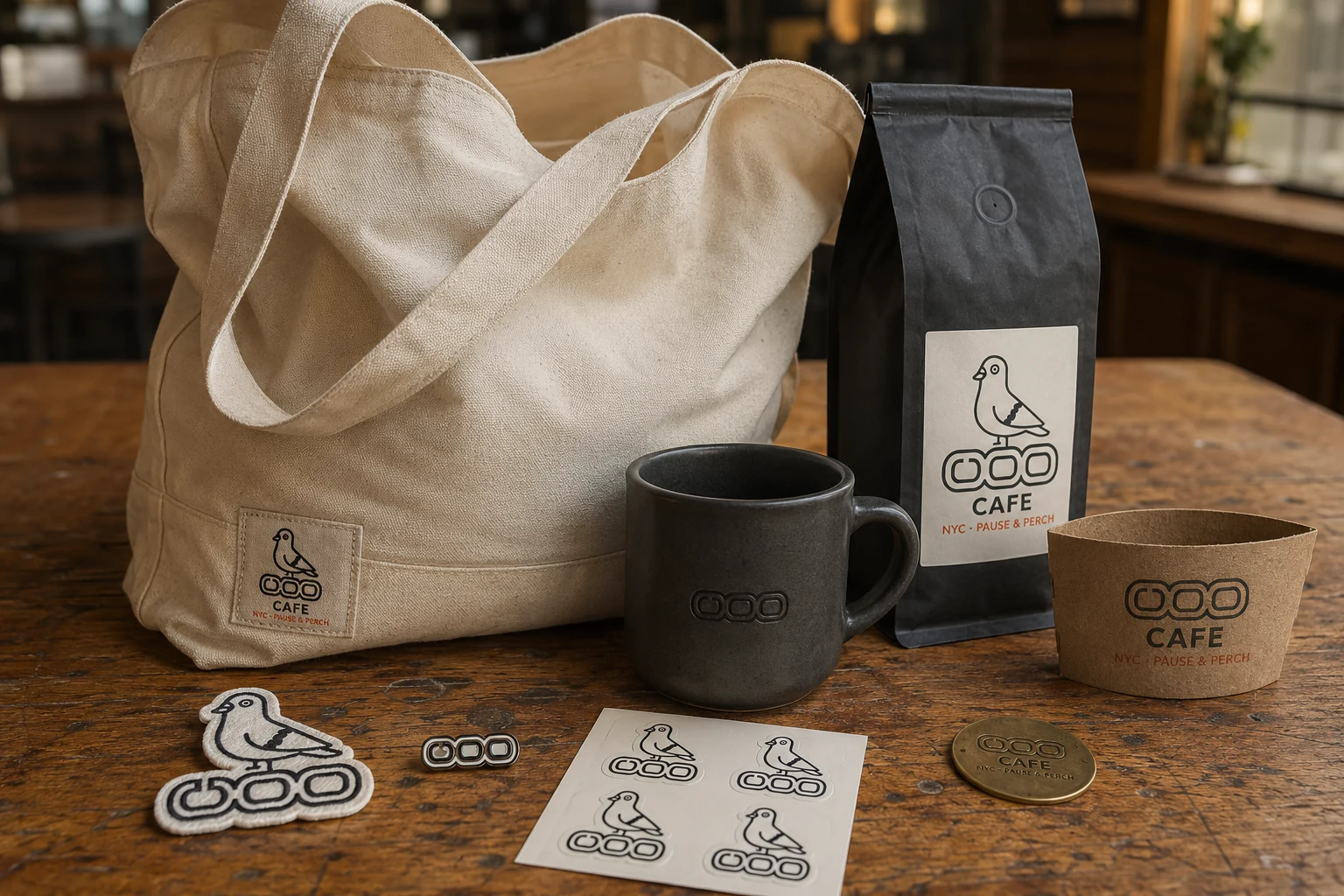
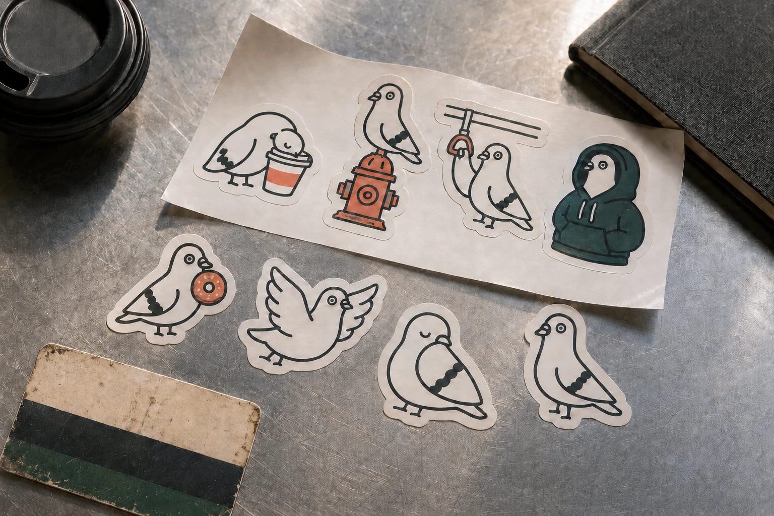
The objects need different finishes. A stoneware mug can take a small mark, while a washed hoodie gives the pigeon more room. The proposed collection specifies materials and sizes for production. Stickers let its mood change from one New York day to the next.
EXPERIENCE
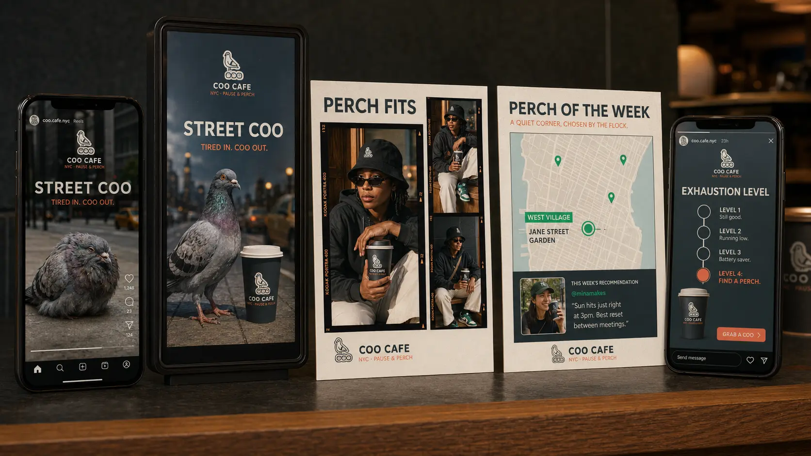
The café rules matter as much as the cup. A street-facing seat gives someone a place to sit alone, and the menu should be easy to order from. The community campaign points out other places in New York where you can pause.
A continuous oak counter faces the street, making solo occupancy and quiet people-watching feel intentional.
A cast-concrete sidewalk board carries one dry observation each day.
Community posts map overlooked public places where New Yorkers can pause without having to purchase anything.
People can share where they go when the city wears them out. Creator portraits and drink prompts give the café a way to join that conversation.
COO gives tired New Yorkers a low-pressure place to rest. Warm light falls on simple materials and seats suited to solitude. Staff language asks nothing of a guest's productivity.
A continuous street-facing oak rail gives solo guests a quiet seat without forcing social interaction.
A sleeping pigeon appears inside the mug only after the drink is finished, turning rest into a small reward.
The cast-concrete A-frame shares one dry observation each day.
A neighborhood-map sleeve turns every cup into a pocket guide to nearby quiet places.
The COO concept imagines a shop shaped by its regulars and the pigeons that inspired it. Its fictional owner keeps a pet pigeon nearby. The room gives tired New Yorkers somewhere quieter to sit.
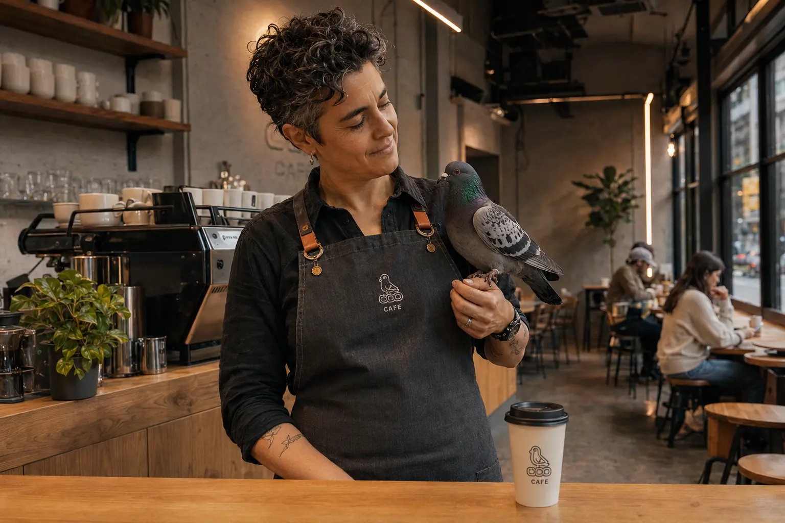
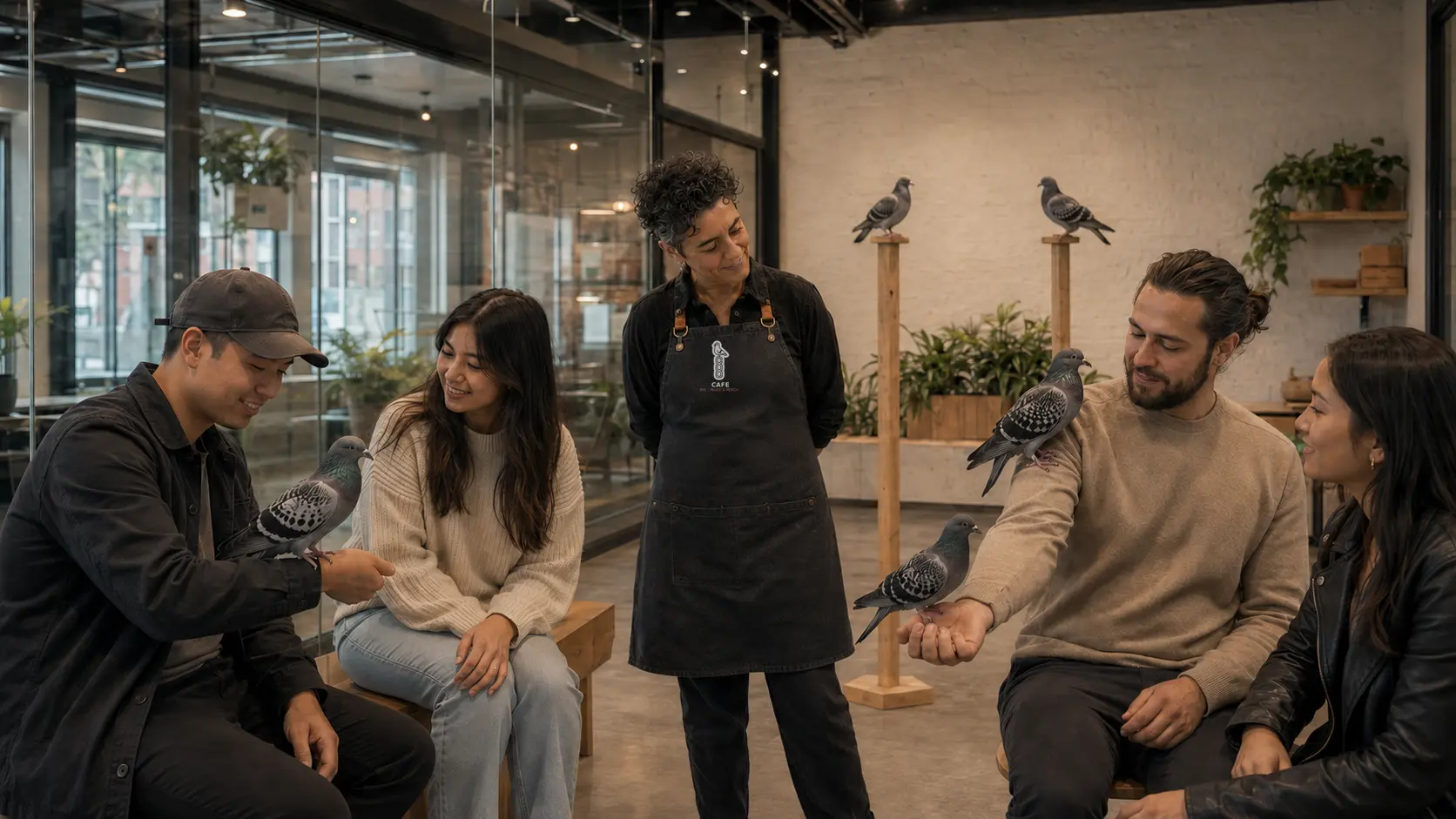
The COO concept includes a proposed pigeon-rescue nonprofit. Café purchases would contribute to veterinary care and rehabilitation. Temporary homes and humane city education are also part of the plan.
A glass-separated lounge would let guests meet adoptable and ambassador pigeons with trained staff. Food preparation stays separate. Each bird needs room to withdraw, with its care taking priority over the visit.
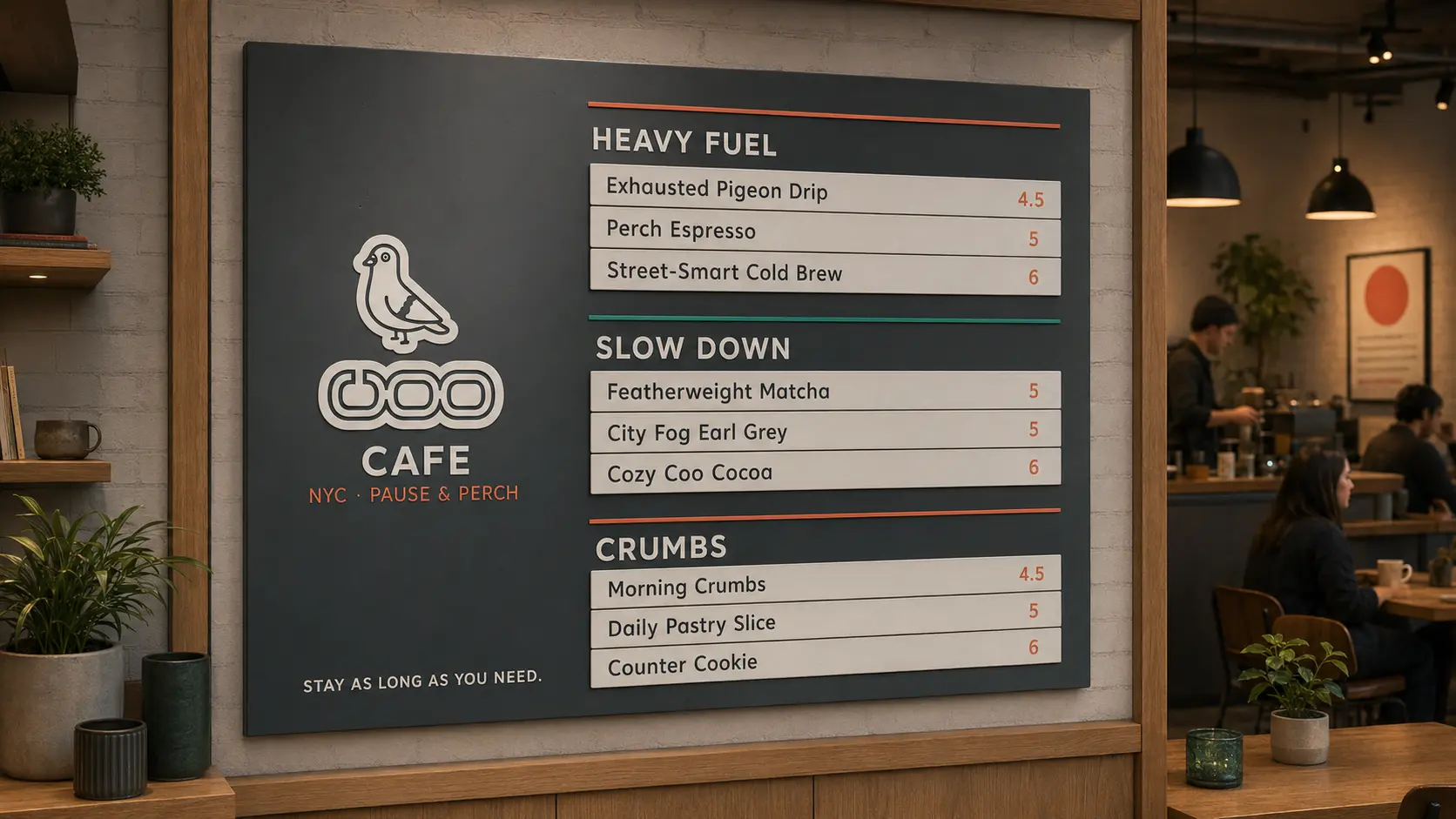
Match the mark to the material. Apparel can use print or stitching, while a mug needs a durable finish. Kraft wraps and map sleeves bring the same pigeon into the everyday order.
Ask people where they pause when New York wears them out. Share the small routines they describe, with useful locations alongside the portraits.
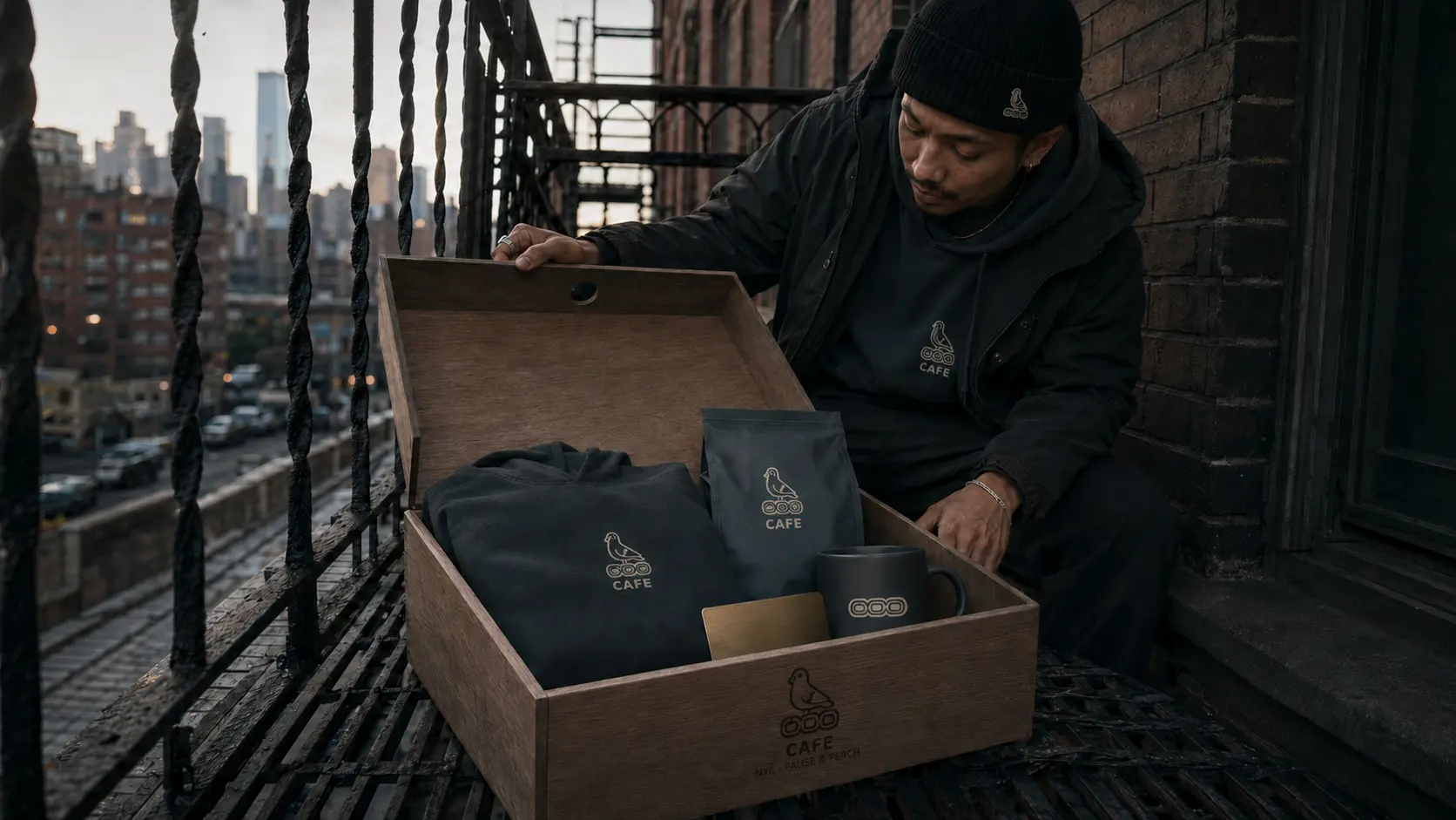
A minimal birdhouse crate delivers the Asphalt Slate hoodie, Overworked Blend coffee, sleeping pigeon mug, and a numbered brass Perch Pass for thirty days of coffee.
WHERE THE CONCEPT STANDS
The identity follows the pigeon into the menu and the small objects people use in the café. The proposed rescue program gives that character a purpose beyond the mark. COO remains a hospitality concept, including the nonprofit model and the spaces shown here.